


During major election years, we’re bombarded with political logos. From the local representative all the way up to the president, we see their logos everywhere and all the time, on bumper stickers, yard signs, or buttons pinned to shirts.
There’s a lot of thought and energy that goes into crafting campaign logo designs. An effective campaign logo is both an advertisement and a fashion statement. American politics is often about identity – for a voter to display a campaign logo is more than an endorsement of a candidate, it is a reflection of their own lifestyle, values, and even socio-economic status.
When it comes to presidential campaigns, the quadrennial climax of the election cycle that splits the entirety of the nation into two sides, the stakes are at their highest. Public scrutiny of presidential candidates is famously intense, and campaign managers have no room for error when it comes to messaging. These logos don’t go into the waste bin once the election is over, they become a part of history.

What makes a presidential campaign logo?
Time is a defining factor in the creation and design of every presidential campaign logo.
Political campaigns generally don’t last for more than two years. If we think of presidents as the “product” being advertised, we are looking at a pretty short product life cycle that ends fairly abruptly.
Because they have a limited window of time to make an impression, presidential campaign logo designers often use simpler tactics and metaphors that are familiar and easy to understand. When the goal is to appeal to at least half the population of the entire country, there isn’t a whole lot of room to gamble. A combination of red, white, and blue is almost a given. But some degree of boldness is necessary – after all, the goal is to get people to fall in love with a design, not necessarily to get married to it.
Presidential logos can also be viewed as microcosms of their era. Logos from the 60s and 70s reflect the funkier aesthetic of the era, and most of the pre-2000s logos look campy to a modern eye that is more accustomed to the streamlined, simplified design concepts of the 21st century.
Let’s take a look at the logos of the later 20th-century election winners to understand how we got to where we are today.
1968-1976

First, let’s start with Richard Nixon’s 1968 logo: it features the slogan “Nixon’s The One!,” Nixon’s face, red, white, and blue, and two red stars. It might have been necessary to include Nixon’s face to get Nixon’s image out in the public e
First, let’s start with Richard Nixon’s 1968 logo: it features the slogan “Nixon’s The One!,” Nixon’s face, red, white, and blue, and two red stars.
This is the only logo we’ll see that includes the face of the candidate. You might recall that Nixon ran against Democrat John F. Kennedy in 1960 in one of the closest presidential elections in history. Importantly, this was the first election to show a televised presidential debate. Many contemporary observers and historians attributed Kennedy’s narrow victory in part to the public’s visual memory of the debate, during which Nixon looked comparatively haggard next to his younger, more dashing opponent.
It’s clear that Nixon’s campaign managers wanted to do a PR makeover for their candidate in the 1968 campaign. In The Selling of the President, the highly influential book by Joe McGinnis about the 1968 Presidential Campaign, it is revealed that Nixon’s advisers were keenly aware of his image problem and designed a strategy to capture favorable still images of their candidate. Thus, in the 1968 campaign logo, Nixon’s face smiling face takes center stage, sporting a healthy, ruddy complexion.
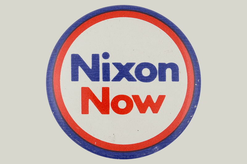
By 1972, Nixon was a known commodity and the face disappeared from the logo. With a simplified logo retaining the two red stars that featured prominently on his 1968 logo, Nixon won the 1972 election in one of the biggest electoral landslides in history.
Jimmy Carter’s logo for the 1976 campaign also featured a simple color palette of red, white, and blue, and a simple 76. The simplicity of his logo complemented his down-to-earth personality well.
1980-1988

In 1980, Reagan and Bush included the GOP’s elephant in their otherwise simple campaign logo, notable for its bold font. The logo showcased traditional lettering to highlight the team’s traditional values. When they ran for reelection in 1984, they went with a slightly different approach and added a touch of bright red and with modern lettering.
Reagan is known for delivering one of the most famous quotes in presidential history when he urged Soviet General Secretary Mikhail Gorbachev to “tear down this wall!”, in reference, of course, to the Berlin Wall. In this context, it is notable that Reagan’s logos used a heavy dose of blue. In fact, prior to the 1990’s, for most presidential campaign logos in the 20th century, blue prevails over red in usage; this is despite the fact that the American flag has more red than blue.

No doubt, logo designers in the Cold War era needed to tread carefully in light of the traditional association of red with Communism.
Bush and Quayle’s 1988 logo design continued the bold trend, as it showcased their names in white on a blue background. Eight white stars – to represent the election year of 1988, no doubt – remind the audience that this is America.
1992-2000
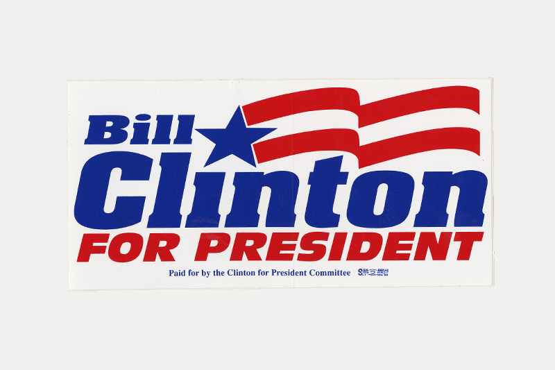
In 1992, Clinton’s presidential logo featured a white background with red and blue lettering, and a red wave. The wave, because it represents movement, complimented Clinton’s progressive platform.

The 1996 Clinton Gore logo design did not feature a wave, but instead a large 96 and a half-red, half-blue design.

Last but certainly not least, the Bush Cheney logo for the 2000 campaign didn’t highlight the turn-of-the-century year, but was a simple, bold proclamation: white letters on a blue background with an angular, waving American flag.
2000 – 2020
Very little changed logo-wise for George W. Bush’s re-election campaign in 2004, other than the use of italicized text to convey a slightly more action-oriented visual. If not for the insertion of the election year at the bottom right, it could have easily been confused with the 2000 version. The similarity was likely strategic; continuity was a key selling point for the Bush administration, which was starting to see approval ratings decline after peaking post 9/11.

There had never been a presidential candidate like Barack Obama in 2008. Obama’s look and message were widely viewed as a breath of fresh air in a stale political scene, and his presidential logo design spoke boldly to his vision of hope and change.
In the clever redesign of the American flag into the shape of a rising sun, we see a modern sensibility that syncs well with Obama’s brand of youth and dynamism. It’s impossible not to notice how much this logo features circles – no doubt, the designers were more than happy leverage Obama’s unique (for a president) name and emphasize a shape that has long been known as a strong symbol of unity, completeness, and welcoming.

The 2012 campaign saw a reprisal of the rising sun visual that was so effective in 2008. The most striking aspect of this logo is the primacy of the digits of the year over the actual name of the candidate, which itself is represented as a website link.
Obama’s campaign, of course, was marked by the strategic and effective use of the internet and social media. The 2012 logo was unmistakably intended to be a call to action as much as it was a visual symbol.

Donald Trump’s 2016 presidential campaign was unique in the sense that it centered around a candidate who had already spent decades building a brand around his last name. The strength of the Trump brand along with the popularity of Trump’s signature catchphrase made the job of creating a logo fairly straightforward. The design is intentionally sparse, meant to stay out of the way of the headlining text. It’s worth noting that this logo often appeared with only Trump’s name shown.
Amidst the unprecedented events of 2020, Joe Biden’s presidential campaign ran on a promise of competence and experience of the kind you would want in a crisis. Solid colors and sturdy text project a steady confidence without too much bluster. The lone visual flourish is an effective one: the stylized “E” adds an element of forward motion and neatly showcases the first three letters as the action verb commonly associated with elections.
Simple Election Logos Work
Obviously, presidential candidates want to show their patriotism, which is why they stick to traditional colors. When it comes to typography, candidates want to choose fonts that make them seem bold, assertive, and confident. Sans serif fonts convey strength and leadership.

When it comes to symbolism, you can’t go wrong with the flag, the most patriotic symbol there is. Variations on the flag – like Obama’s circular symbol that contains red and white stripes underneath a blue arc – can still be successful.
As societal norms evolve, so do our symbols. With limited real estate and a template bound by history, it will be interesting if future campaign logos attempt to integrate trends such as inclusive design.
Ultimately, simple designs work. Political logo design requires time and energy, and a healthy respect for what’s worked in the past.