
Virginia Logos
Virginia Logos designed on Hatchwise
21
designs in this collection










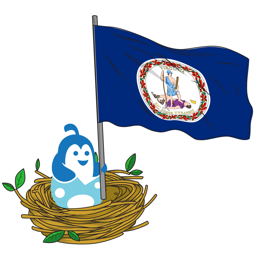
Famous Logos From VirginiaOne of the original colonies, Virginia is named for the Virginia Company of London and was colonized to gain footing in the New World land and commerce landscape. It was designed to open new areas of trade and deter further Spanish incursion, after witnessing their overtaking of Florida.Its earliest record of industry was in 1614 as the colony teetered on the brink of collapse due to famine, disease, and confrontation with the native tribes. The tobacco trade changed all of that, but it was short-lived. In 1624, the company’s charter was revoked, and Virginia became England’s first royal colony.The official seal of the Commonwealth of Virginia was created in 1776, and it was important to the designers that it look nothing like the traditional coat-of-arms common in Great Britain. It depicts a Roman leader from mythology killed by a simple soldier wearing a Spanish helm, spear and sword in hand, chain lying next to the body, with the Latin phrase Sic Semper Tyrannis, which historians know to mean “Thus always the tyrants.”
HiltonOne of the most famous and globally recognizable hotel chains, the Hilton logo was designed to adapt to the contemporary style of the time, while holding on to its trademark elegance. The first iteration was simply the words “Hilton Hotels” written in white cursive print on a gray backdrop with a gold crest between the words.In 1967, a drastic change took the sophisticated look of the logo and gave it an edge, literally. It featured a geometric shape, drawn in black on a white background, with no pomp or circumstance. With two mirroring shapes as the legs of the “H” and a single black bar between them, it was distinctive and spoke to innovations in the hospitality business.The logo we all know today, the stylized “H” in a circle, took shape in 1998 and has either been displayed with or without the hotel chain’s name below it.MarsWe have all heard, and possibly even enjoyed, candy created by Mars Incorporated. But did you know they make more than just sweet treats? They are the official manufacturer of their own line of dog food brands and even Uncle Ben’s rice.The first logo was designed in 1932 and has undergone very small adjustments to the style. The logo remains consistent, even in other countries that have tried to tinker with the look but ultimately went back to the original.The earliest logo known to the historical record is a slanted serif wordmark with bold red text bordered in yellow, all on a black backdrop.
Dollar TreeWho doesn’t love great products for economical prices? Dollar Tree heard the cries of the masses and in 1959, the first Dollar Tree opened its doors, but it wasn’t called Dollar Tree in those days. The first name for the discount store was “Only $1.00” and wasn’t even really a logo. It was a neon sign with the word “Only” in pink with pink arrows pointing to a white “$1.00”.It wasn’t until 1991 that the current Dollar Tree logo was adopted, conceptually making the “1” part of the tree, to further the narrative of the discount chain’s mission to stay on brand. The tree is a perfect geometric circle composed of two shades of green, the trunk a large black “1”, and is often featured with the name “Dollar Tree” below it.The font chosen for the current logo was modeled to resemble the typeface of a one-dollar bill.
Start your own
Creative contest
- Fast - see designs or names in hours
- Awesome - choose from dozens of custom designs or unique names created just for you
- Affordable - We have packages priced for budgets of all sizes