
Rhode Island Logos
While is it the smallest of the United States, Rhode Island is also the second-most densely populated (after New Jersey). This New England state may be small, but it is known for many things. Officially named the State of Rhode Island and Providence Plantations, it was eventually shortened to the much simpler "Rhode Island".
With over 400 miles of coastline, and many inlets and bays, it is little wonder that this state has earned the official nickname, the "Ocean State".
Rhode Island's largest industry is Health Servies, with tourism coming in second. Rhode Island's agricultural production includes nursery stock, vegetables, dairy products, and eggs. Milk is the single largest output.
Each of the growing or established businesses or producers in the state needs a good logo to reflect their brand, and Hatchwise is proud to have provided custom logos for many of those. Here we have a collection of designs created for companies and businesses located in the state of Rhode Island.
With over 400 miles of coastline, and many inlets and bays, it is little wonder that this state has earned the official nickname, the "Ocean State".
Rhode Island's largest industry is Health Servies, with tourism coming in second. Rhode Island's agricultural production includes nursery stock, vegetables, dairy products, and eggs. Milk is the single largest output.
Each of the growing or established businesses or producers in the state needs a good logo to reflect their brand, and Hatchwise is proud to have provided custom logos for many of those. Here we have a collection of designs created for companies and businesses located in the state of Rhode Island.
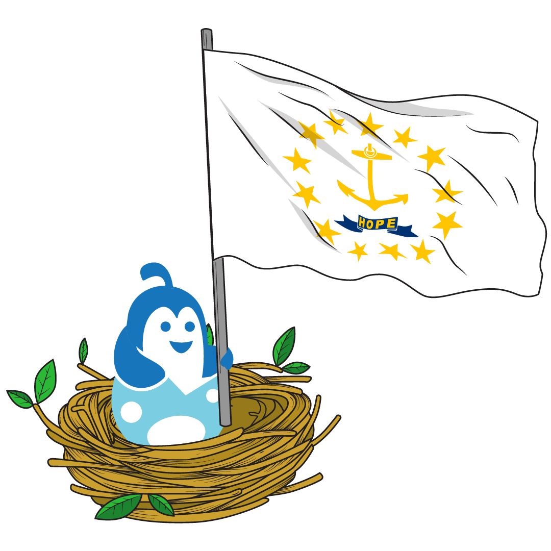
Rhode Island Logos designed on Hatchwise
18
designs in this collection









Famous Rhode Island Logos
Narragansett BeerNarragansett Brewing Company is arguably one of New England’s most famous beer brands. They have been brewing since 1890 from Providence, RI, and their lager is known for being both crisp and light, making it perfect for long days on the beach or after a particularly challenging day out fishing. In fact, for many Americans, it is still regarded as the beer of choice for shark hunters, as popularized in the first Jaws film (1975).For many years the Narragansett Brewing Company logo was emblazoned all over Fenway Park in Boston, too, as Red Sox fans enjoyed a few lagers while watching the game. In the 1940’s Theodor Geisel, known to everyone as Dr. Seuss, was asked to create a new campaign for the brewery, and the Chief Gansett character was created.The logo has evolved and been reinvented several times since the brewery opened. Still, the current version of the logo uses the traditional harkens back to the brand’s history with a bright red shield, green border, and diagonally placed name in a blocky white script. Sometimes the words “Made on Honor, Sold on Merit” are placed on the shield, and at other times it simply says “The Famous Narragansett Since 1890”. A tall ship sketch is located at the top of the shield, a nod to the Ocean State’s rich colonial and naval history.
HasbroWould our childhood have been the same without Hasbro? Probably not! Founded in 1923 in Providence by three Polish brothers, Hasbro was initially a textile company that eventually moved into school supplies and toys by 1942. Its first significant seller was Mr. Potato Head. By 1964 they had given the kids of the world action figures like G.I. Joe and My Little Pony. They also created Play-Doh, Troll Dolls, the Spirograph, the Nerf range, and the Eazy Bake Oven. Some of their famous board games include Clue, Battleship, Dungeons and Dragons, The Game of Life, Hungry Hungry Hippos, Trivial Pursuit, Trouble, and even Scrabble!The current Hasbro logo is an off-beat square with a fun, comic-styled Hasbro font in the center. Underneath the name is an abstract smile, and the logo uses a faded color scheme of light turquoise green into deep sea blue.Hasbro is a contraction of the Hassenfeld Brothers, who founded the company. The current color scheme has been broadly consistent since 1978, with other logos being in uniform black with brand name variations. One different version features a small boy smiling.
Kiel James PatrickA clothing brand that is making waves for its nod to traditional New England and nautical fashion is Kiel James Patrick. The brand started in Pawtucket, and its flagship store is located on Bowen’s Wharf in Newport. The brand was founded by a couple, Kiel and Sarah Patrick, who often feature as models for the various clothing and jewelry they release. Their shoots often are taken in idyllic spots around the Ocean State and New England.The logo for Kiel James Patrick is quite simple yet effective. An obvious naval reference in a deep navy and white is the brand’s name below an anchor with two crossed arrows. The ‘J’ letter in the name is also shaped like an elongated oar. The anchor reference is apparent, but the two arrows may indicate ‘land activities' like hiking and archery. The brand is known for combining Vineyard Vines's practicality with LL Bean’s traditional functionality. The anchor symbol is prevalent on much of their clothing and jewelry, either as an embroidered logo or a fastener.
Narragansett BeerNarragansett Brewing Company is arguably one of New England’s most famous beer brands. They have been brewing since 1890 from Providence, RI, and their lager is known for being both crisp and light, making it perfect for long days on the beach or after a particularly challenging day out fishing. In fact, for many Americans, it is still regarded as the beer of choice for shark hunters, as popularized in the first Jaws film (1975).For many years the Narragansett Brewing Company logo was emblazoned all over Fenway Park in Boston, too, as Red Sox fans enjoyed a few lagers while watching the game. In the 1940’s Theodor Geisel, known to everyone as Dr. Seuss, was asked to create a new campaign for the brewery, and the Chief Gansett character was created.The logo has evolved and been reinvented several times since the brewery opened. Still, the current version of the logo uses the traditional harkens back to the brand’s history with a bright red shield, green border, and diagonally placed name in a blocky white script. Sometimes the words “Made on Honor, Sold on Merit” are placed on the shield, and at other times it simply says “The Famous Narragansett Since 1890”. A tall ship sketch is located at the top of the shield, a nod to the Ocean State’s rich colonial and naval history.
HasbroWould our childhood have been the same without Hasbro? Probably not! Founded in 1923 in Providence by three Polish brothers, Hasbro was initially a textile company that eventually moved into school supplies and toys by 1942. Its first significant seller was Mr. Potato Head. By 1964 they had given the kids of the world action figures like G.I. Joe and My Little Pony. They also created Play-Doh, Troll Dolls, the Spirograph, the Nerf range, and the Eazy Bake Oven. Some of their famous board games include Clue, Battleship, Dungeons and Dragons, The Game of Life, Hungry Hungry Hippos, Trivial Pursuit, Trouble, and even Scrabble!The current Hasbro logo is an off-beat square with a fun, comic-styled Hasbro font in the center. Underneath the name is an abstract smile, and the logo uses a faded color scheme of light turquoise green into deep sea blue.Hasbro is a contraction of the Hassenfeld Brothers, who founded the company. The current color scheme has been broadly consistent since 1978, with other logos being in uniform black with brand name variations. One different version features a small boy smiling.
Kiel James PatrickA clothing brand that is making waves for its nod to traditional New England and nautical fashion is Kiel James Patrick. The brand started in Pawtucket, and its flagship store is located on Bowen’s Wharf in Newport. The brand was founded by a couple, Kiel and Sarah Patrick, who often feature as models for the various clothing and jewelry they release. Their shoots often are taken in idyllic spots around the Ocean State and New England.The logo for Kiel James Patrick is quite simple yet effective. An obvious naval reference in a deep navy and white is the brand’s name below an anchor with two crossed arrows. The ‘J’ letter in the name is also shaped like an elongated oar. The anchor reference is apparent, but the two arrows may indicate ‘land activities' like hiking and archery. The brand is known for combining Vineyard Vines's practicality with LL Bean’s traditional functionality. The anchor symbol is prevalent on much of their clothing and jewelry, either as an embroidered logo or a fastener.
Start your own
Creative contest
- Fast - see designs or names in hours
- Awesome - choose from dozens of custom designs or unique names created just for you
- Affordable - We have packages priced for budgets of all sizes