
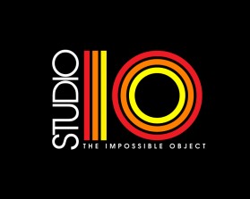
STUDIO IO
by StudioIOContest received 162 entries and the contest holder has awarded a winner.
- BACK TO CONTEST ENTRIES
- CREATIVE BRIEF
- ALL ENTRIES
Company or website name
STUDIO IO
Slogan or Tagline
The Impossible Objects
Describe your company and organization and target audience
We are a production company that produces films.
The design should have the following
We are looking to take our current company logo and have it recreated into a more 1970s style logo for the opening of a period piece film. Ultimately the logo in the shot will be placed as a label on the center of a record in the opening shot.
This logo will be used for
- Online (Website, facebook etc.)
- Print (business cards, letterheads, brochures etc.)
- Merchandise (mugs, t-shirts etc.)
- Signs (including shops, billboards etc.)
- Television/screen
This design should not have this in the entries
We do not wish to skew from the target of it being an adaptation of the current company logo, and to have it in a 1970s design. We are open to interpretation outside of the provided sample, but want to keep it in the feel of that decade's art.
What style of logo would you like?
Colors to use in the design
We would like to stick close to the red, black, white, but are also open to seeing other creative ideas outside the box.
Briefly describe your contest
We are looking to take our current studio logo and have it recreated in a 1970s style logo similar to the uploaded Warner logo provided. This logo will be placed at the start of a period piece film set in the 1970s and we want the logo to match that esthetic.