
Logo Design contest
Ironclad Fire Protection
Awardedfeatured
Congratulations to winner Armchtrm ! They were awarded the contest prize of $190
Prize Awarded
$190
Creatives
12
Entries
108
Contest Views
1,922
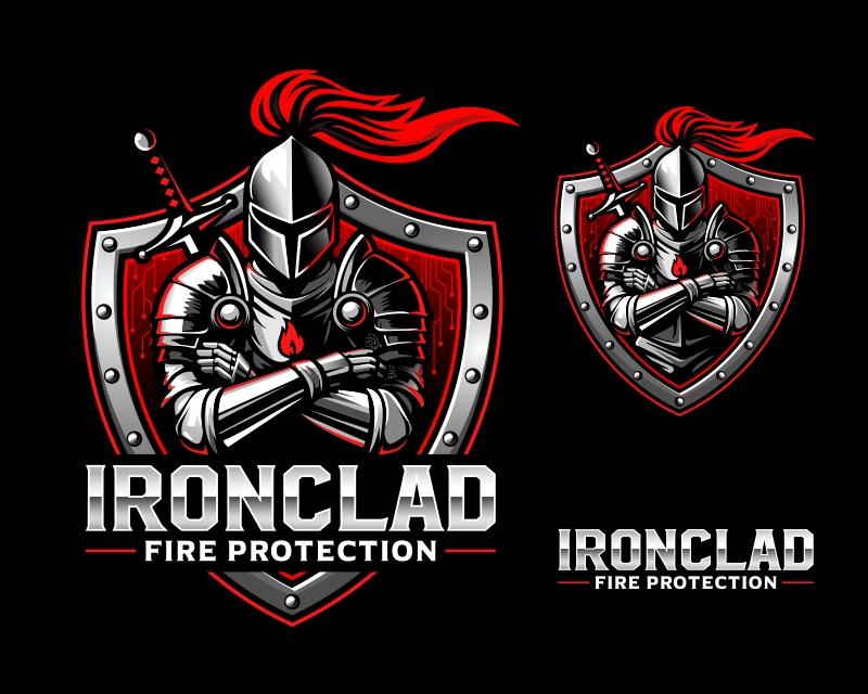
Winning entryby Armchtrm
Creative Brief
What the contest holder asked for
- Company or website name
- Ironclad Fire Protection
- Slogan or Tagline
- -
- Describe your company and organization and target audience
- <h4 data-start="47" data-end="74"><p data-start="0" data-end="31"><span data-start="33" data-end="61" style="font-weight: normal; font-size: 1.125rem;">Ironclad Fire Protection</span><span style="font-weight: normal; font-size: 1.125rem;"> is a </span><span data-start="67" data-end="112" style="font-weight: normal; font-size: 1.125rem;">premium fire extinguisher service company</span><span style="font-weight: normal; font-size: 1.125rem;"> focused on delivering </span><span data-start="135" data-end="184" style="font-weight: normal; font-size: 1.125rem;">efficiency, professionalism, and transparency</span><span style="font-weight: normal; font-size: 1.125rem;"> to businesses that require fire protection compliance. Unlike competitors who often cut costs with </span><span data-start="284" data-end="311" style="font-weight: normal; font-size: 1.125rem;">recharged extinguishers</span><span style="font-weight: normal; font-size: 1.125rem;">, Ironclad exclusively sells </span><span data-start="340" data-end="372" style="font-weight: normal; font-size: 1.125rem;">brand-new fire extinguishers</span><span style="font-weight: normal; font-size: 1.125rem;">, ensuring </span><span data-start="383" data-end="419" style="font-weight: normal; font-size: 1.125rem;">higher reliability and longevity</span><span style="font-weight: normal; font-size: 1.125rem;">.</span></p><p data-start="424" data-end="799"><span style="font-weight: normal;">The company stands out by offering <span data-start="459" data-end="547">automated reminders, live ETA tracking, and a highly professional service experience</span>—eliminating the frustration of delayed, unorganized providers. This approach appeals to <span data-start="636" data-end="698">business owners, property managers, and facility operators</span> who value <span data-start="709" data-end="758">efficiency, accountability, and clear pricing</span> over just finding the cheapest option.</span></p><p data-start="801" data-end="1038" data-is-last-node=""><span style="font-weight: normal;">With a strong emphasis on <span data-start="827" data-end="864">trust and long-term relationships</span>, Ironclad Fire Protection prioritizes <span data-start="903" data-end="962">customer convenience, regulatory compliance, and safety</span>, ensuring clients stay <span data-start="986" data-end="1037">protected without the typical service headaches</span>.</span></p></h4>
- The design should have the following
- <h4 data-start="71" data-end="101"><strong data-start="76" data-end="99">General Composition</strong></h4><p data-start="102" data-end="334">The logo should feature a <strong data-start="128" data-end="151">battle-ready knight</strong> in the center, framed by a <strong data-start="179" data-end="200">shield background</strong> with a subtle geometric pattern. The knight is the primary focus, with strong, clean details and a modern, professional appearance.</p><h4 data-start="336" data-end="360"><strong data-start="341" data-end="358">Knight Design</strong></h4><ul data-start="361" data-end="891"><li data-start="361" data-end="496"><strong data-start="363" data-end="374">Helmet:</strong> Fully enclosed, sleek, and polished with <strong data-start="416" data-end="435">no visible face</strong>. The visor should have a <strong data-start="461" data-end="478">T-shaped slit</strong> for visibility.</li><li data-start="497" data-end="686"><strong data-start="499" data-end="509">Armor:</strong> Dark metallic with subtle highlights to create depth. The <strong data-start="568" data-end="633">pauldrons (shoulder armor) should be rounded and well-defined</strong>, with <strong data-start="640" data-end="664">red circular accents</strong> near the shoulders.</li><li data-start="687" data-end="783"><strong data-start="689" data-end="715">Tassel (Helmet Crest):</strong> A <strong data-start="718" data-end="740">flowing red tassel</strong> that moves dynamically toward the right.</li><li data-start="784" data-end="891"><strong data-start="786" data-end="803">Hands & Arms:</strong> The knight’s <strong data-start="817" data-end="858">arms should be crossed over his chest</strong> in a strong, confident stance.</li></ul><h4 data-start="893" data-end="919"><strong data-start="898" data-end="917">Sword Placement</strong></h4><ul data-start="920" data-end="1116"><li data-start="920" data-end="1040">The <strong data-start="926" data-end="993">sword handle should be visible above the knight’s left shoulder</strong>, appearing as if it is strapped to his back.</li><li data-start="1041" data-end="1116"><strong data-start="1043" data-end="1114">Only the handle should be visible—do not extend the blade downward.</strong></li></ul><h4 data-start="1118" data-end="1148"><strong data-start="1123" data-end="1146">Shield & Background</strong></h4><ul data-start="1149" data-end="1477"><li data-start="1149" data-end="1227"><strong data-start="1151" data-end="1169">Shape & Style:</strong> A <strong data-start="1172" data-end="1201">bold, well-defined shield</strong> that frames the knight.</li><li data-start="1228" data-end="1359"><strong data-start="1230" data-end="1241">Rivets:</strong> The shield’s outer edge should feature <strong data-start="1281" data-end="1312">small, evenly spaced rivets</strong> to reinforce the armored, battle-ready feel.</li><li data-start="1360" data-end="1477"><strong data-start="1362" data-end="1385">Background Pattern:</strong> Use a <strong data-start="1392" data-end="1420">subtle geometric pattern</strong> inside the shield for depth and texture—<strong data-start="1461" data-end="1475">no flames.</strong></li></ul><h4 data-start="1479" data-end="1500"><strong data-start="1484" data-end="1498">Typography</strong></h4><ul data-start="1501" data-end="1799"><li data-start="1501" data-end="1585"><strong data-start="1503" data-end="1554">"IRONCLAD" should be bold, uppercase, and white</strong>, without a metallic texture.</li><li data-start="1586" data-end="1680"><strong data-start="1588" data-end="1630">"FIRE PROTECTION" should also be white</strong>, in a slightly smaller font beneath "IRONCLAD."</li><li data-start="1681" data-end="1799"><strong data-start="1683" data-end="1698">Font Style:</strong> A <strong data-start="1701" data-end="1732">clean, bold sans-serif font</strong> that is strong and modern—no decorative or medieval-style fonts.</li></ul><h4 data-start="1801" data-end="1830"><strong data-start="1806" data-end="1828">Additional Details</strong></h4><ul data-start="1831" data-end="2067"><li data-start="1831" data-end="1953"><strong data-start="1833" data-end="1850">Flame Emblem:</strong> A <strong data-start="1853" data-end="1873">small flame icon</strong> should be placed <strong data-start="1891" data-end="1921">on the knight’s chestplate</strong> as a subtle branding element.</li><li data-start="1954" data-end="2067"><strong data-start="1956" data-end="1981">Shading & Highlights:</strong> Use subtle lighting and highlights to add dimension to the armor, shield, and text.</li></ul><p data-start="2069" data-end="2223" data-is-last-node=""></p>
- This logo will be used for
- [object Object], [object Object], [object Object], [object Object]
- This design should not have this in the entries
- <p data-start="43" data-end="83">🚫 <strong data-start="46" data-end="81">Weak or Generic Design Elements</strong></p><ul data-start="84" data-end="390"><li data-start="84" data-end="179">No basic shields or clipart—the <strong data-start="118" data-end="160">shield must feel unique and integrated</strong> into the design.</li><li data-start="180" data-end="285">No cartoonish or childish knights—the knight should be <strong data-start="237" data-end="282">battle-hardened, modern, and professional</strong>.</li><li data-start="286" data-end="390">No overly abstract or minimalist knights—the knight <strong data-start="340" data-end="387">must be detailed and instantly recognizable</strong>.</li></ul><p data-start="392" data-end="422">🚫 <strong data-start="395" data-end="420">Fire Imagery Mistakes</strong></p><ul data-start="423" data-end="731"><li data-start="423" data-end="531"><strong data-start="425" data-end="463">No flames in the shield background</strong>—the background should use a <strong data-start="492" data-end="528">subtle geometric pattern instead</strong>.</li><li data-start="532" data-end="641">No firefighting or destruction themes—this is about <strong data-start="586" data-end="616">protection and reliability</strong>, not fire suppression.</li><li data-start="642" data-end="731">No fire helmets, axes, or firefighter symbols—this is <strong data-start="698" data-end="728">NOT a fire department logo</strong>.</li></ul><p data-start="733" data-end="761">🚫 <strong data-start="736" data-end="759">Typography Mistakes</strong></p><ul data-start="762" data-end="1077"><li data-start="762" data-end="851">No thin, weak, or script fonts—the text <strong data-start="804" data-end="848">must be bold, strong, and highly legible</strong>.</li><li data-start="852" data-end="948">No overly medieval or decorative fonts—the font <strong data-start="902" data-end="945">should be modern, industrial, and clean</strong>.</li><li data-start="949" data-end="1077"><strong data-start="951" data-end="989">No metallic or chrome text effects</strong>—the text should be <strong data-start="1009" data-end="1061">solid white with a subtle black stroke or shadow</strong> for contrast.</li></ul><p data-start="1079" data-end="1112">🚫 <strong data-start="1082" data-end="1110">Color & Texture Mistakes</strong></p><ul data-start="1113" data-end="1399"><li data-start="1113" data-end="1191">No bright/neon colors—stick to <strong data-start="1146" data-end="1188">steel, black, red, and dark gray tones</strong>.</li><li data-start="1192" data-end="1294"><strong data-start="1194" data-end="1224">No metallic finish on text</strong>—keep typography <strong data-start="1241" data-end="1261">clean and strong</strong> without unnecessary gradients.</li><li data-start="1295" data-end="1399">No excessive gradients—some shading is fine, but <strong data-start="1346" data-end="1396">the design should remain bold and professional</strong>.</li></ul><p data-start="1401" data-end="1442">🚫 <strong data-start="1404" data-end="1440">Composition & Scalability Issues</strong></p><ul data-start="1443" data-end="1940"><li data-start="1443" data-end="1557">No overly complex or overcrowded designs—the logo <strong data-start="1495" data-end="1554">must work across business cards, uniforms, and vehicles</strong>.</li><li data-start="1558" data-end="1649">No horizontal-only layouts—the <strong data-start="1591" data-end="1646">logo should be emblem-style for maximum versatility</strong>.</li><li data-start="1650" data-end="1765"><strong data-start="1652" data-end="1686">No weak or awkward silhouettes</strong>—the knight, shield, and typography <strong data-start="1722" data-end="1762">must have strong, well-defined lines</strong>.</li><li data-start="1766" data-end="1940"><strong data-start="1768" data-end="1806">No misplaced or oversized elements</strong>—the <strong data-start="1811" data-end="1874">sword should be properly positioned above the left shoulder</strong>, and the <strong data-start="1884" data-end="1937">shield background should not overpower the knight</strong>.</li></ul>
- These values are what the logo should communicate
- [object Object], [object Object], [object Object], [object Object], [object Object], [object Object], [object Object], [object Object], [object Object], [object Object], [object Object], [object Object], [object Object]
- What style of logo would you like?
- [object Object], [object Object], [object Object], [object Object]
- Colors to use in the design
- <h4><span style="font-weight: bolder;">Color Palette</span></h4><ul><li><span style="font-weight: bolder;">Primary Colors:</span><ul><li><span style="font-weight: bolder;">Steel Gray / Silver</span> (for the knight, shield, and text)</li><li><span style="font-weight: bolder;">Deep Red / Fiery Orange</span> (for flames and accents)</li><li><span style="font-weight: bolder;">Black / Dark Gray</span> (to add contrast and depth)</li></ul></li><li><span style="font-weight: bolder;">Optional:</span><ul><li>Some <span style="font-weight: bolder;">subtle blue highlights</span> to give a high-tech or premium feel.</li></ul></li></ul>
- Types of files I need for this design
- [object Object], [object Object], [object Object], [object Object], [object Object], [object Object]
- Briefly describe your contest
- Design a bold, battle-ready logo featuring a knight, shield, fire extinguisher, and flames—symbolizing strength, protection, and unstoppable fire safety.
- Upload files
- -