
https://eatgonanas.com/
by carolinemContest received 60 entries and the contest holder has awarded a winner.
- BACK TO CONTEST ENTRIES
- CREATIVE BRIEF
- ALL ENTRIES
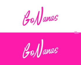
Company or website name
https://eatgonanas.com/
Describe your company and organization and target audience
GoNanas is #notyournanas banana bread. We are a women-owned, vegan, gluten-free, and allergen-friendly banana bread company at the forefront of the #1 comfort food trend. The best part about our banana breads? You can't even tell they're better-for-you because they taste THAT good.
The design should have the following
This logo will be used for
- Online (Website, facebook etc.)
- Print (business cards, letterheads, brochures etc.)
- Merchandise (mugs, t-shirts etc.)
- Signs (including shops, billboards etc.)
- Television/screen
This design should not have this in the entries
Please do not use a font that can be found online. We're looking for the recreation of our current logo but with NO dramatic changes. Same color, same overall shape. Simply just a logo that is more consistent overall with the thickness of the strokes and easier to read. No tagline, no icons, no additional elements. Please do not use cursive letters for this.
Colors to use in the design
Hot pink (same as current logo). If selected, we'd also like a white version as well.