
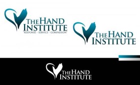
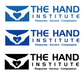
Logo Design Contest
The Hand Institute
by freewheelincContest received 106 entries and the contest holder has awarded a winner.
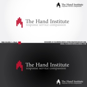
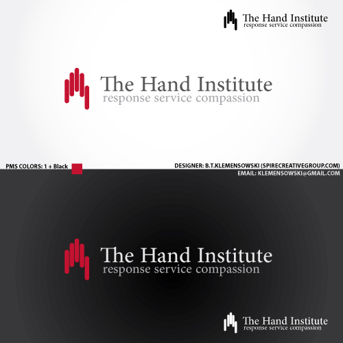
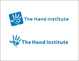
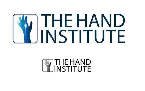
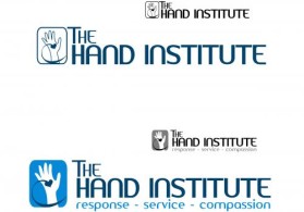
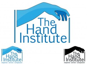
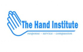
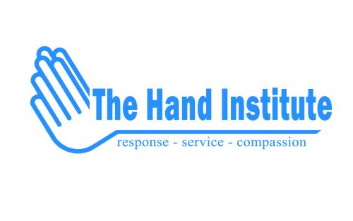
Winning entry by ongyudicandra
- CONTEST OVERVIEW
- CREATIVE BRIEF
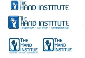
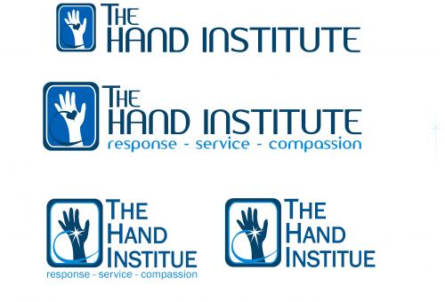
- ALL ENTRIES
Congratulations to winner ongyudicandra ! They were awarded the contest prize of $130.00


Discussion:
GUIDELINES
(ignore all previous comments)
THANK YOU!
Thank you for all the hard work. Some GREAT designs have been submitted and there's around 10 candidates for the winning design. I will be asking the winner to make slight changes and to submit a vector version of the logo, if possible, compatible with PhotoShop. At this point, my office is reviewing the current designs and you do not need to submit more logos.
All designs were inspected carefully and the fact that some don't have a score or comment doesn't mean it wasn't taken into consideration ... or it may actually win. My apologies for not being able to comment each design.
I wish I could choose more than one winner but for those who wont win, I hope it was a learning experience.