

- BACK TO CONTEST
- CREATIVE BRIEF
- ENTRY # 8597
Comments for entry # 8597
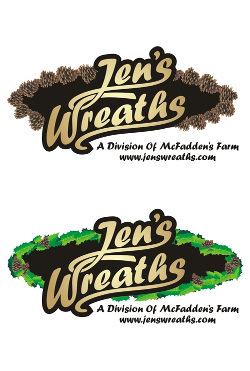
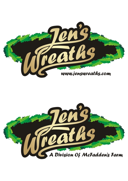
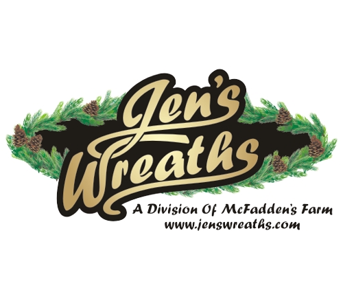
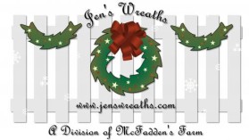
Like the pine cone one on top, but not crazy about the bottom one.
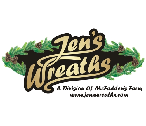
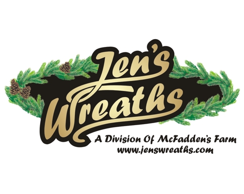
Here's what I like. I like the 2 lines of wording "A division of mcfadden's farm & the "www.jenswreaths.com". Keep that the same. I like the top one, but it seems too dark/brown. I like the bottom one, but I'm not crazy about the leaves. However there is a picture at this link... http://www.fotosearch.com/UNX006/u13129929/ . I like this picture a real lot. This wreath looks real & fresh. Could you take this logo and put the fresh pine look around it & try it with and without pine cones here and there. Or, maybe pine cones on the left side and this pine look on the right side? You're definetely in my TOP 3. Thank you so much for taking the time to work with me.

Please let me know if you still need further changes. Thank you.
Browse other entries from this Logo Design Contest


Fast. Awesome. Affordable
About the Creative
111
114
235
Digiti Minimi Bio
Each project, big or small, requires a unique approach. I know that reaching your core customers is going to take a one-of-a-kind solution. I translate your message graphically into a language your customers are going to understand. And that understanding results in sales.
Other entries by Digiti Minimi:
Similar Entries