
Texas Logos
This "Lone Star State", known for The Alamo, football, Texas Long Horn cattle, and its food, is a well-known one. We've gathered some of our favorite logos that have been designed right here on Hatchwise for companies all over the state. They represent the hardworking people of Texas and what they have built in the way of business.
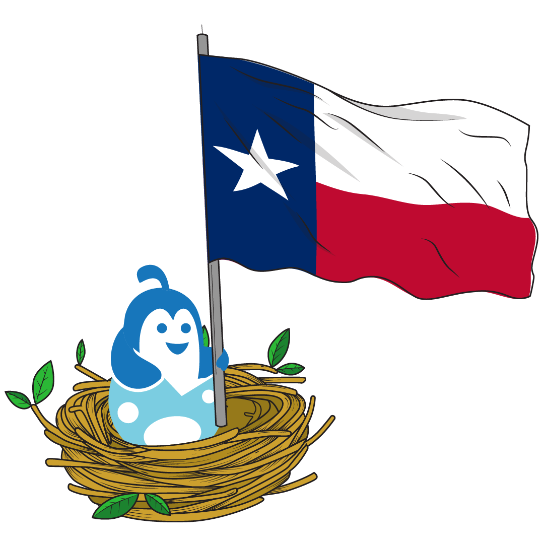
Texas Logos designed on Hatchwise
21
designs in this collection






Famous Logos From Texas
Texas is a larger-than-life state with a big reputation for big business ventures, and big profits.
The Texas economy was initially centered around the cattle industry which remains a strong producer of wealth to this day. Later, rich oil deposits would catapult Texas to the top of the energy and fuel industry. Today, aerospace, medicine, technology, and tourism are all major players in the state as well.Needless to say, there have been many businesses, brands, and fortunes built in Texas. Let’s take a look at a few iconic logos from some top Texas brands.
Phillips 66The Phillips Petroleum Company has been at the forefront of the natural gas industry since 1917. The brand eventually launched its own Phillips66 service stations in Texas in 1928, giving rise to the well-known Phillips 66 logo featuring a classic highway shield design in a nod to Route 66.
The shield was rendered in black, against a deep orange background. The Phillips name appears across the top of the shield in orange, while the numerals 66 are printed in black and angled slightly to fill the lower portion of the shield.
The logo was refreshed In 1959, giving the shield a thick black frame and a split background with a crisp white over deep red. The Phillips name still appears across the top of the shield but is now rendered in capital block typeface in a solid black. The numerals 66 are now centered, rather than angled, in the bottom portion of the shield and are rendered in black as well. This classic styling has remained the face of the brand to this day.
ExxonMobilThe ExxonMobil brand was formed by the merger of two energy industry giants, Exxon and Mobil in 1999, creating one of the most powerful energy companies on the planet.
While both brands have sported some fantastic logos over the century, both had graduated to a simple solid typography logo in the 80s, making it easy to merge into one during the merger. .
Today, the Exxon name appears in red block text with the Xs extended and crossed. The Mobil name follows, in blue block text with a red “o”, combining to form a new logo, with an understated nod to the joining of two industry powerhouses.
Valero EnergyFounded in 1980, Valero Energy has been a powerful player in the energy industry. The launch of Valero service stations in 2000 made the brand a household name. Most customers will recognize the latest Valero “V” logo created to coincide with the launch of the first service stations.
During the redesign, the original Valero star was replaced with a large custom-designed sans serif “V” in a custom blue shade with a thin yellow ribbon woven through the raised arms of the “V”. The name Valero appeared in all caps in the same unique blue as the letter above. The Valero wordmark was modernized in 2018, creating the rounded playful font seen today.
Start your own
Creative contest
- Fast - see designs or names in hours
- Awesome - choose from dozens of custom designs or unique names created just for you
- Affordable - We have packages priced for budgets of all sizes