
Maryland Logos
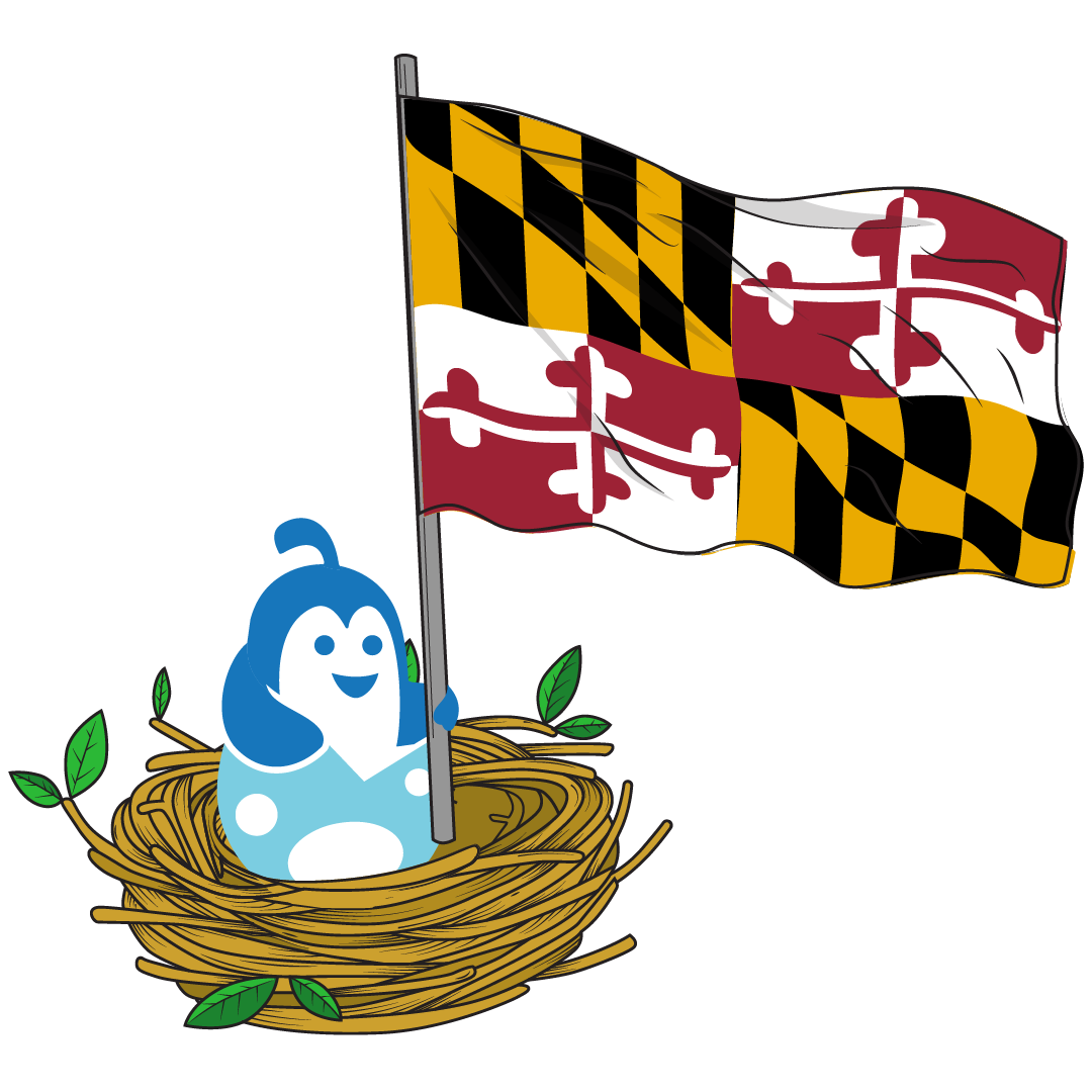
With rolling sand dunes, green forests, marshlands, and the Chesapeake Bay, Maryland is a beautiful state. The fourth largest nexus in the field, with more than 400 biotechnology companies located in the state, Maryland is a major center for life sciences research and development. Here below we have a collection of logo designs created for and used by companies, businesses, and more all located in Maryland.
Maryland Logos designed on Hatchwise
21
designs in this collection



Famous Logos from Maryland
The people of Maryland might
look at you funny if you ask them to show you the state logo because to them it
isn’t just a logo. The most recognizable symbol for the state of Maryland is
the Great Seal of the State of Maryland, which is used to authenticate acts
carried out by the General Assembly of Maryland.
The state seal has been
modified over the years, however, the reverse side never saw adjustments or
reimagining and is now the official seal. The seal is double-sided, reverse and
obverse, with the reverse showing the coat of arms with Latin text encircling
it. The inverse is a Lord Baltimore on horseback, sword drawn, also encircled
by Latin. The Baltimore family crest is emblazoned on the horse’s armor.
While the seal is very
detailed and colorful, the most important part is written on the ribbon at the
base of the two figures on the reverse side. It is the Latin translation for
the motto of the state of Maryland which reads <span style="mso-fareast-font-family:"Times New Roman";mso-fareast-theme-font:major-fareast;
color:#0E101A">fatti maschii, parole feminine, or in English, “Manly deeds, womanly words.”Here we have three logos that are not only well-known and famous, but the companies claim their founding state to be that of Maryland.
Marriot Founded in 1960, the original Marriot logo lasted for two full decades before taking on a necessary update, moving from the art Deco style, the sharp “M” shape icon, and bold gothic lettering used for the name. It had a black crown above the “M”, perhaps to demonstrate its upscale intentions. In 1976 the logo coloring went from a vibrant red to a more crimson shade, the lettering changed to a more block form except for the stylized “M”, and below “Hotels Resorts Suites” was drawn in sans-serif in all caps. This is the first time we see the circular “M” icon that is internationally recognizable today. The current iteration formed in 2013 simplified the logo a bit, with the hotel chain's name in black print below the logo “M”, which is still in red but with a cleaner look.
Lockheed Martin Anyone and everyone in the aerospace industry has heard of Lockheed Martin and knows their logo from a distance. What many people don’t know is that the logo is very new. It wasn’t until 1995 that Lockheed Corp and Martin Marietta merged to form the industry leader in airplane engineering. There are a few versions of the logo, but they all have two basic consistent elements, the company name, and a stylized star. The star is significant in its design because only two of the star’s points are visible, the others fading as they move away from the center, which was supposed to indicate dynamic expression as if it is moving fast. The color of the name has been blue, gray, and italicized, but always written in full without abbreviation.
Geico It might seem kind of wild since many of us had no idea Geico existed until internet ads and TV commercials, but Geico insurance has been around since 1936. In its infancy, it was shortened to Geico from its longer version, the Government Employee Insurance Company. Since its inception, Geico has only had four significant logo designs. The first was very simple, the letters GEICO capitalized in black with Government Employee Insurance Group below in a smaller typeface. On both ends of GEICO were small gray triangles. The second showed the company name below an eagle on a pedestal within a circle. Again, this was monochromatic, and the logo lasted until about 1974. <span style="font-size:11.0pt;line-height:107%;font-family:"Calibri",sans-serif; mso-ascii-theme-font:minor-latin;mso-fareast-font-family:Calibri;mso-fareast-theme-font: minor-latin;mso-hansi-theme-font:minor-latin;mso-bidi-font-family:"Times New Roman"; mso-bidi-theme-font:minor-bidi;color:#0E101A;mso-ansi-language:EN-US; mso-fareast-language:EN-US;mso-bidi-language:AR-SA">The current logo we all know is the most basic of the styles, modest, and easy to recognize. It is always fully capitalized, is only the name GEICO, and is either blue on a white background or white on a blue background.
Marriot Founded in 1960, the original Marriot logo lasted for two full decades before taking on a necessary update, moving from the art Deco style, the sharp “M” shape icon, and bold gothic lettering used for the name. It had a black crown above the “M”, perhaps to demonstrate its upscale intentions. In 1976 the logo coloring went from a vibrant red to a more crimson shade, the lettering changed to a more block form except for the stylized “M”, and below “Hotels Resorts Suites” was drawn in sans-serif in all caps. This is the first time we see the circular “M” icon that is internationally recognizable today. The current iteration formed in 2013 simplified the logo a bit, with the hotel chain's name in black print below the logo “M”, which is still in red but with a cleaner look.
Lockheed Martin Anyone and everyone in the aerospace industry has heard of Lockheed Martin and knows their logo from a distance. What many people don’t know is that the logo is very new. It wasn’t until 1995 that Lockheed Corp and Martin Marietta merged to form the industry leader in airplane engineering. There are a few versions of the logo, but they all have two basic consistent elements, the company name, and a stylized star. The star is significant in its design because only two of the star’s points are visible, the others fading as they move away from the center, which was supposed to indicate dynamic expression as if it is moving fast. The color of the name has been blue, gray, and italicized, but always written in full without abbreviation.
Geico It might seem kind of wild since many of us had no idea Geico existed until internet ads and TV commercials, but Geico insurance has been around since 1936. In its infancy, it was shortened to Geico from its longer version, the Government Employee Insurance Company. Since its inception, Geico has only had four significant logo designs. The first was very simple, the letters GEICO capitalized in black with Government Employee Insurance Group below in a smaller typeface. On both ends of GEICO were small gray triangles. The second showed the company name below an eagle on a pedestal within a circle. Again, this was monochromatic, and the logo lasted until about 1974. <span style="font-size:11.0pt;line-height:107%;font-family:"Calibri",sans-serif; mso-ascii-theme-font:minor-latin;mso-fareast-font-family:Calibri;mso-fareast-theme-font: minor-latin;mso-hansi-theme-font:minor-latin;mso-bidi-font-family:"Times New Roman"; mso-bidi-theme-font:minor-bidi;color:#0E101A;mso-ansi-language:EN-US; mso-fareast-language:EN-US;mso-bidi-language:AR-SA">The current logo we all know is the most basic of the styles, modest, and easy to recognize. It is always fully capitalized, is only the name GEICO, and is either blue on a white background or white on a blue background.
Start your own
Creative contest
- Fast - see designs or names in hours
- Awesome - choose from dozens of custom designs or unique names created just for you
- Affordable - We have packages priced for budgets of all sizes