
Kansas Logos
Who can not think of Kansas without associating Dorothy, Toto, and Auntie Em? However, aside from The Wizard of OZ, this "The Free State" is known for many other things.
Not only is it bordered by the famous Missouri River, but it also has many other rivers running through the state, including; the Kansas, Arkansas, Saline, Spring, and Solomon Rivers.
With miles of open farmland, Kansas is one of the most productive agricultural states, producing high yields of wheat, corn, sorghum, and soybeans. With wheat being the leading one.
The state also is heavily influenced by the aerospace industry with some major aircraft corporations having manufacturing plants in the state.
This collection of logos below is a small sampling of some of the many custom-designed logos for businesses that hail from the state of Kansas.
Not only is it bordered by the famous Missouri River, but it also has many other rivers running through the state, including; the Kansas, Arkansas, Saline, Spring, and Solomon Rivers.
With miles of open farmland, Kansas is one of the most productive agricultural states, producing high yields of wheat, corn, sorghum, and soybeans. With wheat being the leading one.
The state also is heavily influenced by the aerospace industry with some major aircraft corporations having manufacturing plants in the state.
This collection of logos below is a small sampling of some of the many custom-designed logos for businesses that hail from the state of Kansas.
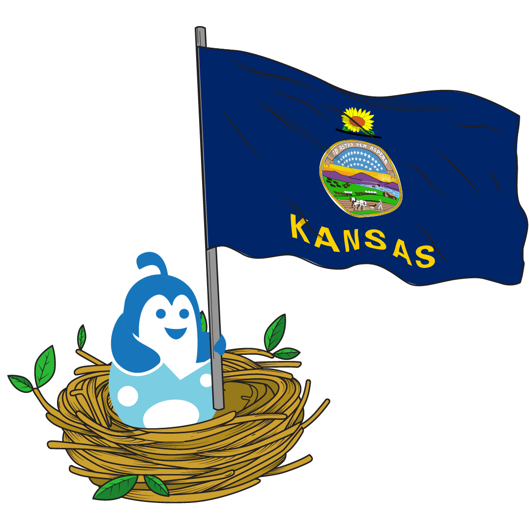
Kansas Logos designed on Hatchwise
21
designs in this collection





Famous Kansas Logos“There’s no place like home. There’s no place like home. There’s no place like home.” Even if Dorothy recited those lines following the aftermath of a tornado, she may have been onto something. For so many business owners, Kansas has become home. Drawn in by the rolling hills and prairies this Great Plains state offers, companies from Hostess to Koch Industries to AMC Theatres have all set up their roots in Kansas. Beyond these companies, we highlight three other famous logos Kansas has brought us below. GarminIf you go back to 1989 in Lenexa, Kansas, you will find the early days of Garmin. The first GPS the brand invented sold for $2,500 and in 1991, Garmin received its first customer, the U.S. Army. From there the rest was history. In less than 10 years the brand was already earning more than $23 million in profit and by 2000, the company went public. Beyond GPS automotive navigation products, the brand has grown to develop GPS software for aviation, marine, outdoor, and sports activities, as well as developing wearable technology Today, Garmin’s headquarters are in Olathe, Kansas, with a legal office also overseas in Switzerland. Garmin understands the importance of a well-designed logo because that logo is the most important brand identifier. In developing the logo, Garmin wanted to keep the design simple, but the mission of the brand clear. Garmin did this through a simple, uppercase wordmark and a simple symbol. The symbol incorporated into the design is a delta, representing the guiding force behind navigation, directing you where you need to go. Sprint CorporationToday Sprint is known as, Sprint-T-Mobile, after T-Mobile acquired Sprint in April of 2020. Even after this acquisition though, Sprint has kept its headquarters and operations in Overland Park, Kansas. Before the acquisition, Sprint was the fourth-largest mobile network operator, with nearly 55 million customers. Like most telecommunications companies, Sprint was also founded in the late 1800s, in 1899. Since then, Sprint continued to develop as a company even after its series of acquisitions and recent merger. Sprint’s logo is another simple design, clearly identifying the mission of the brand. The logo features the wordmark in a clean, legible font. The only addition beyond the wordmark to the logo design is a symbol that sometimes sits above the Sprint name, and sometimes to the right of it. This symbol is a series of thick yellow lines that represent the long-distance network Sprint covers.
Spirit AeroSystemsIf you’re traveling a long distance, chances are you will need to board a flight. The world’s largest aerostructures manufacturer is found in Wichita, Kansas – Spirit AeroSystems. This company is responsible for building key components of Boeing aircraft, making it a key player in the airline industry. Spirit AeroSystems was formally established only in 2005, but it came out of Stearman Aircraft which was founded back in 1927. Today, Spirit is a publicly traded company and employs more than 16,000 people. The Spirit AeroSystems logo features a futuristic wordmark that represents the company’s continued promise to innovation. Despite being futuristic, the font choice is clean and professional. Positioned to the right of the wordmark, on a diagonal, is a plane flying off into the sky. This plane represents the industry Spirit operates in. A final component of the design is the color choice, blue. Blue represents the sky Spirit’s planes fly through. All these components help to depict what this brand’s focus is.
Spirit AeroSystemsIf you’re traveling a long distance, chances are you will need to board a flight. The world’s largest aerostructures manufacturer is found in Wichita, Kansas – Spirit AeroSystems. This company is responsible for building key components of Boeing aircraft, making it a key player in the airline industry. Spirit AeroSystems was formally established only in 2005, but it came out of Stearman Aircraft which was founded back in 1927. Today, Spirit is a publicly traded company and employs more than 16,000 people. The Spirit AeroSystems logo features a futuristic wordmark that represents the company’s continued promise to innovation. Despite being futuristic, the font choice is clean and professional. Positioned to the right of the wordmark, on a diagonal, is a plane flying off into the sky. This plane represents the industry Spirit operates in. A final component of the design is the color choice, blue. Blue represents the sky Spirit’s planes fly through. All these components help to depict what this brand’s focus is.
Start your own
Creative contest
- Fast - see designs or names in hours
- Awesome - choose from dozens of custom designs or unique names created just for you
- Affordable - We have packages priced for budgets of all sizes