News and inspiration for entrepreneurs and creatives, plus updates on new developments at Hatchwise.
Home / Blog Posts / Featured Design Contest: Epicurean Epiphany – Natural Food Logo
Hatchwise is #1 in Creative Custom Logo Design and Eyecatching Marketing Material Design.
Featured Design Contest: Epicurean Epiphany – Natural Food Logo
At Hatchwise, we love witnessing the extraordinary designs pouring in from all corners of the globe. This logo design contest centers on a virtuous food company and a soon-to-come book named Epicurean Epiphany, which proudly touts the tagline, “Simple. Real. Whole Food.” The company was looking for a logo to front their new book.
They aim to spark inspiration in others through natural whole food. The mission of the company is to unveil the connection between food and a fulfilling life, debunking the notion that healthy eating must be boring or synonymous with self-deprivation.
What Was Requested
The client’s request included the incorporation of the initials “EE” along with the full text “Epicurean Epiphany.” This logo will be used across various platforms, including Facebook, their website and printed materials and merchandise. They wanted to steer clear of ornate fonts and use an aesthetic that is distinctive, captivating, and memorable. They wished to stay with jewel tones or black and white.
Ready to see what the talented Hatchwise community came up with?
Here is a selection of a few entries and the winning design below:
Stunning Entries
Similar to many other entries, this submission embraces simplicity while injecting a touch of intrigue. The design cleverly employs the acronym “EE” twice, delicately framing a fork at its center.
The utilization of all capital letters enhances the boldness of the book title, which is accompanied by a compelling tagline just below. The choice of a rich gold font color exudes sophistication, and the font itself exudes elegance, creating an overall polished appearance.

This audacious entry features a sleek black backdrop that sets the stage, while a gilded typeface adds an air of sophistication to the brand.
Positioned at the heart of this arrangement is a blocky figure, holding a fork, which instantly captures attention. Dominating the composition, the book title emerges in commanding all-caps, seizing the spotlight.
This submission maintains a simplistic and organic approach, aligning well with the brand’s identity. The use of wholesome green and brown tones is both strategic and appealing.
The logo ingeniously incorporates the initials “EE,” positioned in a back-to-back arrangement in a vibrant green circle. Positioned just below is the book title, accompanied by the tagline, bordered by two understated yet effective green lines.
The transformation of the sprout into a fork added a delightful and imaginative dimension to this piece. The artistic presentation incorporated the EE, the title of the book, and the tagline, cleverly blending shades of green and brown against a backdrop of deep black.
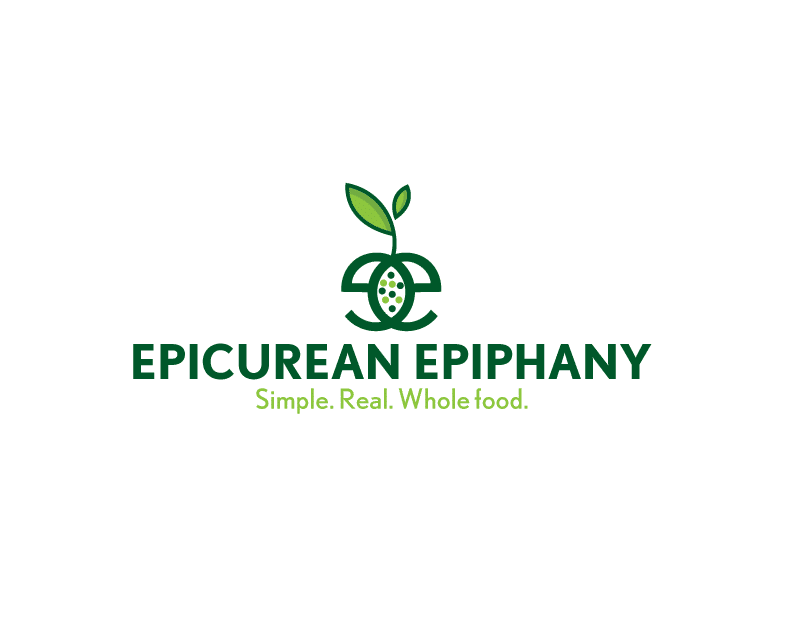
Similar to its tagline, this submission embraces simplicity. Positioned at the center, a modest leaf sprouts from lowercase letters “EE,” while playful polka dots within, accentuating the book title and tagline.
The skillful incorporation of varying green hues adds a refreshing dimension to the design.
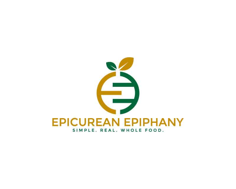
Another green and tan palette, this logo creatively integrates the letters “EE” to resemble a wholesome fruit or vegetable, accentuated by the graceful leaves atop.
Positioned beneath, the book title is presented in a warm tan hue, while the accompanying tagline shines in green.
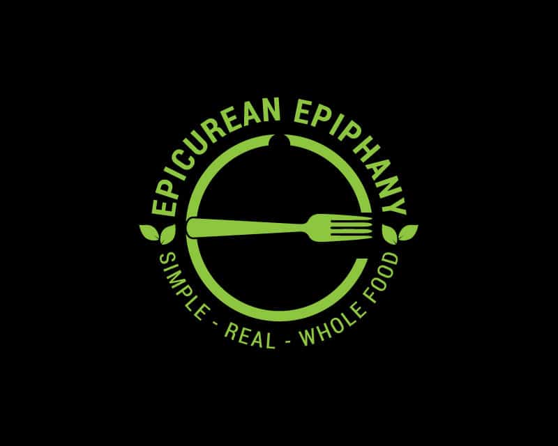
Deep black serves as the backdrop, while the letter ‘E’ is artfully fashioned using a single stroke, culminating in a graceful curve formed by a fork.
The company’s name arches over the ‘E’, and the tagline completes the lower half. This creative also employs vibrant, fresh leaves to symbolize the brand’s commitment to a wholesome and natural identity.
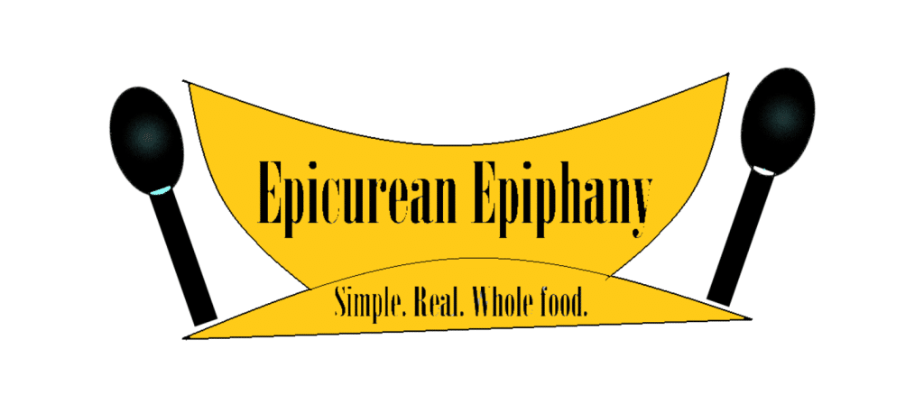
This radiant logo concept features elements that emulate the curvature of a bowl in a vibrant yellow. Two sleek spoons flank the bowl shape in a striking black.
The book’s title is in bold black lettering, positioned prominently on the upper section of the design. Completing the design, the tagline is placed on the lower half, offering a nice balance.
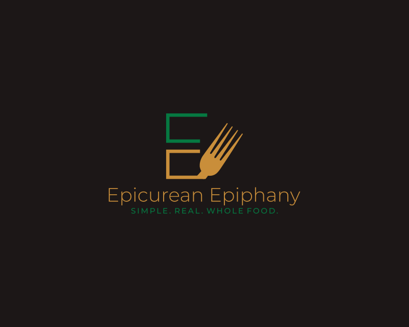
The logo ingeniously incorporates the letter “E,” splitting it into two segments in earthy tan and refreshing green tones. The lower section of the central “E” transforms into the tines of a fork.
The book title appears below in a tan hue in sentence case, while the tagline rests beneath it in a lively uppercase font in green.

Embracing the essence of the logo’s intent, this entry uses black and white. The title of the book is boldly presented in uppercase, using a black font, and the tagline follows suit.
The logo merges the culinary spirit with a minimalist design.
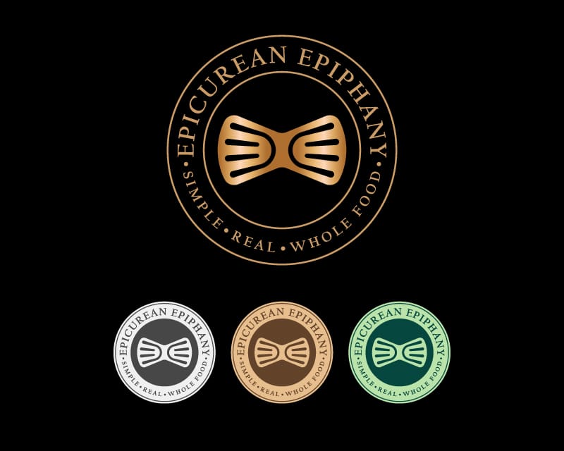
The striking circular logo, available in four distinct color schemes, captures attention against a sleek black backdrop. The book’s title and tagline encircle the logo’s perimeter in a refined gold font.
At the heart of the design lies a dual spatula motif, mimicking the “EE” in the title’s name.
The Winning Design

The winning submission adhered to the client’s script. It embraced a minimalistic color scheme through its monochromatic design. The emblem “EE” was strategically showcased in an offset arrangement.
Encircling this emblem, the book title and tagline seamlessly closed the loop, in addition to forks that symbolize nourishment the book aims to offer its readers.
Summing Up the Contest
This captivating journey through the creative submissions for Epicurean Epiphany’s Logo Contest showed us various designs to symbolize the company’s dedication to simple, real, whole food.
The diverse entries demonstrated an understanding of the client’s vision, seamlessly incorporating the “EE” initials and the full text into designs ranging from elegant and sophisticated to minimalistic and bold.
Each entry carried its unique flair, celebrating the connection between food and fulfillment. After reviewing over 1,170 entries, design #2838486 by dickyomar was crowned the winner.
The logo is a masterful embodiment of the project’s essence and stands out for its monochromatic minimalism, encapsulating the book’s promise of nourishment and inspiration through every carefully crafted element.
The Hatchwise Logo Contest format demonstrates how brands can easily find their visual voice to tell their story.
Check out other Restaurant Logo Design contests:
Souls Restaurant – An upmarket restaurant that offers international fusion food
So Good Restaurant Group – A new restaurant holding company starting with unique fast-casual franchises and moving into custom concepts. They put people and process first with an emphasis on running a well-oiled restaurant business.
American Grill – A food court restaurant that will be serving breakfast, lunch, dinner, and late-night all-American comfort food.
Delicioso Restaurant – The restaurant is not yet operating. The demographics can be a very wide spectrum but to pinpoint they would say 18 to 40 years old (imagine Chilies, Chipotle, TGI Fridays, etc.).
Mad Greek Restaurant – They are a family-owned restaurant since 1988. We are known for our pizzas as well as pasta and authentic Greek dishes. It is a casual atmosphere.
- Nicole Sonnier
- September 4, 2023

