News and inspiration for entrepreneurs and creatives, plus updates on new developments at Hatchwise.
Home / Blog Posts / Featured Design Contest: Ironclad Plumbing and Drain, LLC – Plumbing Logo
Hatchwise is #1 in Creative Custom Logo Design and Eyecatching Marketing Material Design.

Featured Design Contest: Ironclad Plumbing and Drain, LLC – Plumbing Logo
Ironclad Plumbing and Drain, LLC is more than just your average plumbing company; they are a residential service-based plumbing company dedicated to crafting plumbing solutions and forging peace of mind, which is their slogan for their customers in northeast Ohio.
The slogan emphasizes not only their expertise but also their commitment to reliability.
What Was Requested
In their quest for a standout logo, they sought a design that captures the essence of their brand: strength, durability, and elegance.
The requested elements for this logo included a minimalist design featuring a single wrench or pipe in a bold, metallic color palette, a prominent ironclad shield symbolizing protection and reliability, and bold typography to convey a sense of robustness. In addition, a creative pipe integration was encouraged to reinforce their core plumbing services.
This logo will play a vital role in establishing their online presence, appearing on their website and social media platforms, as well as on print marketing materials and merchandise. With 369 entries submitted, only one designer emerged as the winner, walking away with the prize of $350.00. Let’s dive into the creative journey that led to Ironclad Plumbing and Drain, LLC’s perfect logo selection!
Stunning Entries
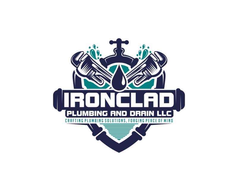
Our spotlight shines now on a logo design that offers a palpable sense of dynamism. It appears to be in perpetual motion. The entire shield is fashioned from a network of pipes, merging the industrial aesthetics of plumbing with action and movement.
There are two prominently positioned wrenches, serving as striking design elements and symbolizing the hands-on expertise and precision of the brand. Streams of water appear to burst from the wrenches. In crisp and commanding white capital letters, the brand name stands boldly against a deep blue pipe backdrop. Just below, the tagline appears in a teal blue.
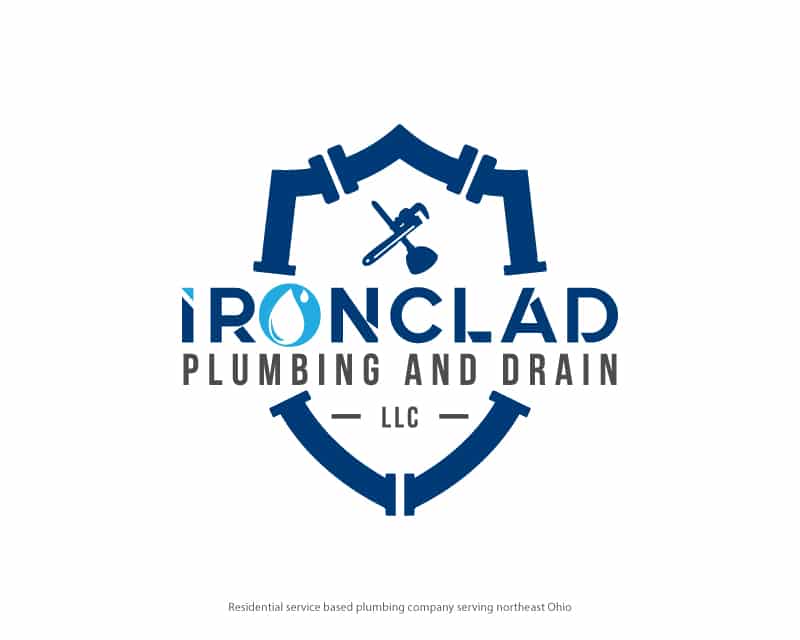
FXF Creations crafted a logo design that incorporates plumbing tool elements. The water droplet forms an integral part of the logo.
In commanding all caps, the wordmark offers an industrial allure, marked by sharp cuts that evoke the craftsmanship of plumbing. The letter “o” morphs into a fluid shape, like the fluidity of water.

faaZ conceptualized brand character, resonating with trust and reliability. The friendly plumber character confidently gives a reassuring thumbs-up gesture, effectively conveying the message, “We’ve got you covered.”
The logo is encased within a sleek silver shield. The brand name adorns the logo in all caps with an ombre blue gradient that transitions into solid silver.

This submission includes an emblem, a fusion of colors, and typography, all capturing the brand’s essence. It features a two-tone shield with the upper segment in silver and the lower portion in a tranquil light blue hue.
The same serene light blue that graces the shield is used in the brand name, boldly presented in uppercase letters, and what sets the wordmark apart is the precision cuts in each letter. It also includes the brand’s initialism, positioned above the wordmark.
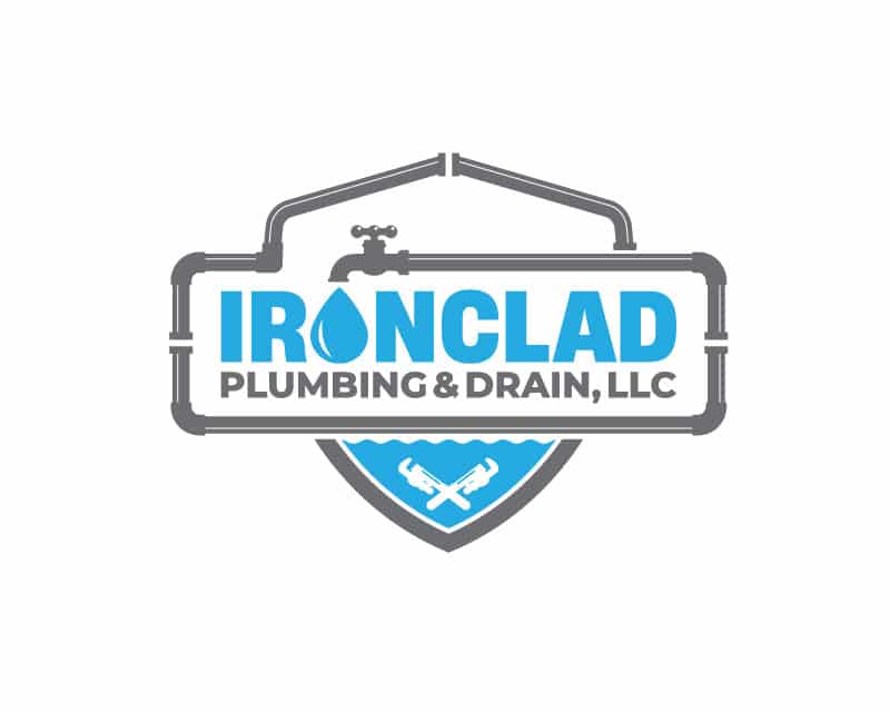
A network of sleek, industrial-grade grey pipes encases the shield’s foundation. A faucet emerges from the network of pipes and, coming from the tap, is a singular water droplet positioned to double as the letter “o” in the brand name. The lower part of the shield is filled with water. It also includes two crossed wrenches.

This submission uses initialism crafted from a network of pipes. The color palette includes bold shades of blue and silver.
The intertwining blue and silver pipes make up the brand’s initials, which also have a water droplet. Below the initials, the brand name is boldly spelled out in uppercase letters in a vibrant blue. “Plumbing and Drain, LLC” is added in refined grey lettering. Completing the design is a wrench.
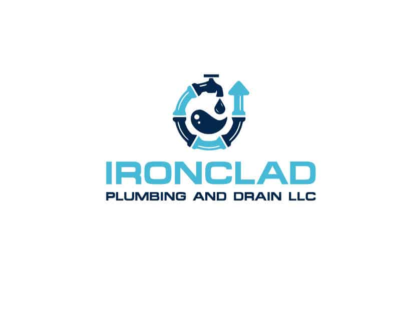
This logo design adopts a circular motif that ends with an arrow and starts with a faucet that offers a dark blue water droplet.
The color palette is an excellent combination of dark and light blue hues, adding depth and dimension. Just below sits the brand name in uppercase letters in a light blue font; the words “plumbing and drain LLC” are in a distinguished dark blue typeface.
This entry channels a superhero aesthetic, using a bold color scheme to underscore the strength and reliability. The shield is displayed in a dark grey hue, blending with a dark blue.
In the upper part of the shield, the all-caps wordmark takes center stage, integrating a water droplet and a faucet. The lower section of the shield features wrenches.
The following entry showcases a clever integration of plumbing elements to form a distinctive shield. This shield is composed of pipes and captures the essence of the brand’s expertise. At the apex of the shield, a prominent water droplet and a wrench take center stage.
The wordmark winds through its heart in an aqua-blue hue and is constructed from interconnected pipes. The words “Plumbing and Drain LLC” are white on a dark blue oval plate that spans the shield’s center.

This logo design fuses dark blue and teal.
Two wrenches extend from the top. A finely detailed faucet in dark blue is a nice touch. The brand name, also in dark blue, commands attention at the heart of the design.
Teal is cleverly integrated, akin to flowing water, and forms the letter “O” in the wordmark. The words “plumbing and drain” within the brand name are teal.

This submission uses the letter “O” as a captivating focal point, where plumbing tools form its background. The company name is boldly displayed in dark blue with typography that takes on a dynamic vortex shape.
This logo design uses a shield composed of pipes. In the lower half of the shield, two wrenches are integrated.
Spanning the middle of the shield, the brand name is displayed in a harmonious blend of teal and dark blue. As an interesting touch, a water droplet serves as the letter “o” in the brand name.
This logo design includes a vibrant combination of bright blue and crisp white. The centerpiece of this design is a shield crafted from pipes, water droplets, and plumbing tools.
Across the heart of the shield, the brand name is elegantly framed. This wordmark is displayed in bold and easily readable lettering.

This entry, created by the talented designer Bandis, shares similarities with our winning design, with a unique twist. Instead of the light blue color palette used in the chosen logo, this rendition opts for a vibrant shade of teal. This adaptation retains all the essential elements as requested by the client.
Like the winning design, this entry features the iconic shield crafted from plumbing pipes and includes water elements.
The Winning Design
Bandis’ winning logo design perfectly encapsulates all the elements the client envisioned. This creation showcases a masterful blend of design elements that combine to convey the right message. At the heart of the design, a sturdy shield takes center stage, symbolizing trust and reliability.
The shield is crafted from intertwining plumbing pipes, representing Ironclad’s industry expertise and commitment to providing solutions. Emerging from the faucet, the letter “O” completes the wordmark. This detail signifies the brand’s fluidity and adaptability.
The precision-crafted dark and light blue hues that fill the logo offer a sense of professionalism. The brand name is etched with precision cuts that add depth and dimension, evoking a sense of craftsmanship and attention to detail. Two wrenches boldly stand in the shield’s lower portion, reinforcing the brand’s identity.
Bandis’ winning logo design skillfully combines these elements to create a logo that is a powerful representation of the brand’s values, strengths, and commitment, leaving a lasting impression on customers and prospects.
Check out other contractor logo design contests:
Earth Dynamics LLC – An excavation site contractor. They provide a wide variety of services from sports fields and solar fields to commercial building site work. It’s a tight family-run business with 20 employees and 35 pieces of equipment all newer Cat equipment. They invest heavily in new technology in the industry to try to keep ahead of the competition.
Star Team Handyman & General Contractors – Handyman and General contractors they provide handyman and general contractors services.
Peak Contracting – A general contractor looking for a logo with maybe a black background, a name in grey (with shading), and maybe a mountain peak in light blue on the top. They are toying with the idea of a circle or border around possibly but not as important.
Eaton Plumbing Inc – A family-owned and operated plumbing contracting business in Columbus, Ohio since 1974. They have a staff of about 50 employees, mainly consisting of men, but they do employ a handful of women. They are looking to create some new designs for t-shirts, sweatshirts, and hats. They also provide a lot of shirts to builders and reps, so they want to create a shirt that has a cool look to it that people will actually wear it out and not just as a work shirt.
J AND N CONTRACTING LLC– A contracting company that will be doing anything related to residential home construction, plumbing, electrical, heating, and air.
- Nicole Sonnier
- September 18, 2023

