


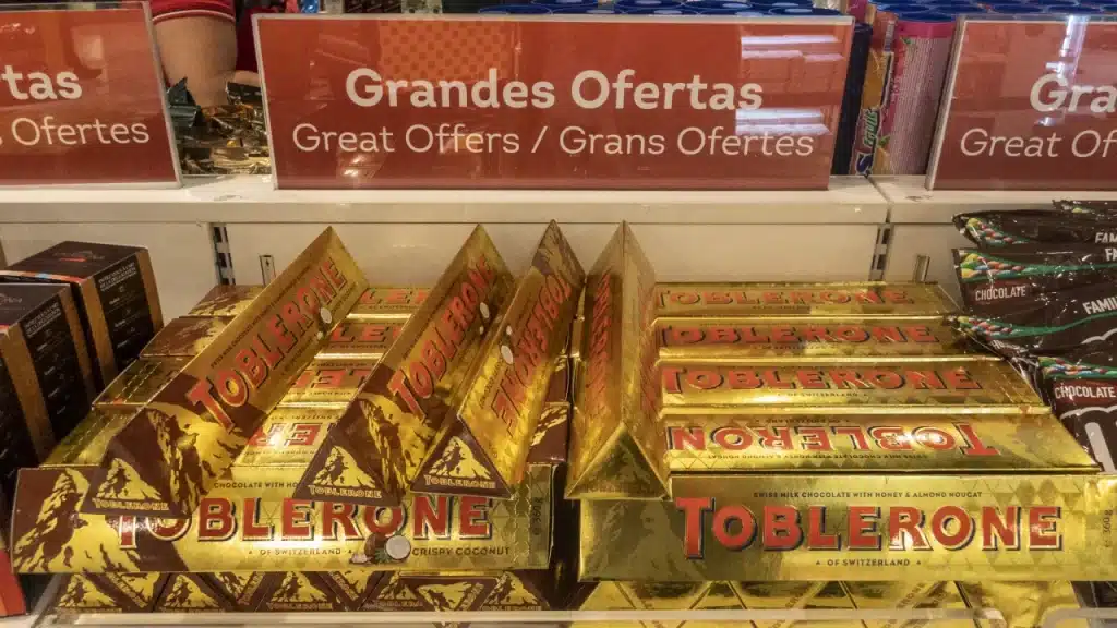
You might know Toblerone as the Swiss chocolate brand that’s well known for its triangular-shaped chocolates. The familiar triangle chocolate bars are produced in Switzerland and were created in 1908. The candy that you see in the delicious bars combines both chewy candy and chocolate to create a delicious bar that has your mouth watering instantly.
Although the chocolate itself is enough to have you interested, it’s not what the company is popular for and what we’re here to talk about. Toblerone has stood out for over a century now due to its distinctive and unique look. In a world where we constantly see square and rectangular chocolate Toblerone has been determined to stand out in an individual way and one that will be remembered.
This company is an excellent example of how a company can incorporate its roots into its logo and how it can have an artistic and practical visual identity. More than this, the design also has a hidden meaning that surprises people when they find it out since it’s not obvious.
In this article, we’ll talk about the logo, its hidden meaning, the history of it, and where both the logo and the company are at today. If you want to learn all of this and more then continue reading!
1908 – Today
The history of the iconic logo dates back to 1908 when company founder Theodor Tobler and his cousin Emil Baumann started to experiment with creating the unusual triangular shape for the chocolate. They worked to develop the divine chocolate taste with the signature look and this was the beginning stages of creating a strong company and iconic brand.
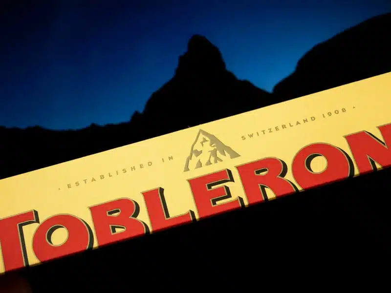
The logo symbol is simple while also having enough detail that when you look closely it has a deeper meaning. This visual identity features a mountain above the company name shown in red letters and bold font. The company name stands out and the mountain gives a symbol of the Swiss Alps, focusing on the company’s origins. The white mountain above is usually mistaken for snow but when you take a closer look instead of immediately unwrapping the chocolates you’ll see there’s more than meets the eye.
What Is Toblerone?
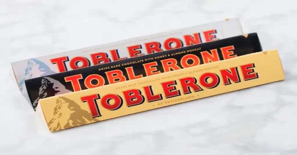
The mouth-watering Swiss chocolate is made up of interconnected pyramids. The Swiss chocolate bar is made up of honey and almond nougat and was created by Theodor Tobler in 1908.
The name Toblerone is a play on Theodor’s family name and the Italian word for almond and honey nougat. These two names are Tobler and Torrone and when combined they make Toblerone, the company name. These chocolate bars have a distinctive shape and are loved by candy fans around the globe.
Hidden Easter Eggs
When you first see the logo it might appear as a clear and concise logo that seems to do its job well. Although it does, what surprises many people is to learn that there are a few easter eggs in the logo and packaging design that have a hidden meaning for the company.

Many people see this logo and don’t think twice, but when they do learn about the design it blows their minds. When you first see the logo you might think to yourself, “It’s just a mountain, right?” But if you take a minute to look closer at the design and focus on the details then you’ll notice there’s a dancing bear shown on the mountain face. What might usually appear as a snowy peak has deeper meaning if you look closely.
The reason for this? Well according to the company’s official webpage the chocolate bar originated in the city of Bern in Switzerland which is also known as “the city of bears”. Even the city’s flag features a bear, which means that this logo is directly referencing its origins and paying tribute to where the company comes from.
This easter egg is hidden well enough that to the untrained eye you might not be able to catch it, but once you know the outline that you’re looking for it come across clearly. The bear is standing on its hind legs in the middle of the mountain and once you see it it’s difficult to not notice it every time you see the logo.

The town of Bern is located near the Matterhorn mountain, which is what ultimately inspired the triangular shape that’s used for the mountain that’s the main idea of the logo.
There’s a second meaning to the triangle as well, which is that the same form of a triangle is the feature of the produced chocolate. All Toblerones chocolates are produced in the form of a triangle, as is the logo.
In recent events, the Toblerone logo will be getting a new update due to conflicting Swiss laws. While the logo may be getting some changes through the years, the beloved chocolate bar retains the same delicious, well-loved taste!