News and inspiration for entrepreneurs and creatives, plus updates on new developments at Hatchwise.
Home / Blog Posts / Logo Design Case Study: A Wombb Agency: Women on a Mission for the Building of Bridges Agency
Hatchwise is #1 in Creative Custom Logo Design and Eyecatching Marketing Material Design.
Logo Design Case Study: A Wombb Agency: Women on a Mission for the Building of Bridges Agency
A client recently started a new contest on Hatchwise, looking for a new logo for their company.; A Wombb Agency: Women on a Mission for the Building of Bridges Agency
According to their contest brief, they are “A not for profit focused on constructing, reinforcing and amplifying positive change in women, for children and across communities.”.
They planned to use the winning logo design online (website, Facebook etc.), in print, and on merchandise.
If there was room, the client wanted the following tagline included on the logo: “Integrating collaborative healthy and healing bridging systems“
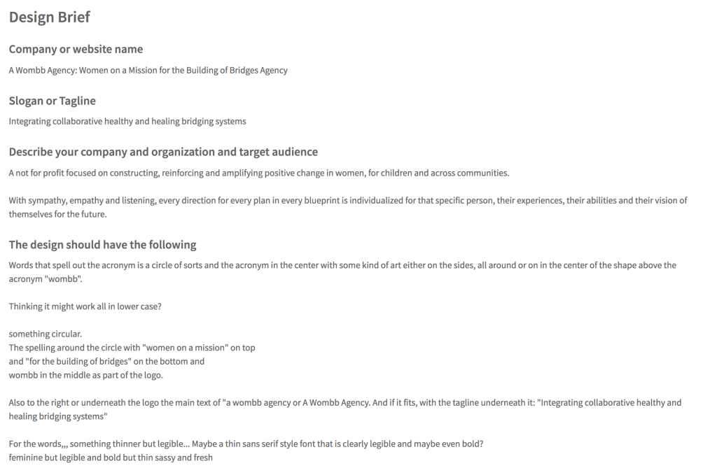
The client (nerolnamsiew) offered a prize of $360.00 for a winning logo.
A Few Of The Entries Submitted

Above we see a few different versions of the logo.
The Hatchwise creative opted to show how the design would look in different color combinations and a separate design.
We see the same design three times with three different color combinations, using a mustard yellow and pastel green for the background with white letters on the bottom.
On the top left, we see an option with a white background where the letters are colored.
On the top right there’s an entirely new concept that just uses letters on a white background.
All of these were excellent concepts given to the client and presented as options for them to choose from along with the winning entry that they chose.

This design creatively uses a variety of words to show the company and right in the center we see the company name. The ‘O’ in the center is in gold and larger than the other words while the remaining words are in black on a white background.
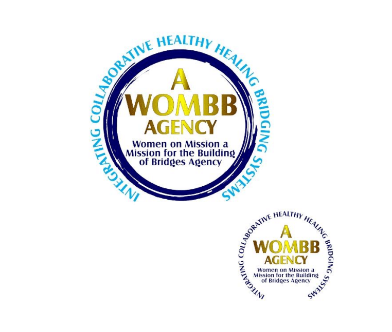
We see a few different colors used for this design, including dark and light blue. Inside the dark blue circle is the agency name in gold and below it there shows more letters in the same dark blue. The outer circle focuses on the company values and shows those letters in light blue. In the bottom right-hand corner we see an option with dark blue letters forming a circle around the name in gold. These two designs are shown on a white background so the colors stand out boldly.

This entry focused on incorporating a variety of blue colors on a white background. The design shows a circle with the word ‘Wombb’ in the center in a light blue and a bridge design above it. The inner circle is dark blue along with the letters in the outer circle. This design is unique and creative while incorporating different colors and keeping the client’s contest brief in mind.

Here we see the same design in three different color combinations to show the client a few different options. The design shows the company name and tagline to the right of a circle design. All three versions use a white, yellow, and dark navy blue. The design is simple while also having character.
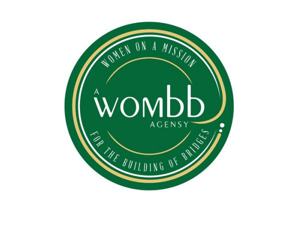
This design stands out since the creative opted to use a different color combination than the previous designs. This design uses dark green for the majority of the design with white letters and some gold incorporated into it as well. The design is a circle with the company name and tagline in the center of it.

This last entry saw a few different color combinations with the same design. We see the design on the top featuring a circle with the company name in the center in black and a gold circle. The remaining letters are in black in the outer circle and to the right, the company name and tagline are shown. On the bottom right we see three different versions of the same design using different colors.
This last entry saw a few different color combinations with the same design. We see the design on the top featuring a circle with the company name in the center in black and a gold circle. The remaining letters are in black in the outer circle and to the right the company name and tagline are shown. On the bottom right we see three different versions of the same design using different colors.
The Result

This contest has now ended and the client has awarded the design shown above as the winning entry (congratulations, koeciet!). The client reviewed all the entries submitted and saw all the entries for their contest before they chose the winning entry.
This result is what the client requested and does an excellent job of representing the company and what they do.
We’re always happy to get the opportunity to see the entries submitted and think that this contest saw a great turnout and end result.
- Rosie
- February 15, 2022

