News and inspiration for entrepreneurs and creatives, plus updates on new developments at Hatchwise.
Home / Blog Posts / Featured Logo Design Contest: 4Horsemen
Hatchwise is #1 in Creative Custom Logo Design and Eyecatching Marketing Material Design.

Featured Logo Design Contest: 4Horsemen
Every so often we love to take a look at the contests that are run on Hatchwise and see what the client requested and the entries that were submitted based on the request from the client. It’s always fascinating to see what designs were submitted and the design that the client choose to be their next logo. In this particular contest, the client was looking for a new logo for their business.
They started by picking the type of contest that they needed for their business, followed by filling out a contest brief describing what they were looking for. Let’s take a look at what they requested, what Hatchwise creatives submitted, and what the final result was!
What Was Requested
After selecting what type of contest they would like to run, the client started with filling out a contest brief describing what they were looking for. They gave some information about how they wanted the design to be and provided details on their business. They requested that the design include four old-world mobster-style men or silhouettes of them. They chose the following colors or combinations of the colors to be included in the design; blue, white, red, blue, and yellow.
They described their business as four guys starting a guys club. Hatchwise creatives reviewed the contest brief and then got started on the entries to submit to the contest!
The Entries Submitted

This first option is mysterious and unique, showing four men on black background above the name. Below the name at the bottom of the design is the company’s slogan “Slay Everything”. This logo includes three different colors and creates a mysterious scene that displays what the company is while still raising some curiosity.

This entry shows a classy option, featuring four men sporting suits and the name in a bold red below them. The slogan is in smaller letters at the very bottom, with the words “Social Club” on a blue ribbon in white letters. This option is different from the first logo entry, giving a more classy and elegant option.

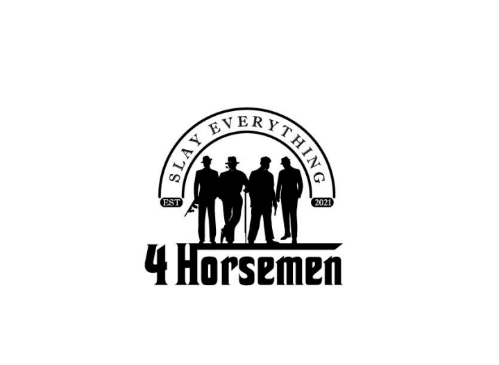
This logo entry uses only two colors; black and white. This entry shows the slogan at the top with the name of the company at the bottom. All elements of the logo are in black on a white background, including the letters and the four men that are shown in the center of the design. The slogan is shown over the men elegantly and stylishly which adds something special to the logo.
This logo entry uses a dark grey on a white background, showing four men above the company name. The name is the biggest aspect of the design, with the men standing above it and the company slogan below it. There’s a bold emphasis on the name and the men standing above add an air of mystery to the design.

This creative chose to take their entry in a different direction, opting not to include men in the design. Instead, they choose to include a cowboy hat and incorporate the name and slogan in a new and interesting way. They decided to put the name in red and the slogan underneath it in black. The hat is also shown in black on a white background, letting the red and black stand out boldly against the white background.

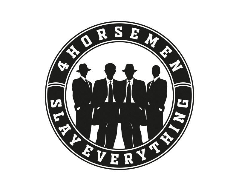
After reviewing the entries submitted to the contest and rating them the client finally decided on the winning entry. They chose the design shown above, featuring four in the center of a circle. In the inner layer of the circle is the company name in white. The winning entry only used black and white for the design. The background and letters are in white while everything else is in black.
- Mosi A.
- December 13, 2021


