


We always enjoy browsing through contests and getting the opportunity to see the amazing and high-quality work that’s being submitted to contests by creatives. It’s always refreshing to get the opportunity to see the different entries based on the contest brief and then what the result was and what the company received as their final design. This particular contest for Jelly Bean Labels caught our interest and we were intrigued by the entries that had been submitted.
We thought we’d share a few of the most fascinating and unique entries with you! Read on to learn about this contest, see some of the entries that were submitted and the final logo that the client received for the company!
The Contest Brief
To start the process for a new logo the client filled out a creative brief describing what they were looking for. Jelly Bean Labels is a stationary website that was looking for a new logo for their business. Their focus is on making creative, unique, stylish, and colorful name labels for children and teenagers. These labels could be used on children’s items when they’re headed to school, on trips or they’re away from home. They wanted a clean logo that was a bit whimsical. Hatchwise creatives reviewed the creative brief and what the client asked for before they got started on submitting entries!
The Entries Submitted

This first entry used pink, purple, and black for the color choices. The logo is fun and creative while still being simplistic and stylish. The logo really shows the heart of the company and keeps it playful, dotting the ‘j’ with a heart. The name is in lowercase letters while the word “Labels’’ is in capital letters below it.
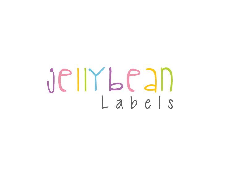
This second entry uses thin stick letters that look hand-drawn, using a variety of colors. Each letter is in a different color with the word below in all black. This entry is fun and unique, the letters adding character to the design and making the logo stick out.
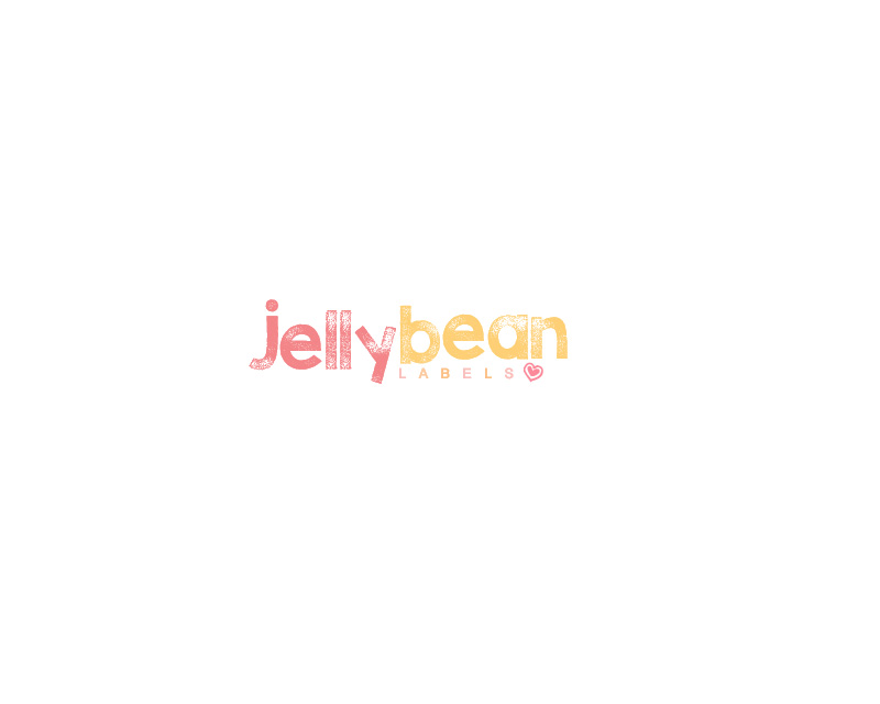
This entry uses red and yellow, making the first two words the largest part of the design. This entry is a simple wordmark, showing the word “Labels” in smaller letters below the first part of the name. At the end, a red heart is drawn. This logo is shown on a white background. It’s a straightforward and creative entry.

This fun entry puts emphasis on what the company does with using multiple colors for the design and making the letters playful. Every letter is in a different color while the word “Labels” is smaller and in purple. The letters have rounded curves and appear jolly and lighthearted.

This entry is creative and different from the others shown here, opting to create a new and fresh look for the company. The entry uses thick and curvy letters and the ‘J’ is dotted with a heart. Multiple colors are used for the logo and below the first part of the name is the word “Labels”. This word is shown in partial letters that are shown in different colored circles.
The Result

After reviewing all the entries that had been submitted and rating them, the client finally chose an entry as their new logo. The winning entry is shown above, a logo featuring curvy and fun letters in a variety of colors. Congratulations to the winner and we couldn’t be happier that the client received a result they love!