


Since we’re a logo design company, to say that we appreciate a good, high-quality design is the truth. We like to pride ourselves on having a diverse group of creatives that are highly qualified to submit unique and versatile designs to contests. We love to see contests and what entries were submitted to them and what was chosen. This recent logo design contest caught our eye and we loved taking a look at the entries that were submitted.
We’ve gathered together a few of our top entries to share with our readers, as well as including some information about the company and the winning result for the contest.
Let’s take a deep dive into this contest and the entries submitted!
What Was Requested
After starting a logo design contest, the client first filled out a creative brief describing what they were looking for and to tell our creatives what it would be used for. They wanted the logo to be simple and elegant, not too busy or complicated. They told creatives that the logo would be used as a sign at the entrance to the community and on marketing material. It would be used mainly online, for print and signs. The client requested that the logo did not include any elements that were modern, complicated, or futuristic.
Hatchwise creatives reviewed the creative brief and got to work on their entries! Let’s take a look at the entries that they submitted to the contest and what the client chose!
Entries Submitted

This first entry used a color palette of a variety of light and dark blue colors. Although the logo has beautiful details included it’s still simple and elegant. The wordmark shows the name, making it the center of attention in the middle of the design. Above it, we can see that there are beautiful blue pine trees on a white background.

This creative chose to take a different look on the request and opted to do a cartoon-like design instead. We see a circle with a woodland setting above the name, which is shown in blue. While the name is shown in big, capital letters there’s green, white, and blue included in the setting above it. This is a small, classic design that has personality.

This design uses a similar color palette with a variety of blue choices and makes the name the center of attention. The name is beneath the design, showing it in an elegant font with a design above it. The scene that we see featured above the name shows a lake with pine trees on the left, mountains, and a rising sun behind it. This creates a beautiful and calming setting for the design.

This design has a different look than those that we’ve seen before it, opting to have a simpler and cleaner logo option. The letters are unique, appearing ‘broken’ and scattered on the design. The name is the only main feature of the design, shown in white capital letters on a dark black background. This design is certainly simple and has been left clean, focusing only on the name of the company.
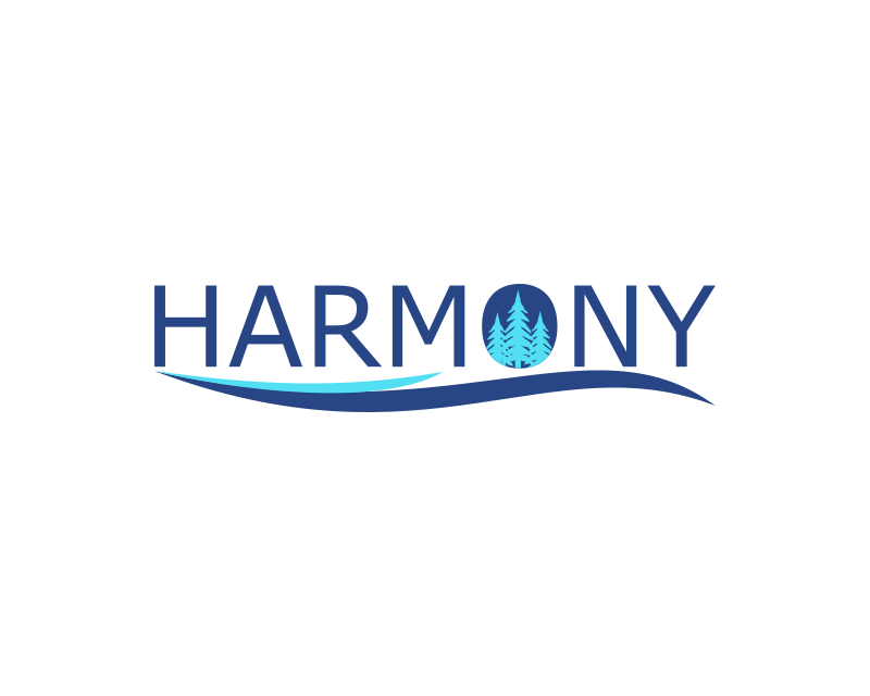
Here’s another unique take on the client’s logo request, this one making the wordmark the center of attention as well. The name is in the center and in the ‘o’ there are a few light blue pine trees. The only colors used are dark blue and light blue on a white background. This logo is certainly a simpler option and focuses on the name more than anything other attributes.
The Result

After reviewing all the entries that were submitted to the contest the client went through and rated them, finally deciding on the perfect logo for their company. They looked through all the options before choosing the option featured above as their winning entry. This entry is clean, simple, and will appear well on different kinds of material. Congratulations to ChampenG, the creative who submitted the winning entry!