


We always love to see contests run here at Hatchwise and the variety of entries submitted are always fascinating to see. It’s fun to see entries submitted and what the client chose as their result. This contest specifically for a hockey team sparked our interest. The contest received a lot of interest and our talented creatives submitted a variety of unique design concepts to it! Let’s take a look at a few of the top entries and what the client chose as their final result!

This entry is fun, creative, and light, and everything you want for a hockey team. The logo uses three main colors; red, light blue, and dark blue. The letters are two different colors, with a hockey disc substituting for the ‘o’ in hockey. In between the two letters is a hockey stick, showing what the logo is for and adding a spark of creativity.

This second entry is drastically different from the first, showing a fierce-looking Viking with two hockey sticks beneath it. All of the logo is in black except for half the letters beneath the logo and the end of the hockey sticks, which are in a dark red. This logo is more serious, giving the hockey team a professional and stern look.

This logo entry is similar to the second submitted, also using a Viking image and two hockey sticks. Grey, white, black, and red are the four-color choices used in this entry. The name “Senior Vikings” is shown right in the middle of the design, with ‘Vikings’ in large lettering. This entry is creative and has a unique look to it!

This entry is simpler than the others submitted, showing a Viking character sketch above the lettering. The Viking is shown in color, with light blue, red, and black used on it. The lettering below reads, “Hockey Team Senior Vikings Semi Pro” and is all in black. This entry is simple and would appear well on t-shirts and other marketing material.

This entry is unique, showing a Viking in between the lettering and his two hands coming out to hold hockey sticks in the front. Below, and in between the bottom lettering is a hockey disc. The upper part of the design is in blue while the bottom part is in a light red. The design shows the point of the logo and makes everything work together well.

This entry, although similar to some of the other entries entered into the contest also has a unique design. A stern Viking is the center of the logo, with a blue circle with stars in it around the Viking, and on the bottom, there’s a Viking with ‘Hockey Team’ below it. The logo is fierce, strong, and bold.
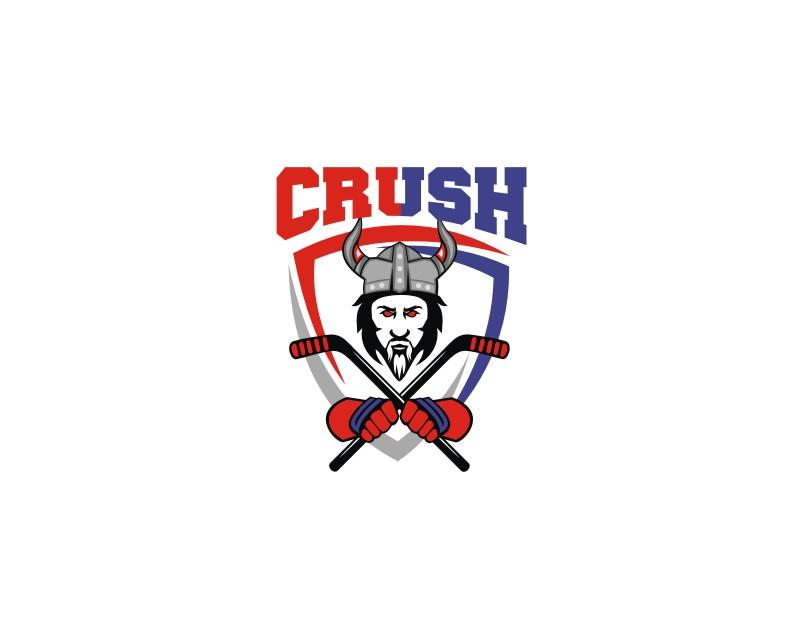
This entry is especially bold in the group, showing a Viking with red eyes and hands holding a hockey stick. The colors used are red, blue, red, black, and grey. The word ‘Crush’ is on top and with the Viking and a shield image below. The logo design is bold and stands out amidst the variety of entries submitted!

This contest was viewed over 990 times and received a ton of awesome design concepts out of which the client selected onlinegraphix’s as their contest winner! The winning entry shows a Viking, using the colors red, black and grey in it. The word ‘CRUSH’ is in the front, boldly standing out against the logo.
Congratulations onlinegraphix on another impressive design!