


This contest for a dealership received a variety of interesting and unique entries from our talented creatives. The dealership requested a new logo for their company that they could use on marketing material. They received a variety of entries to choose from and ended up with a result that they loved for their business. In this blog post, we’ll take a look at all the amazing entries that this contest received and the final result!
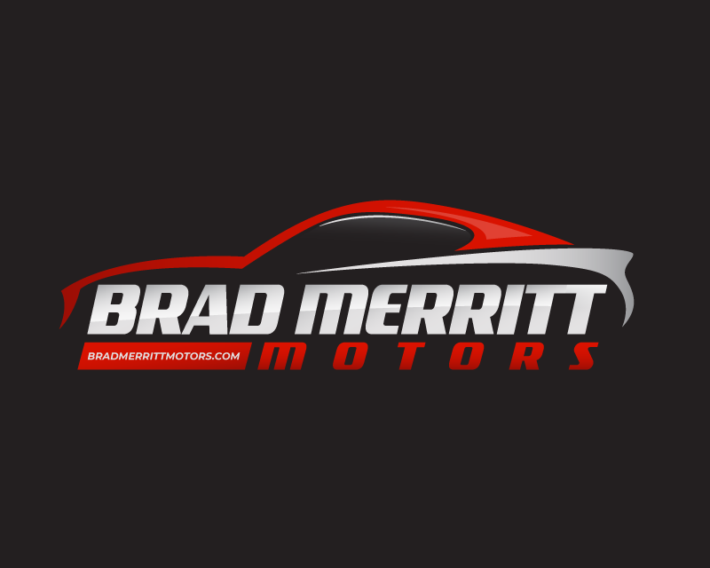
This first entry shows the company name with the company colors and incorporates the idea of cars into the logo. It shows the company name with a car above and the main colors of red, grey and black. In the bottom left corner, there is the website URL, creating an informative and stylish logo.

This entry is slightly simpler, showing the abbreviated name above the full name. On the sides of the B and M red wings seem to be coming off the side. This logo also uses the brand’s colors of black and red on a white background. This logo is simpler and cleaner than the first logo entry shown.

This entry is classy and uses a creative combination of the letters to display the company name. The creative combined the two Ms and used them above the company name. Below the Ms are the company name, the whole logo using the colors red and white with a black background.

This entry stands out from the other entries submitted for the colors used and the interesting circle concept that the logo has. You’ll see the abbreviated name in blue letters above the full company name in grey letters beneath the initials. The logo is simple, yet still classy with a circle and a few bold color choices. This creative is one of the few who chose to branch out from the company colors with their entry.
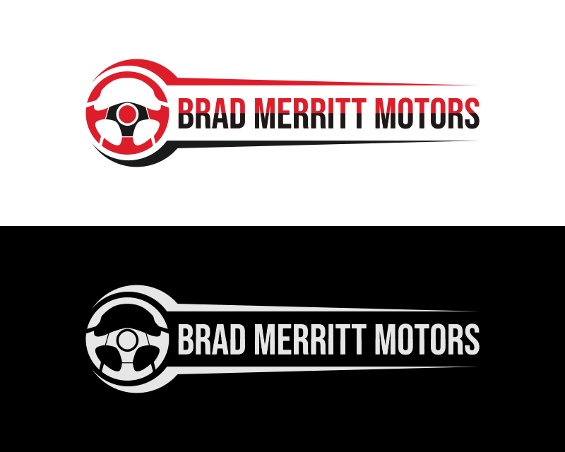
This logo is sleek and shows a unique take on the request. Showing what the company does, the creative chose to include a steering wheel to the left of the company name and gave a black and white and color version. The color version shows the steering wheel and half the letters of the name in red while the bottom part is in black.

This is another unique entry that was submitted, using the same brand colors of grey and red. Once again the symbols ‘BMM’ are shown in the middle with the full name underneath. What makes this logo more interesting is that the creative chose to incorporate a car wheel into it, letting the letters go through the middle.

This is one of the cleaner and sleeker designs that have were submitted to this contest, using classy colors and a slim design. Once again, we see the abbreviated letters of the company name, BMM above the full name. The abbreviated name is shown above in red, with the full name beneath it in white. We see two lines on the top and bottom, giving the logo a classy look.
The Results

After the client reviewed all the entries submitted and rated them, they chose a winning entry to use for their marketing material and company. The company chose the entry that they thought represented their company while and showed their dealership. The winning entry is shown above and was submitted by Hatchwise creative nobikor. Congratulations to nobikor for submitting the winning entry!