


Hatchwise takes one of the more difficult parts of launching a business off your hands. Instead of agonizing over every creative decision with your business’ marketing suite of materials, Hatchwise can get you started by crafting a custom logo that is perfect for your business.
Shroomies was recently one of those companies that turned to Hatchwise for help in designing its custom logo. With Hatchwise, all Shroomies had to do was fill out a creative brief outlining the details of what the brand was looking for in a logo, and then Hatchwise’s team of creatives from all over the globe got to work on designing it.
It wasn’t long before Shroomies received a wide array of entries to choose the winning design from.
What Was Requested
For Shroomies, the client was looking for a design that was fun, colorful, and playful and that also articulated what the brand was all about – offering mushroom products in the legal Oregon mushroom market. Shroomies’ tagline is “magic time,” and while using this wasn’t required, you’ll notice that many designs included this.
Below we highlight 10 of the submissions Shroomies received so you can get a sense of their experience working with Hatchwise for yourself.
A Few Entry Comparisons

#3120576 by muxalex
This first entry depicts a mushroom image and includes both the brand’s name, as well as the client’s tagline. The colors are playful, but you’ll notice that they are muted and not as bright as some of the following submissions.
The green color ties back to the client’s origins, resembling Oregon’s green scenery. The center of the mushroom features an eye image that wasn’t included in the briefing; however, it provides a nice point of comparison to other designs.

#3119978 by emilyfnm3d
In this design, the colors are bright and playful and the font is a bold selection. The Shroomies client name is written in capital letters, whereas the tagline is written in lowercase letters, clearly showing which is the brand name.
This design also features a variety of mushrooms, rather than one mushroom, showing the abundance of products this brand offers.

#3119670 by quimcey
This designer took a unique twist on the client’s request for a playful logo that was different from other submissions. This designer used a variety of colors, spanning the rainbow, and played around with different fonts.
Additionally, this designed incorporated sparkles to highlight and emphasize the overall design. This logo conveys a fun element to the brand, but the brand message isn’t as clear as some other submissions.

#3119617 by bimohrty17
Unlike other submissions, this designer took the client’s request for a playful logo and translated that into the mushroom design itself, by turning the mushroom into a character.
The mushroom’s colors are like the colors of the Super Mario Bros. game and the mushroom’s cheery demeanor conveys friendly feelings about the brand.
This font stands out from other submissions and given the sizing of the client’s name and tagline, it is clear that the name of the brand is “Shroomies.”

#3119597 by inka07
This logo submission has a retro vibe about it sticking to only three colors, brown, red, and green. The red coloring makes the brand name stand out and the green coloring ties back to the client’s Oregon roots. The mushroom image is the focus of the logo design, clearly showcasing the client’s focus.
While this logo isn’t as playful and colorful as other submissions, it provided a different viewpoint for the client to consider.

#3119591 by inka07
A second design submission by inka07 featured the same color scheme as the previous submission, but still provided an entirely different design to consider.
This showcases the creative’s ability to provide two drastically different options. This logo features a unique font and a stylized mushroom design. The mushroom image is inside a clock image tying back to the client’s tagline, “Magic Time.”

#3119387 by Ganneta27
This logo stands out in its simplicity. The mushroom is intentionally placed in the middle of the logo, drawing your eye to it. The use of two fonts compliments one another and the use of the gold stars subtly hint at the client’s tagline “Magic Time.”
This logo features similar colors to some of the prior submissions while also providing a unique take on the client’s creative brief.

This entry played around with the shape of the entire logo design, creating a hexagon shape. Within that shape, the designer included a variety of mushrooms in different colors, as well as the client’s name and tagline.
The client’s name stands out, however the mushroom images are more muted than other submissions. This entry focuses on having the brand name as the focal point which serves as a nice point of contrast to other submissions.
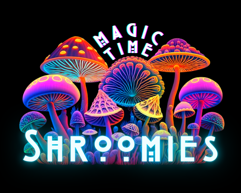
This design resembles a forest of mushrooms and instead of putting the tagline below the brand name, the designer placed it above it.
This logo does a terrific job of conveying the fun and playful feelings the client was looking for and offers a unique take on the color scheme, as well as the font choice. This logo is intricate, making it more difficult for scalability, but it was a strong contender overall.
The Winning Design

#3120185 by Armchtrm
The client received a total of 11 entries and after reviewing all entries, Shroomies awarded this designer the prize of $230 and the title of “winning design.”
Unlike other designs, this entry utilized playful colors and a 3D, glow-in-the-dark effect. Every detail of this logo is intentional from the mushrooms to the road coming out of the mushroom garden, to the font choice, to the background color.
The designer also provided a second version of the logo for the client to use for other marketing mediums beyond a logo.
This winning design is the new logo of Shroomies and upon awarding a winner, Shroomies was able to start using this design right away.
Check out other (legal) recreational drug company logo contests:
Mr Greens Cannabis – Looking for a logo for a marijuana/cannabis retail location. The name is “Mr. Greens Cannabis” OR just “Mr. Greens” This will be used on buildings, signs, business cards, billboards, and apparel.
Kronik Cannabis – A Washington State legal cannabis producer/processor company named Rochester Farms. Looking to start another brand/line called Kronik Cannabis.
Cannabis Connection – An up-and-coming new legal cannabis store in the BC area. They have a target audience of people who are looking for marijuana for their needs so must be of legal age.
Vapy Wednesday – A growing medical and recreational cannabis market, information platform (medicine, usability, science, etc.), medical cannabis, CBD.
Cannabis Company Logo – A cannabis retailer looking for a logo and name design. The name they are considering should be included in the design.