

- BACK TO CONTEST
- CREATIVE BRIEF
- ENTRY # 320967


Comments for entry # 320967
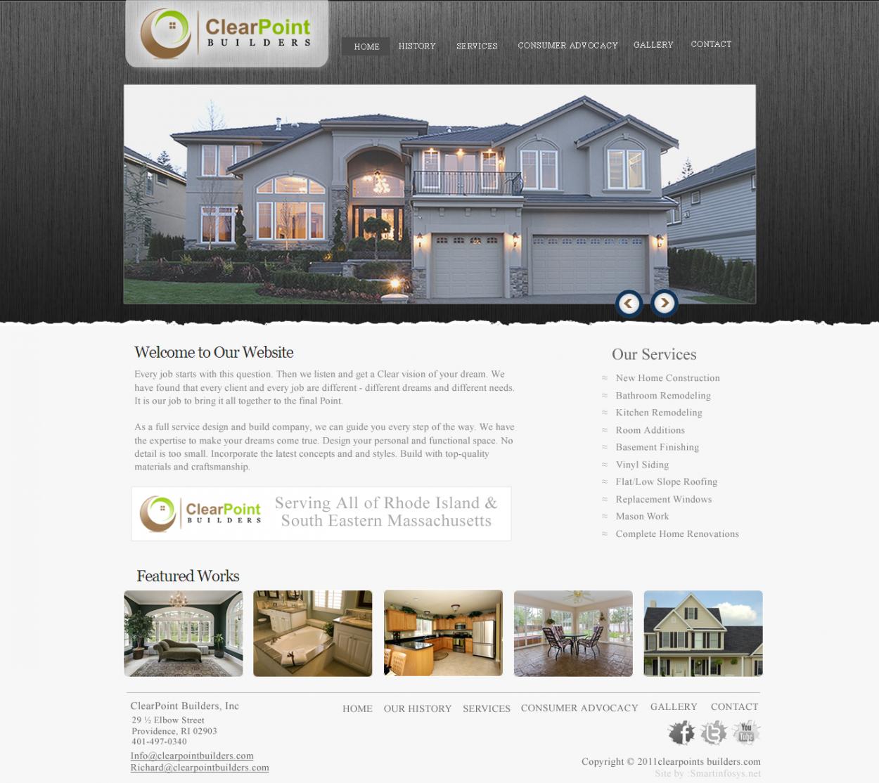
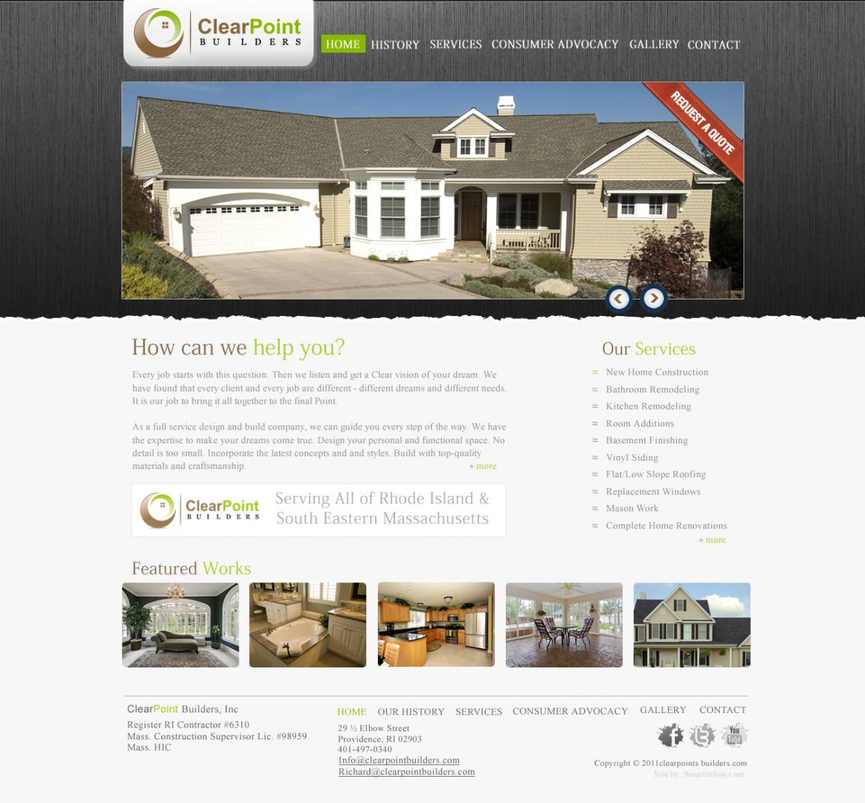
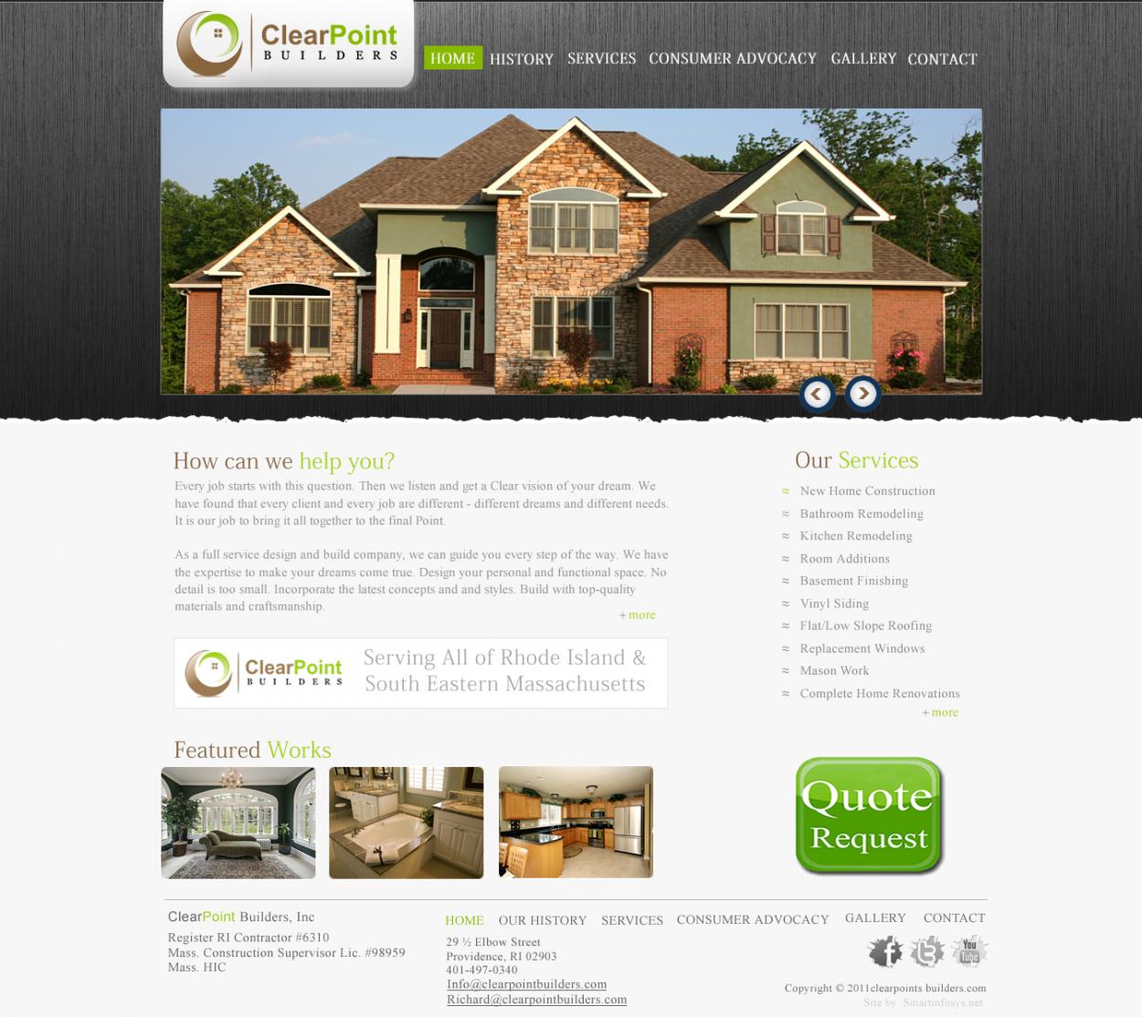
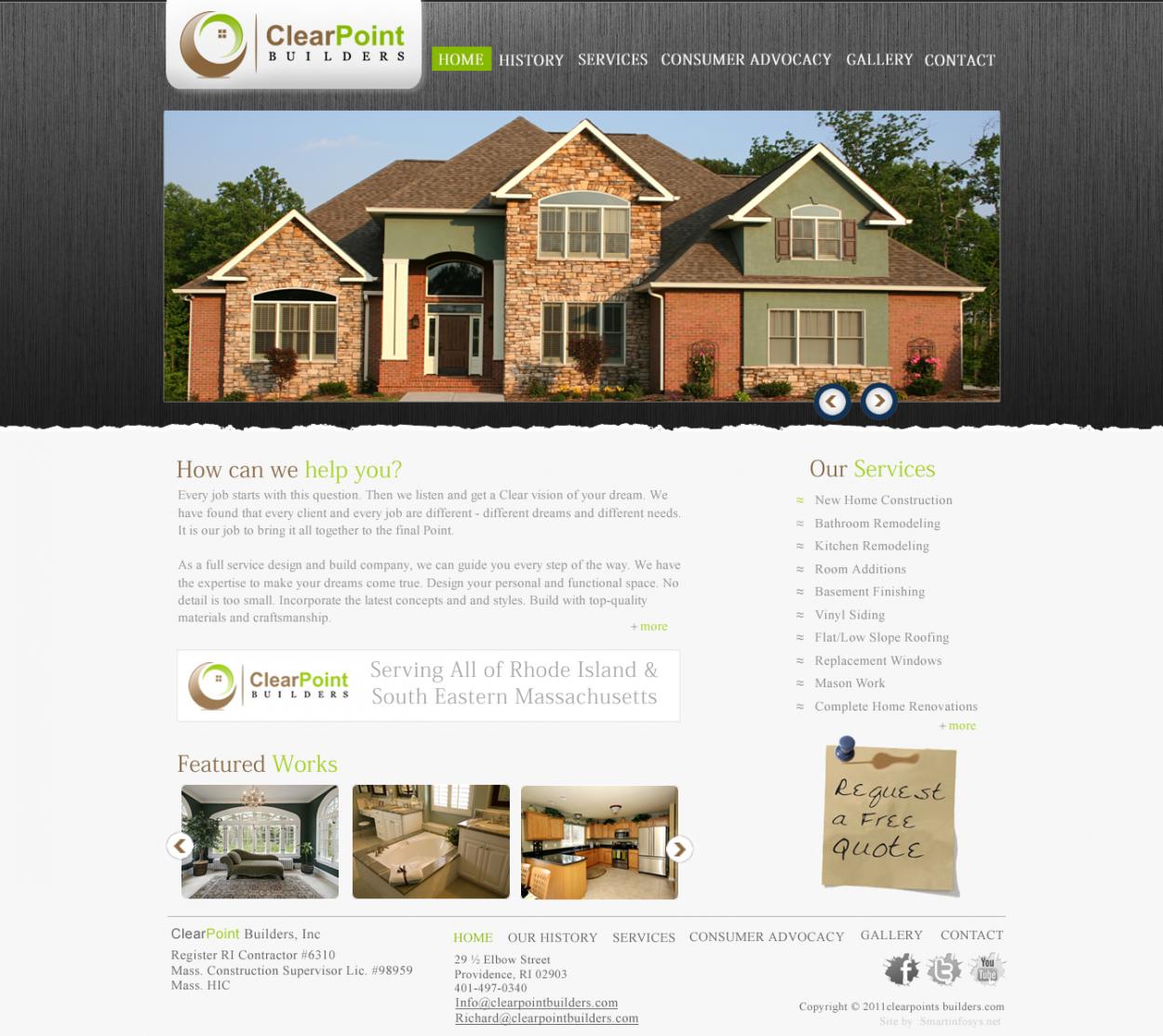
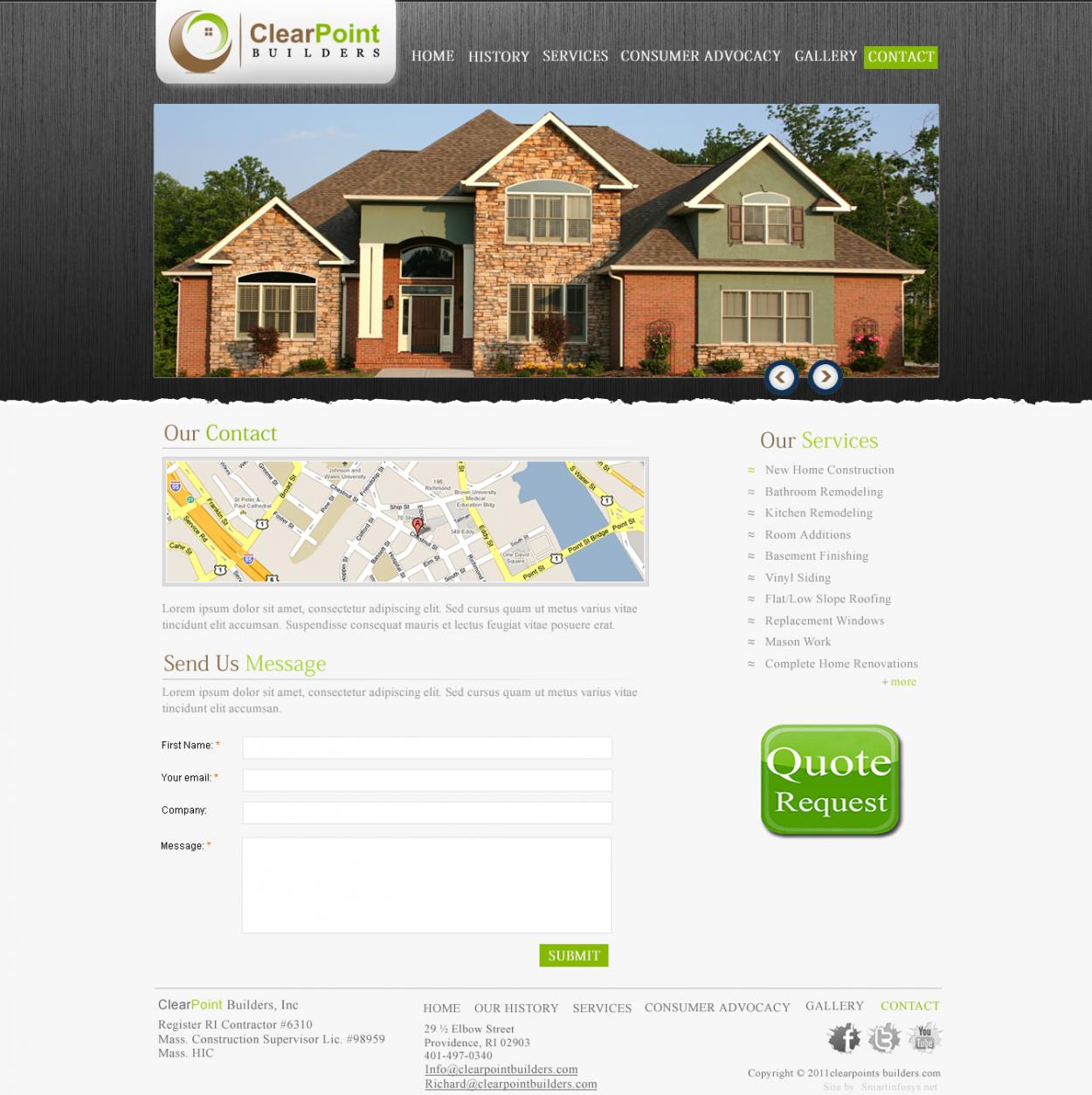
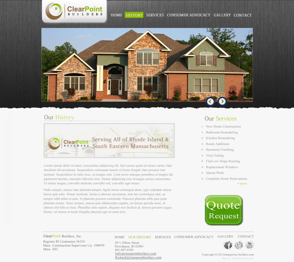
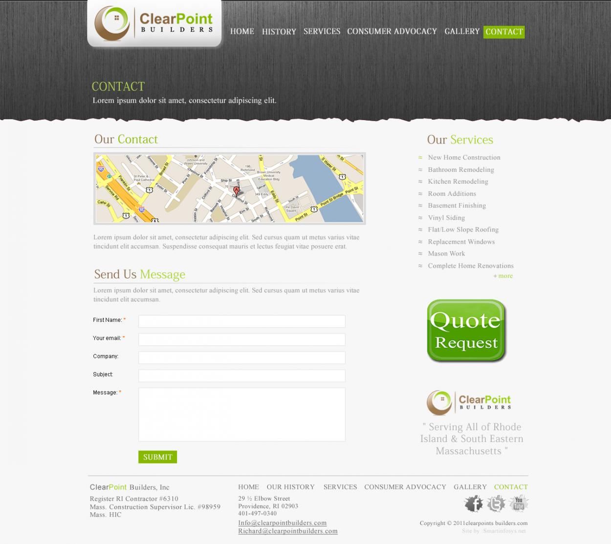
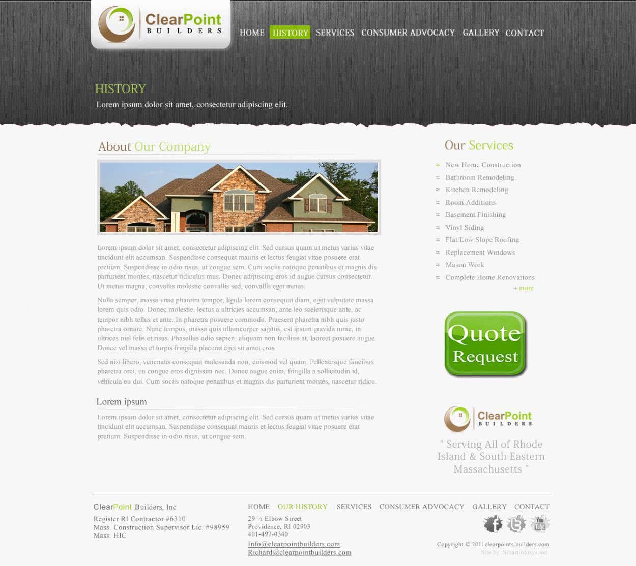
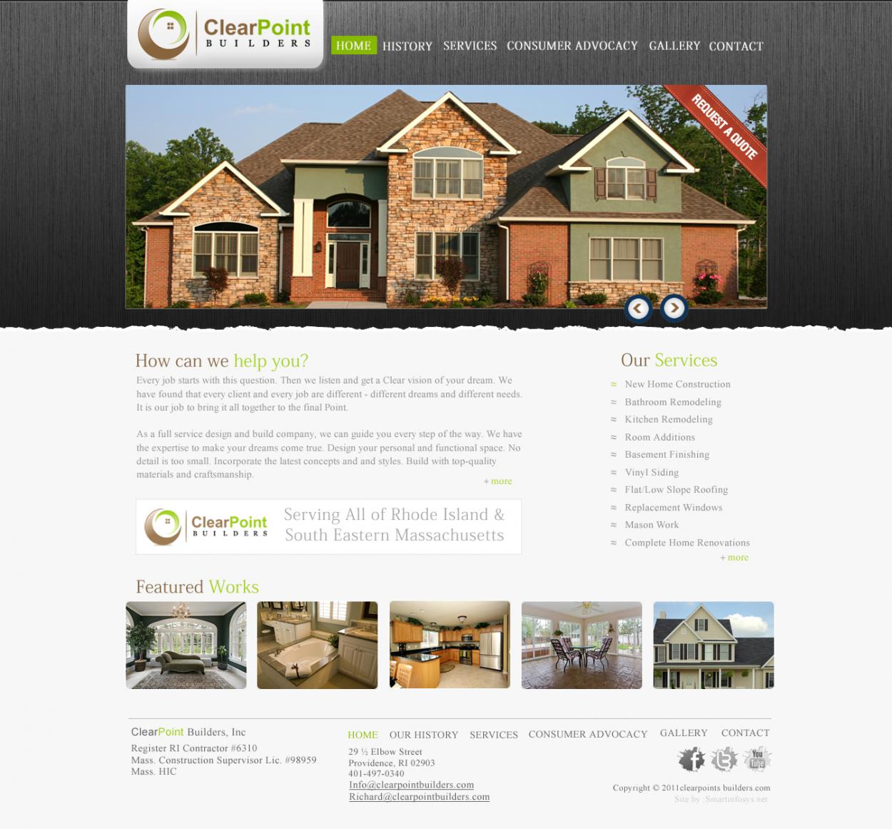
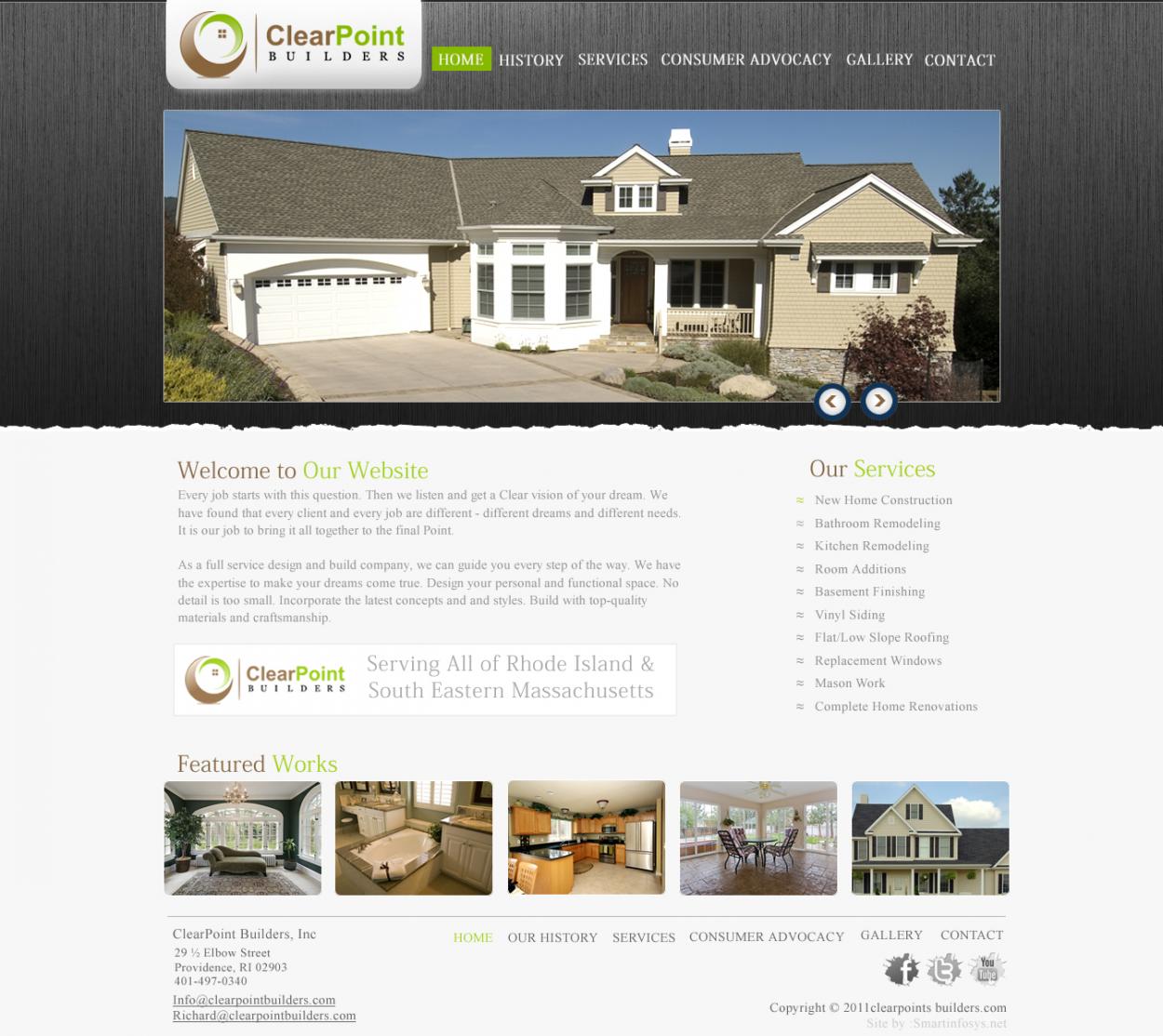
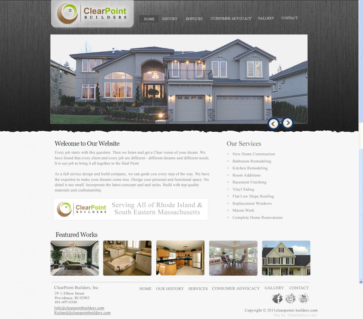
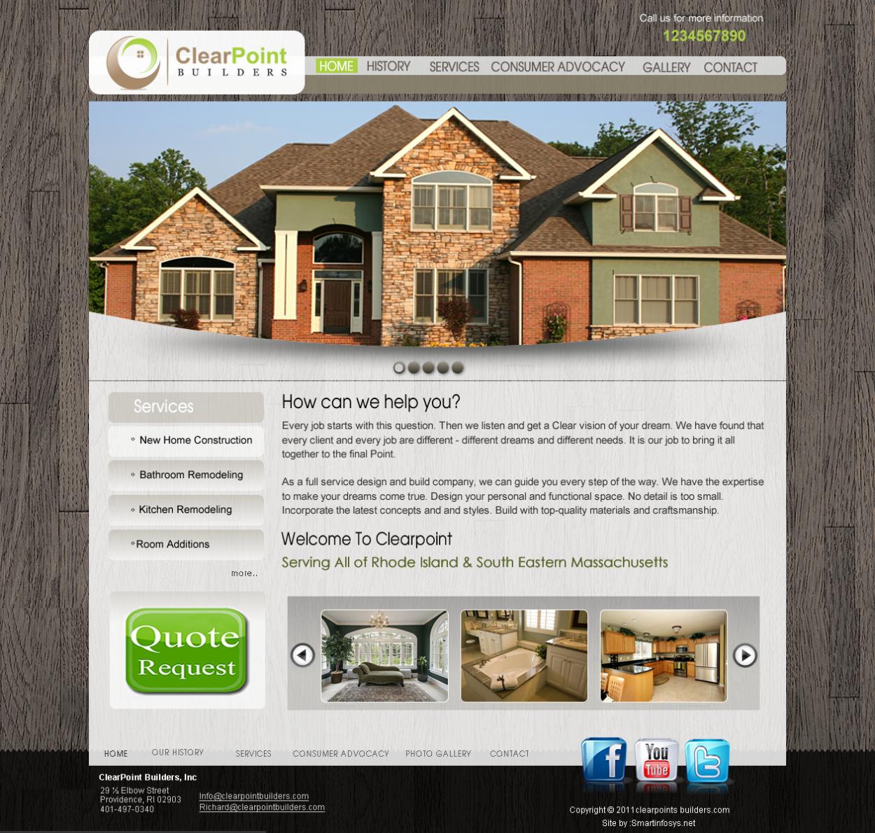
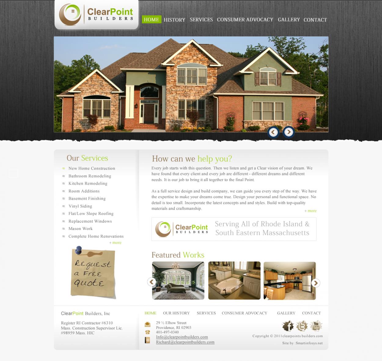
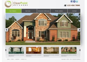
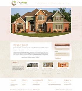
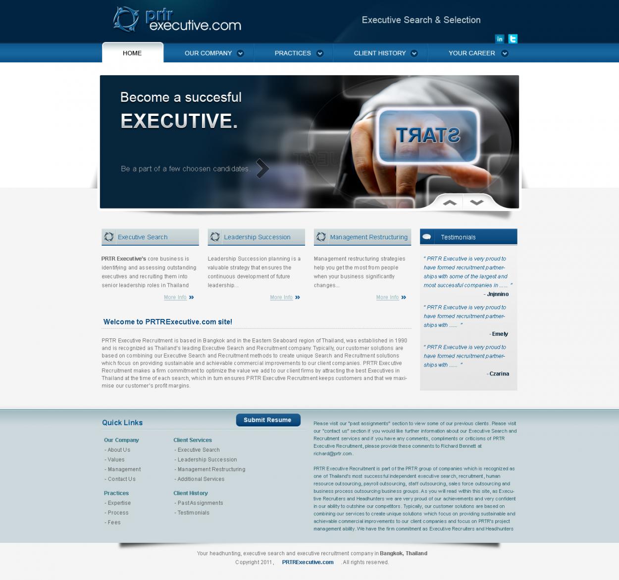
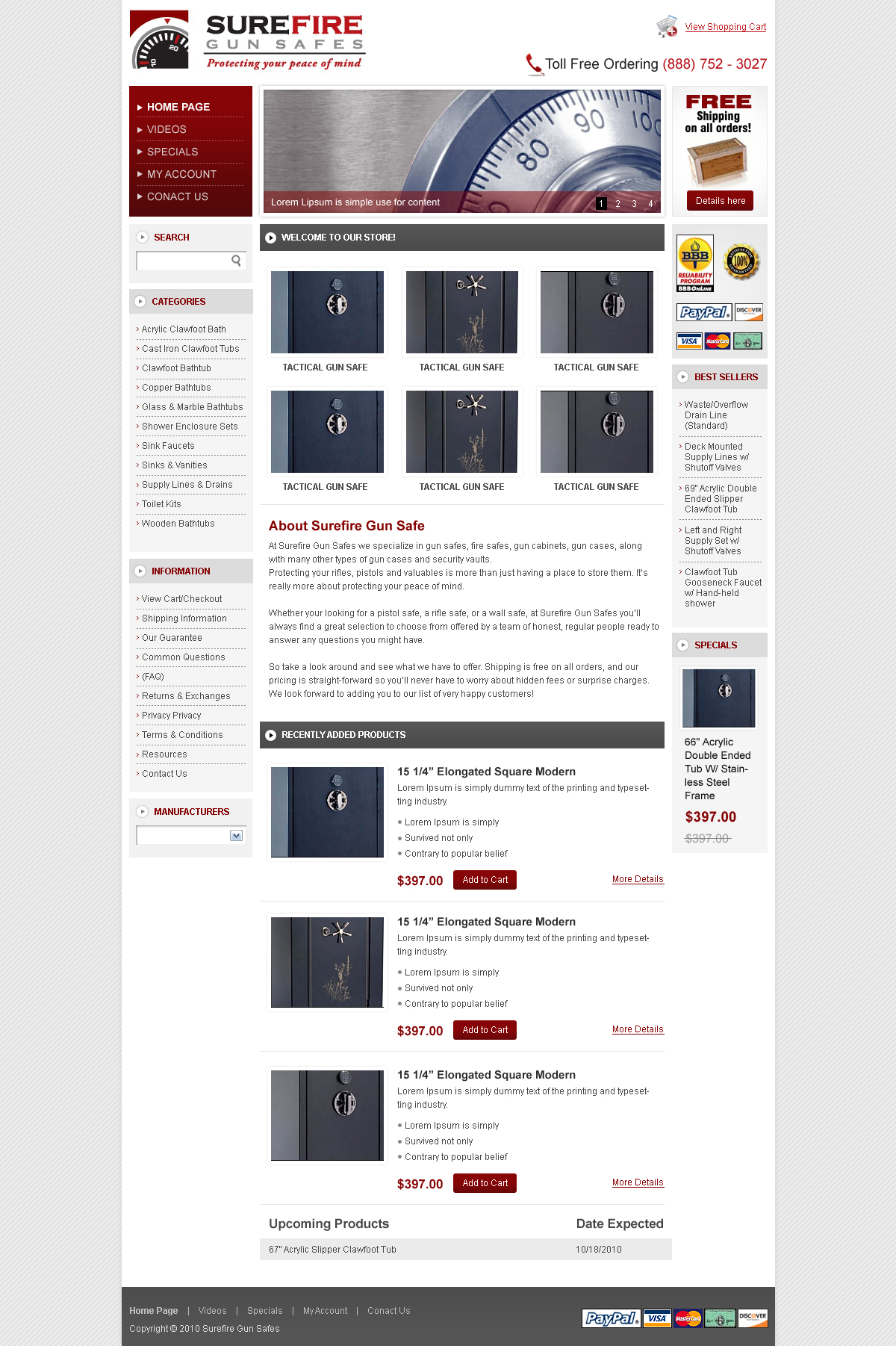
Darker font, they are washed out by the light background. A solid white or other color behide the logo. Navigation heavier font, difficult to see. "What can we do for you?" this is the first line before Every job starts with... it should stand out and be larger font. Use a little color below, like the trademark colors of the social links amd to the left colorize ClearPoint Builders... let's see where that brings us. Thank you.
Nice job so far Vinit, (from one partner of 4 partners (Family) here at ClearPoint.
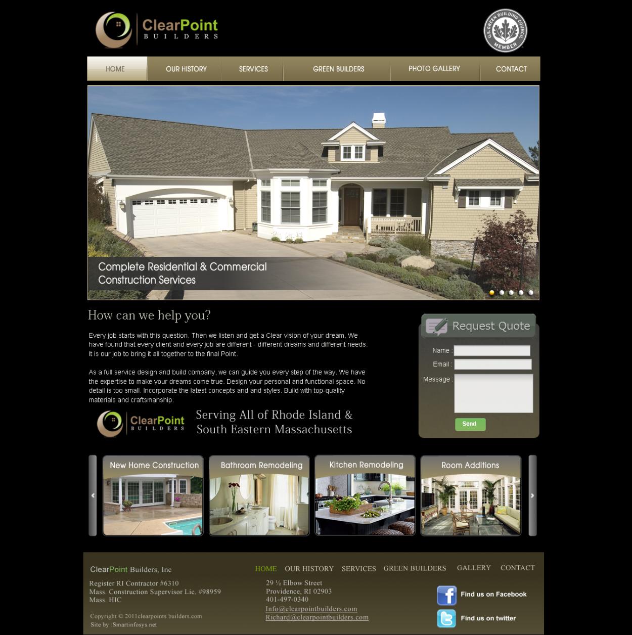
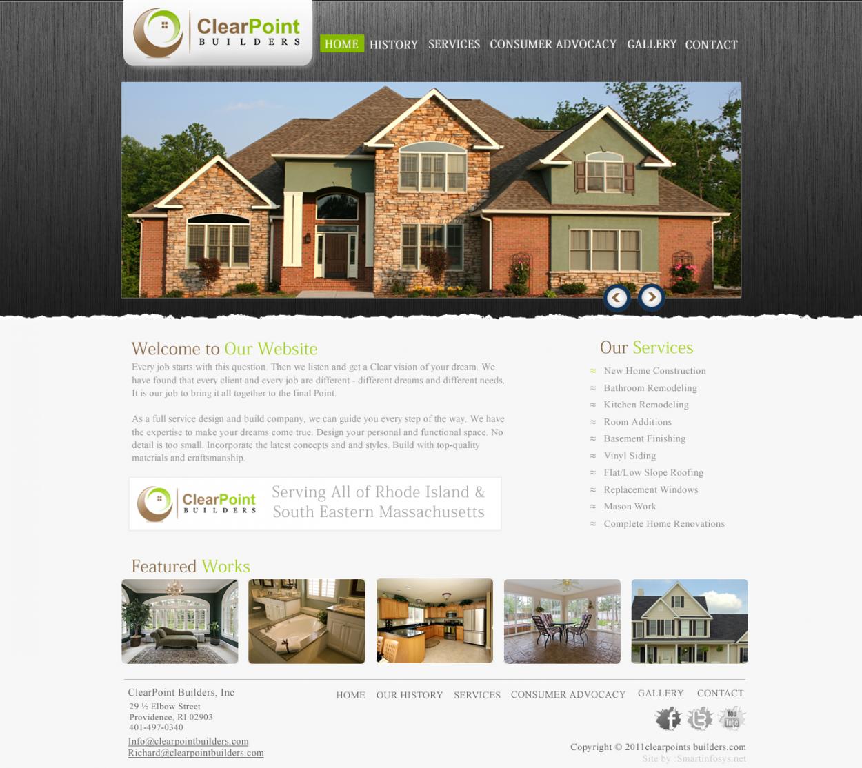
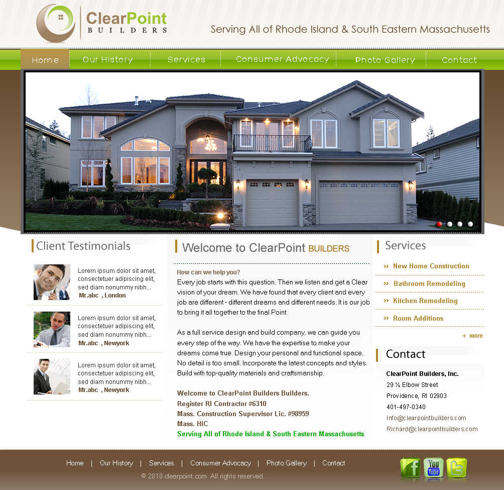
I like this very much. I know I will add some stuff, but I like your design and colors. I love the fact that you placed the logo twice! It is in fact different then what I had in my mind, but I did ask for creativity... Give me a little while to digest it more and have my over the shoulder reviewers get a look too and we'll see if we cant continue the momentum of the creative... Thank you for your talent!
.
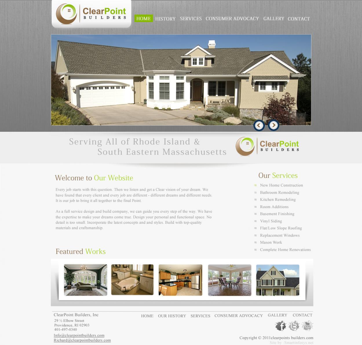
Hello please view this entry. Seems problem in last entry upload & earlier hence we had withdrawn it. Thanks
Browse other entries from this Web Design Contest
Browse other Web Design Contest
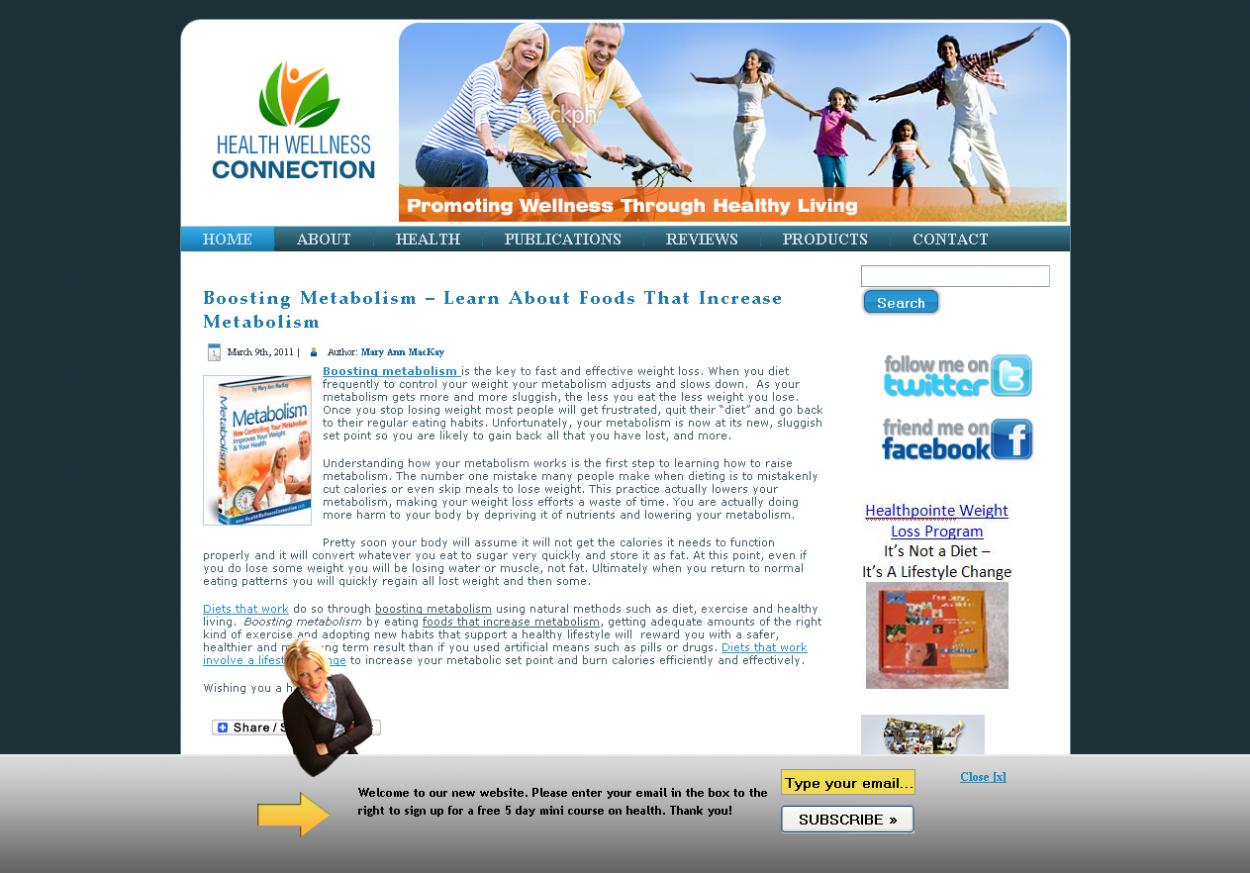

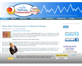
Web Design Contest: Health Wellness Connection
Website design to promote healthy living
$250.00 Prize
37 ENTRIES


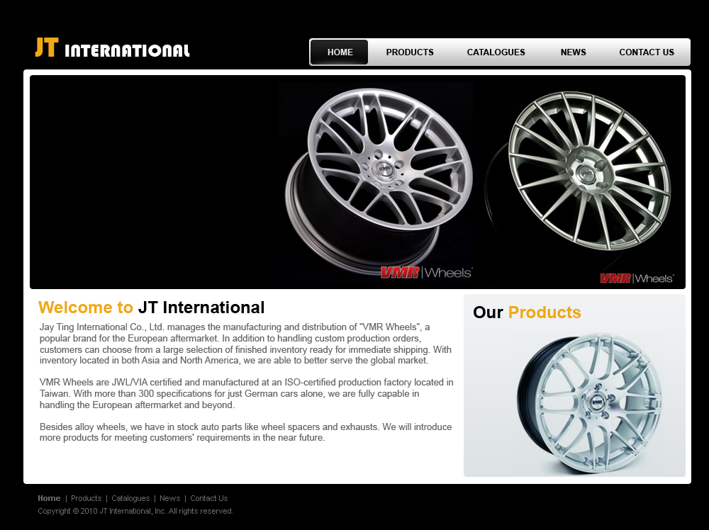
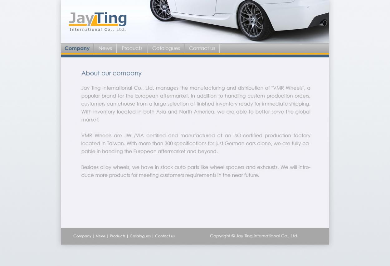
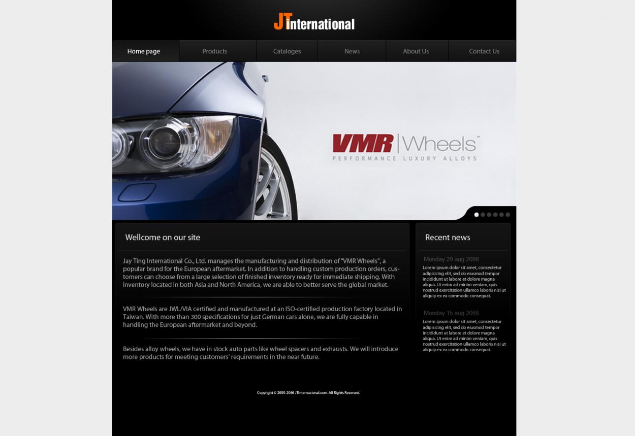
Web Design Contest: Home page for JT International
5-page website for trading company
$200.00 Prize
55 ENTRIES
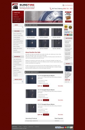
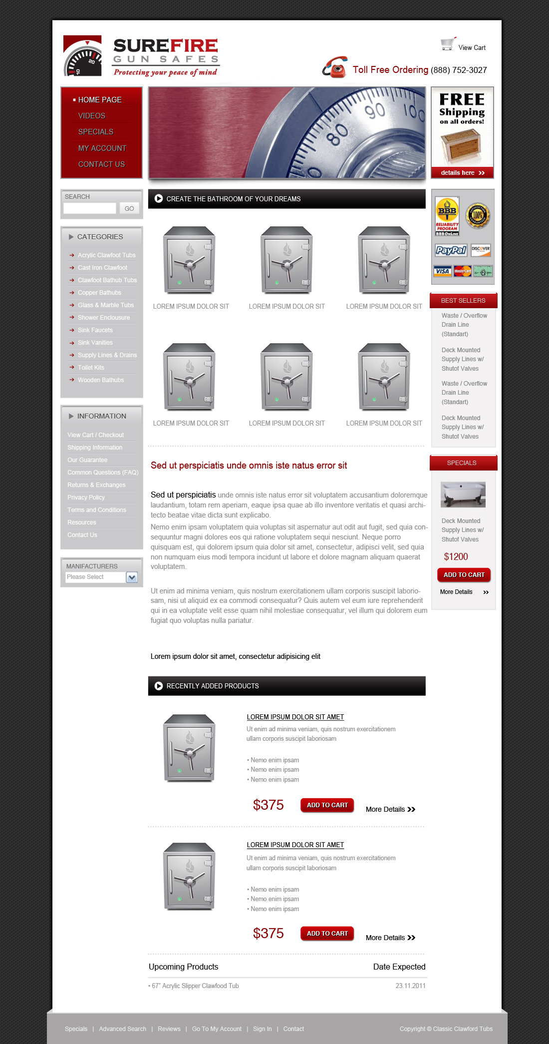
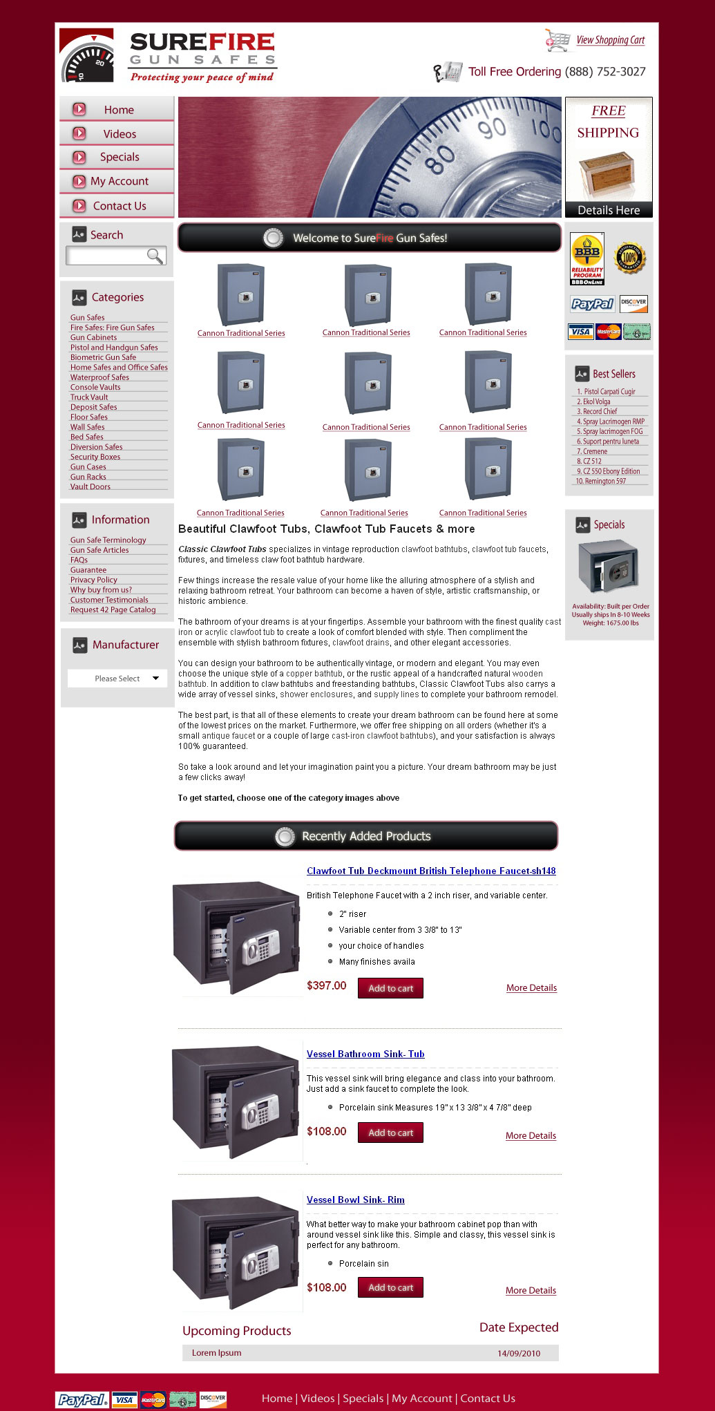
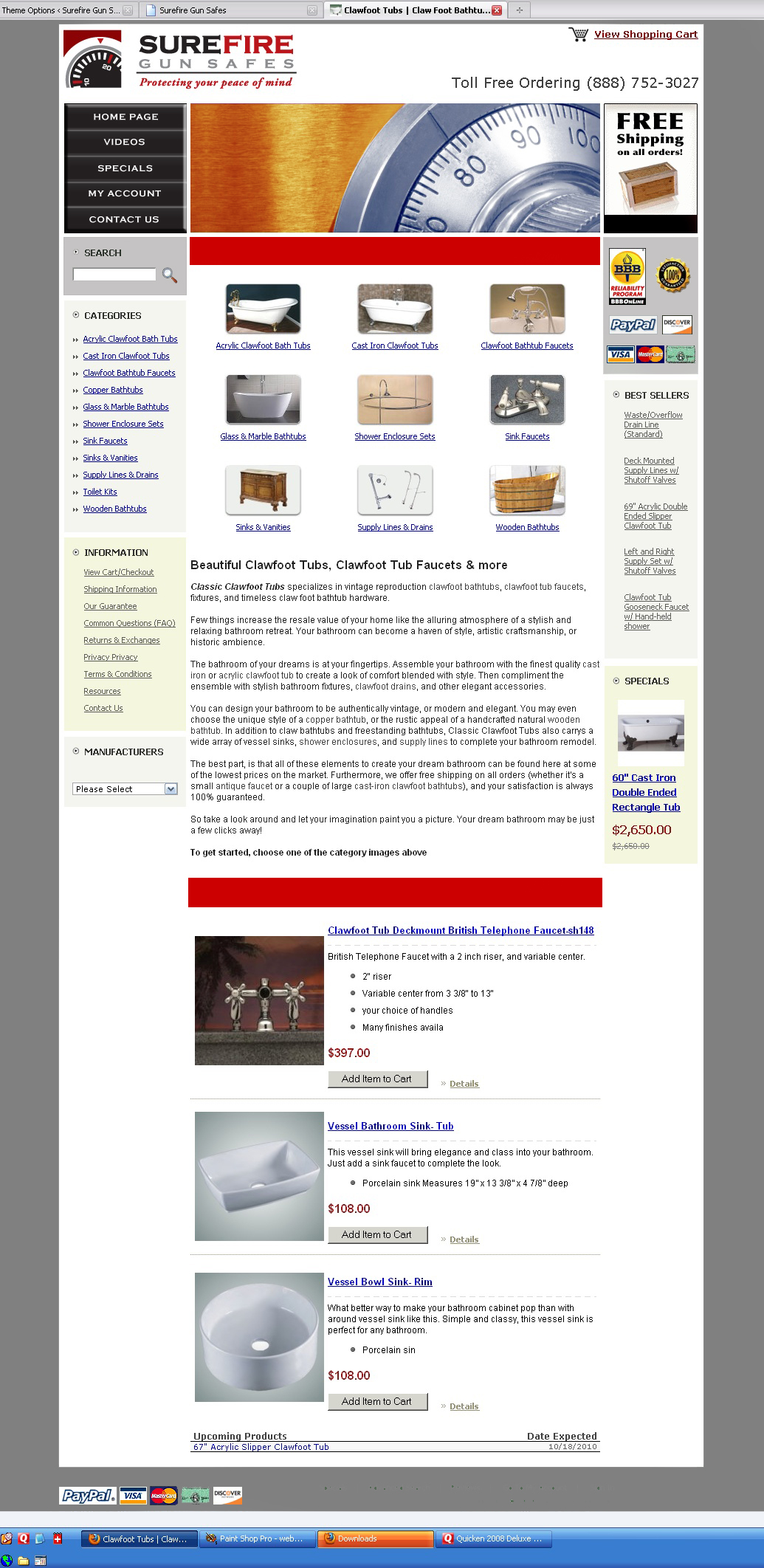
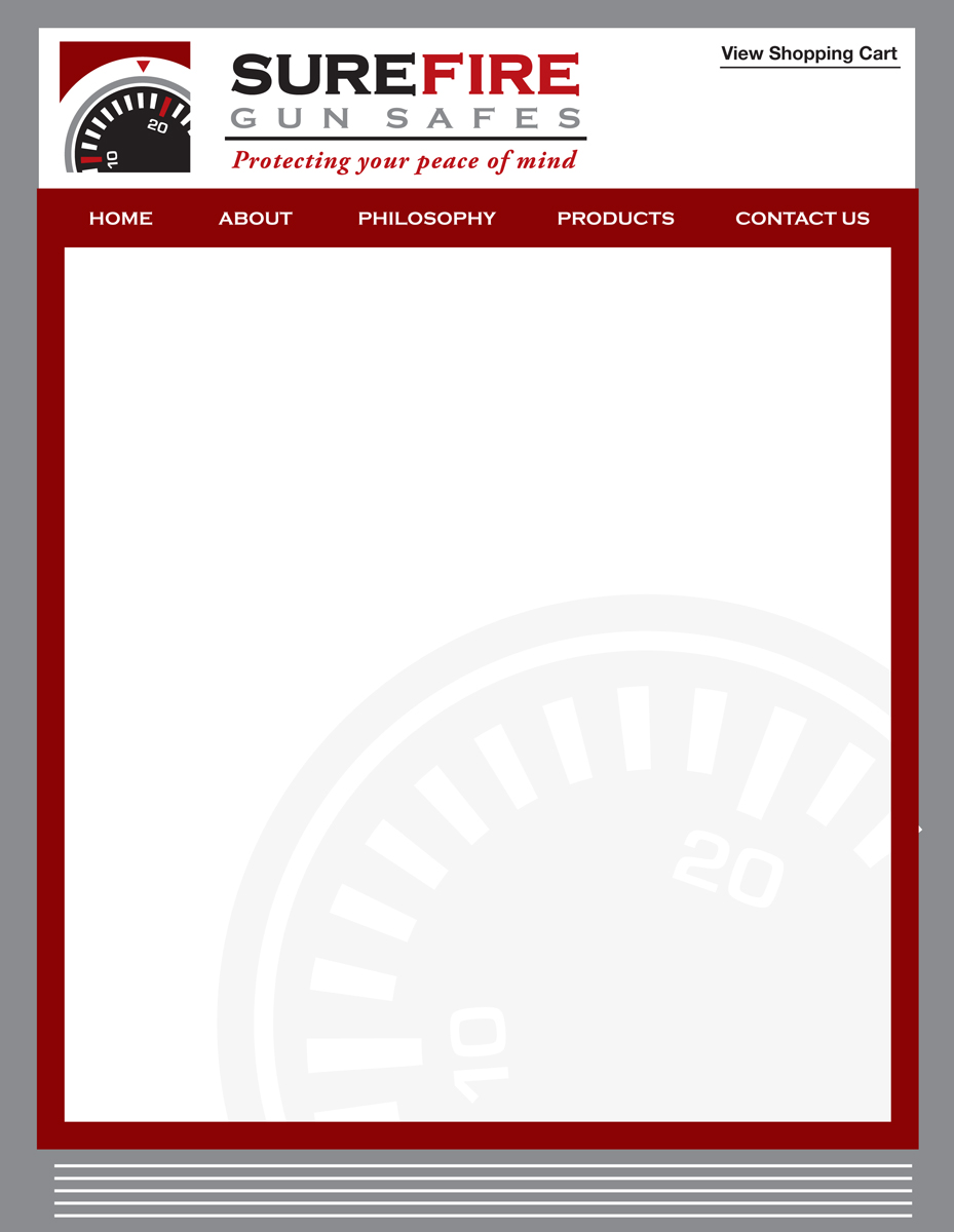
Web Design Contest: Surefire Gun Safes
Redesign color scheme of our template
$300.00 Prize
39 ENTRIES


Fast. Awesome. Affordable
About the Creative
38
38
154
nerdcreatives Bio
Graphic & Webdesigner with 09 years design experience.
Other entries by nerdcreatives:
Similar Entries