NBC was founded in 1926 and is known as the oldest major broadcasting network in the US, with a fascinating history and unique story. The American television network is owned by Comcast through NBCUniversal and is known widely for its simplistic and classy logo. Perhaps even more interesting than the company’s history and the unique beginning is the history of its iconic symbol that has made its mark on the world with just one stylish design. To say that the iconic peacock logo has become famous would be an understatement; the symbol has made its mark not only on the network industry but everywhere it’s shown. Although you might associate NBC today with its iconic multicolored peacock logo, the network’s emblem has come a long way to reach this point.
The Complete History Of The NBC Logo
The logo, widely known throughout industries and viewers around the world, has an exciting history that has gotten it to this point. For nearly a century, the network has had incredible success. It has made history with its television programs and the colorful symbol that proudly represents the company has made an impact. In this article, we’ll talk about the history of this iconic logo, where it originated, and its journey to reach the stunning logo that we see today. We’ll also examine the importance of the logo and what has made it the masterpiece it is today.

1926 – 1931: The Beginning Of The Logo
The first logo looked drastically different from the one we’re familiar with today. Created in 1926, the first logo was black and white with a simplistic style. This first logo draws attention to the time it was made and focuses on detailing the company. The logo showcases a microphone in the center with lightning bolts coming out the side. This is shown over a map of the United States which is also in black and white, merely an outline in the back. Above this design, the letters “NBC” are shown in a thick black font and a curved style. The logo is creative while also being simplistic, informative, and unique.

1931 – 1943: A Simplified Version
The first logo stayed with the company for five years before the network decided it was time to change. They opted to adjust to the second logo, a square with NBC text shown diagonally inside it. They opted to keep two elements from the previous concept; the lettering and the lightning bolts. We see the lightning bolts shown around the ‘B,’ drawing attention to the one middle letter. The details were black on a white background, keeping the logo’s simple yet classy appearance.

1943 – 1946: A New Design
After twelve years of use, the second logo left the company in 1943 and was replaced by a fresh design. This new logo was more modern, contrasting with a white background and a black microphone in the center. The logo showed red lightning bolts on either side of the microphone; if you look closely, you can see the difference between the two. The waves on the left were meant for the radio network, while those on the right were meant for the television network. This new logo modeled the original logo used in 1926, simply making a more modern version with refreshed features.

1946 – 1952: A Simpler Version
Three years later and the network decided that they wanted a cleaner symbol that they could use to promote their company. This version removed any fluff from the design and decided to keep it an entirely text-based design. This design used a thinner font than the previous designs had, simply showing the letters “NBC” in black letters on a white background.

1952 – 1953: A New Font
The network must have liked the cleaner design option because it stayed with the company for six years before they decided that the only change necessary was a new font. This font was thicker than the previous one had been, still showing the same letters but this time with black shadows behind the white letters. The notes made a strong impression, standing out sharply against the white background and highlighting the network’s name.

1953 – 1959: A Completely New Design
After only a short year with the new text design, the network decided it was time to make its most significant change to its symbol. They introduced a unique design that showed a xylophone and mallet, stylized with three colors and a black mallet. This logo was made to symbolize the NBC chimes first heard as a seven-tone sequence on NBC radio back in 1927.

1956 – 1975: The First Peacock Appearance
Three years later, the iconic peacock appeared on the network. This new logo that used the peacock was designed by Herb Lubalin and John J. Graham of Sudler & Hennessey in 1956. This design opted to take the logo in a completely new direction with various bright colors and a different kind of design. This design used a concept of a peacock with eleven brightly colored feathers that stood out in contrast to the white background. The symbol is unique, using a striking white bird against the brightly colored tail feathers, with small spiked balls at the end of each feather. These brightly lit colors stand out against the white bird outline and the stark white background.

1958 – 1975: The Snake Logo
The following logo that the network came out with is called “NBC Snake” because of its unique symbol. The logo opted to use a text-based design, using only the letters “NBC” in a thin black font on a white background. The reason that this logo was labeled as the snake logo is due to how the letters intertwined with one another and appeared like a snake. This logo didn’t replace the previous peacock logo that the company used but was used in addition to it, used at the end of every show on the network. The typographic logo is clean and stylish, showing the “C” as the base of the logo, with the other two letters stacked on top of it and intertwining with one another.

1975 – 1979: The Red, White, and Blue Logo
his logo was called “Big N” and, as the name implies, showed a big ‘N’ for the design. This logo was designed by Lippincott & Margulies and Dolphin Productions (TV) and showcased red, white, and blue for the color scheme. This logo only stayed with the company for a short time before it was canceled due to legal action from Nebraska ETV. Nebraska ETV filed a trademark infringement lawsuit against NBC in 1976. The “Big N” logo was nearly identical to the logo that Nebraska ETV had started using in 1974. The only difference between the two logos was that NBC’s logo used blue, making the two designs virtually identical.

1979 – 1986: The Improved Peacock
The following design created for the network opted to keep only the outline of the “N” in the background and use the peacock, creatively combining the two logos. The outline of the “N” was shown in blue behind a colorful peacock. The peacock has its head held high the aspect that earned the logo its nickname “The Proud N.” This logo is outlined in a thin blue line, the same coloring as the letter shown behind it, and the feathers are mirrored on either side of the logo. In the center of the feathers, one single blue feather is shown with a white stroke in the center of it.

1986 – 2010: An Update
The previous logo stayed with the network for seven years before they decided it was time for an update. The logo was simplified, now only using six feathers for the peacock and removing the blue “N” from behind it. The peacock’s head now turned towards the right, representing the network looking towards the future. The logo also showed the peacock above the letters “NBC” in bold black letters and a thick font. This logo was more straightforward and cleaner than the previous one, with the redesign pulling things together for the logo.

2010 – 2013: A Simpler Redesign
Three years later, the network opted to simplify the logo further, updating it to be more original and cleaner than the other design. This design was made for media format and the most significant change made was a glossy look added to the design. This glassy look came from the translucent gray color used to replace the white that had been used on the design previously. Besides this change, the logo is kept the same in appearance with the same colors in use and the peacock’s head turning towards the right.
2013 – Now: The Logo Today
Three years after the changes were made, the logo was improved once again, this time small adjustments merely being made. The emblem had minor adjustments to its appearance, a few highlights, and a larger peacock to improve it. Because of the reflections used in the design, it became three-dimensional and had increased volume. This design is the one we see today used for the network, having been in use for nearly a decade.
The Launch Of The Streaming Platform
On July 15th, 2020 NBC launched Peacock, an online streaming platform that offers free and paid subscription options for users. This platform followed the same idea as many media streaming platforms before them, the largest difference being that this platform offers a free platform to users. At the time people were beginning to look for more affordable options and NBC, recognizing this, took the opportunity to create the streaming platform Peacock. For their new streaming platform, NBC also created a new logo instead of using the same logo that they use for their network.
The logo for the steaming platform opts to use a typographic design, simply showing the word Peacock with the letter P closely resembling a peacock’s head. The network keeps the two logos closely resembling each other, using the same colors for the streaming platforms logo while also remaining different. At the end of the company name it shows a row of dots, each colored the same as NBC’s logo and adding a bright element. These two logos are familiar while also being different and unique to their company.
Elements Of The Design
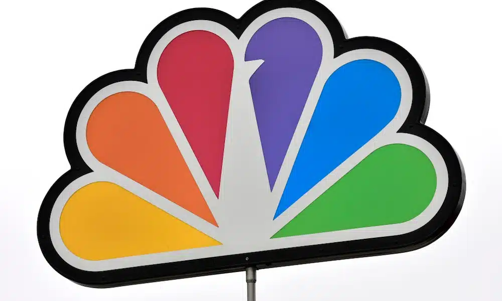
As you can see by merely looking at the logo, it has a variety of unique and individual colors that make it stand out. This logo has a variety of elements that are used to pull together the design, the main one being that the colors used are bright and add character to the design. When you look at the design, the first thing that stands out and makes its mark is the variety of colors and the animation that makes it specific. Every design feature is used to demonstrate a part of the company and plays a role in promoting the network. Modern design has various unique features; each is an intentional part of the design and plays into the company.
In the case of the colors used in the design, each one is calculated and represents a part of the company:
- Purple is for stations.
- Green represents productions.
- Orange is for sports.
- Blue is for network.
- Red is for entertainment.
- Yellow is for news.
Turkey or Peacock?

One of the most common questions viewers have about the logo is whether it features a peacock or a turkey since the two are easy to mistake. The iconic NBC logo shows a stylized peacock, introduced in 1956 and since then redesigned to be the icon that we see today. This peacock isn’t only symbolic because of the creativity that it holds but also what it represents for the network and the value that it brings.
Summing It Up

NBC is the leading network around the US and has made its mark on the world. In this article, we discussed the history of the famous network and the journey that it’s endured to reach the popularity that we see today. One aspect of the network that stands out and has made an impression on people is its symbolic logo that represents the company. As we’ve seen with the history above, each variation of the network’s logo only stayed around for a short time before a redesign replaced it.
Although each logo has only been around for a short time, the newest logo has stayed around long enough to make its mark and become a significant part of not only the network but the world in general. This logo exemplifies what an iconic symbol can do for a company and what’s necessary to succeed with a design in the industry.