


Columbia Pictures, a prominent American film and television powerhouse, holds an esteemed position among fervent movie fans.
Throughout its rich and eventful history, the company has encountered numerous challenges on its path to growth, constantly seeking to push boundaries and embrace innovative technologies.
As a result, Columbia Pictures has continuously reinvented itself, undergoing multiple changes to remain at the vanguard of the industry. Astonishingly, the brand has undergone a remarkable total of 14 rebranding endeavors, accompanied by alterations to its logo and on-screen imagery. In many instances, a logo would only retain its presence for a fleeting duration of one or two years.
Thus, the saga of the Columbia Pictures brand logo unfolds as a captivating tale of evolution and adaptability. Today, the studio proudly unveils its latest emblem, symbolizing the culmination of relentless pursuit and unwavering dedication to excellence in the ever-transforming realm of entertainment.
Let’s dive in.
The Start Of The Company
The origins of this renowned film company trace back to its predecessor known as CBC Film Sales Corporation. Founded by the Cohn brothers, the business operated as a tightly-knit family affair, with only a handful of non-related individuals, including producer Joe Brandt, forming part of the staff. Regrettably, the venture did not succeed, leading some to dub it the “Corned Beef and Cabbage” company.

After enduring five years of financial hardships and setbacks, the family behind the company found themselves teetering on the brink of failure in 1924.
Desperate for a fresh start, they made the bold decision to undergo a complete rebranding. This strategic move proved successful in distancing themselves from their previous struggles, breathing new life into the business, and preventing its demise.
However, it’s worth noting that Columbia Pictures didn’t achieve instant success as the renowned American film and television leader we know today. In fact, during the early 20th century, the company languished near the bottom of the competitive ladder among its counterparts.
During this period, the studio found solace in a few lucrative ventures. Movies like “Hawkes and Capra,” “It Happened One Night,” and “Mr. Smith Goes to Washington” emerged as significant money-makers, along with the comedic exploits of the Three Stooges. These productions required minimal investment yet managed to keep the company afloat.
A fortunate turn of events in the 1940s provided a lifeline for the struggling studio.
By chance, Harry Cohn discovered Rita Hayworth, a talented film actress, and dancer who skyrocketed to fame after her role in “Gilda.” Hayworth’s success revitalized the company and boosted its profits. Sensibly, Cohn also redirected one of the company’s divisions from animation to producing television series, a decision that proved highly lucrative starting in the early 1950s.
The turning point came in 1962 when David Lean’s epic film “Lawrence of Arabia” clinched four Academy Awards. This remarkable achievement marked a significant milestone for Columbia Pictures and paved the way for subsequent Oscar-winning pictures. Gradually, the company ascended to national prominence, striving to become a flagship in its industry.
The 1960s posed significant challenges for many studios, and Columbia Pictures sought support from its investors during these trying times. The Coca-Cola group acquired the company in the 1980s, but nearly a decade later and the Sony Corporation secured a controlling stake, propelling the studio into a meteoric rise that continues to this day.
Throughout its rich history, the company’s brand promotion and logo development were influenced by these pivotal events and fluctuating fortunes, resulting in frequent changes to its visual identity. Now, let us embark on an exploration of the various Columbia Pictures logos that have graced the screen since its inception.
Columbia Pictures Logo Over Time
As with many iconic companies, the company has had many signature logos throughout its years. Although they have all made a significant mark on the company and its viewers, there have been many different logos throughout the years.
Some have been entirely original logos, while others have been simply refinements and edits to previous logos. Changes, both large and small, have been made to the logo until we’ve reached the iconic and signature logo that is beloved and associated with the brand today.
One aspect of the company that has been iconic since the beginning and has certainly become a signature aspect of the company is the lady and the torch. First introduced in 1926 this logo aspect of the company became unique to the company and a part that would fully integrate with the company for the remainder of it’s years. Let’s take a look at the Columbia Pictures logos throughout the years.

The First Logo (1937)
The original logo, created back in 1937, was a purely text-based design. Instead of opting for any type of emblem with the design, it merely showed the letters C, B, and C in large letters at the top, and below it had the rest of the name. This was before the company’s name had been changed, so it was simple and used a bold font for the first few letters and a thinner font for the rest of the name. Overall this design was unique for its time, but it definitely got some superior upgrades in the following years.

The company rebranded in 1924 and revealed the first official Columbia Pictures logo. This time the logo showed an oval shape with a woman in the center and the company name above it. This design was entirely in black and white, with only a rough outline of the woman instead of a full design. The design was simple yet elegant, tying together important elements of the company in modern ways.

The Columbia Pictures Logo from 1925 to 1926
In 1925, Columbia Pictures changed its icon to one that was more refined and modernized. This design showed a circle with a lady in the middle holding a plate with the company’s initials. The design was in black and white, set against a solid dark grey background. It showed the company name inside of an inner circle in white. The circle itself was in black, along with the outer circle. The lady inside was shown in white. This design was unique and stylish for the company. However, it wasn’t to last.
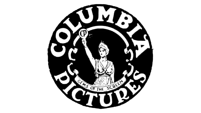
Columbia Pictures Logo from 1926 to 1932
In 1926, the iconic Lady with a Torch graced the company’s logo for the first time. It sat in a circular emblem with a black background. The design showed the lady holding the torch in the center, with the company name around her. The design was entirely in black and white, placed on a white background to stand out and make a mark on those seeing it. The letters were large and bold, standing out.

1932 to 1933 Columbia Tries Color
The year 1932 rolled around, and with it, the company decided it was time to try adding color to its logo. This time they opted to use a circular design with the lady holding the torch inside of a smaller circle in the center. The company name was around her, also shown in red. The design was unique, with almost a retro aspect.

Bringing Back The Classic 1933 to 1936
The next thing the company did was opt to return to the black-and-white color palette they had used previously. This was a powerful design that truly made a movement for the company and used stark comparisons to stand out. It would last just three years, however.

A New Design from 1936 to 1938
The year 1936 came and with it came a shape replacement to the design. This time the design opted to use a rectangle instead of a circle as the main part of the design. Inside the rectangle showed a smaller rectangle with the company name shown in a bold font and a design setting in the middle. The design was unique and yet individual to the company, earning it a much-needed redesign.

The Logo from 1938 to 1945
The company shortly decided to go back to the circle that they had used previously for their company. This logo featured a circle with the company name in an interior circle and in the very center, a lady holding a torch. There were some sunbeams shooting out behind the lady and the silhouette was elegant and showed in an outline. The design showed all aspects of the design in black except for the background, which was shown in a beige.

The 1945 to 1964 Columbia Pictures Logo
1945 proved to be an exciting year, and with it, the company decided it was time to use a secondary logo for its brand. This logo showed a black and white design with a ribbon wrapping around the lady holding the torch. The ribbon had the company name in bold font.

A New Update Through The Years 1964 to 1975
This design, created in 1964, was the simplest and most minimalist style that the brand had throughout the years. This design had a C as the main element of the design and a torch inside it. The symbol was in white with a black outline and shadow. The entire design was enclosed in a monochromatic color scheme.

1975 to 1981 Something Totally Different
In 1975, a completely new design took over. It showed an iconic symbol with the company name in a bold black font. There was also a half-circle emblem in black and white that sat above it. The logo showed sun rays coming out toward the tom in white with a black background. It sought to create a fresh and iconic look for a new era.

She’s Back! 1981 to 1989
With a new year came some changes to the design that included the lady with the torch. It was surrounded by the same rays as the previous design on a black background. The iconic font, however, remained unchanged and still remained an iconic symbol of the company.

1989’s Reversal of the Coloring
With the year 1989 came a color switch that created a new and iconic logo for the company. This still showed the lady with the torch, but this time, a pink background was placed behind the lady with the torch, which was shown in black. The design was simplistic, but the peach-colored background added a new touch of individuality to the design.

1992 to 1993 A Quick Detour
In 1992 and for only a year, the Columbia Pictures logo took the icon from the previous design and put it next to the wordmark on the right side. The wordmark was constructed in large capital letters in a bold serif font that took up two separate lines and matched the height of the lady with a torch icon.

The Logo Used Today (1993 – Present)
The logo used to this day and familiar to Columbia Pictures fans showed the company name to the left and the design to the right. The font was unique and artistic, standing out in a bold manner while the design opted to be more elegant and individual to the brand. The design showed the lady holding the torch, while the wordmark was larger than the design and stood out.
This version of the logo has also been seen with the wordmark beneath the icon.

You can also see a full-color version of the logo with the lady with a torch icon shown in the same style as is used during the opening scenes of their films. This logo and painting was a specially commissioned project with its own unique history.


As time passed Columbia Pictures decided it was time for a change and this time they decided to make their logo more modern. When painter Michael Deas needed a reference for the logo he was creating he opted to use a friend from the New Orleans paper The Times-Picayune. In her home, a friend named Kathy Anderson created the basis for the iconic scene we see today with billowing, mountain-like clouds and the soft shining light of the torch.
Columbia Pictures Logo Key Elements
While there have been many versions of the logo with their own unique aspects, they’ve shared a few common features.
1. The Lady with a Torch

There’s no doubt that if you’ve heard of Colombia Pictures you’ve already seen the iconic lady holding a torch graphic.
This emblem is commonly associated with the brand and stands out to fans of the company. This logo has many familiar aspects that stand out and make a difference, ultimately giving viewers a feeling of familiarity and elegance.
2. Black & White Coloring

For most of its life, the logo has existed in black and white. The sharp contrast and timeless monochromatic color palette showcase the brand’s long-standing history and modern sensibilities. However, the brand has used the full artist rendition of its lady with a torch as a logo as well.

3. A Representation of the Sky
Whether it be the beams shooting out of the torch or the subtle clouds of today, the background behind the lady with a torch has always been important to the logo. Since the beginning, setting the woman against a sky has been a part of the design and is unlikely to go away.
Conclusion
This logo is by far one of the most recognizable icons in the film industry.
While it’s changed quite a bit over the years, there have always been constants among the images.
The Lady with the Torch is the most iconic of them to date. Her strength and Goddess-like image celebrate the strength and victory of the brand, and she will surely continue to be the face of the company for years to come.


