When it comes to electronics, most of us want to purchase our products from a company we know and trust. Whether that is Microsoft, Amazon, Sony, or another reputable company, with electronics, brand loyalty is everything.
That may lead you to ask yourself, “How is brand loyalty built?” Well, the answer is short and sweet – simply put, a company builds brand loyalty through a timeless logo design. And that’s the story for the brand, Sony.

Sony is a company that has been around for over 75 years and it’s a company whose logo is known all over the world..
This logo recognition didn’t happen overnight and if you are eager to learn more about Sony’s story, then you came to the right blog post.
Throughout the remainder of this article, we’ll tell you how Sony created a universal logo that as a result, generated brand loyalty for the company, and has made it the leading technology company we know today.
Meet Sony

Most of us know the Sony brand at a surface level but let us introduce you to the brand on a deeper level. Sony was founded in 1946 in Tokyo by Akio Morita and Masaru Ibuka.
What was founded in 1946 has grown today to be a leading electronics consumer brand creating computers, video games, accessories, and even robots that are sold across the globe.
Beyond these products, Sony is also an entertainment company competitor with a record label and production company underneath the Sony brand.
As the brand has developed, Sony’s philosophy has always stayed consistent. Sony’s mission is to “create and deliver products and services that contribute to the betterment of society” and that’s what the brand still strives to do today.
Every product Sony releases is a product the brand hopes will have a positive impact on the world. Sony today is credited with being not only the largest music entertainment company but also the world’s largest gaming console company and one of the largest gaming publishing companies in the world.
The Evolution of Sony
Above, we provided you with a brief introduction to the Sony brand but in this next section, we’ll take you on a deeper dive into Sony’s evolution.
1946: The early days of Sony

Sony was founded in 1946 by Akio Morita and Masaru Ibuku in Tokyo. When Sony was founded, it was founded as Tokyo Telecommunications Engineering Corporation. It took less than a year for Sony to release its first product, a megaphone. A few years later, in 1950, Sony released the first tape recorder in Japan.
During these early years, Akio and Masaru registered Sony’s logo as an official trademark. This strategic decision helped to publicize and roll out the brand on a larger scale.
1960: Sony expands overseas

After growing rapidly in Japan, Sony began to expand on an international scale. When founder, Akio Morita noticed the rapid rise of portable transistor radio purchases in the United States, he saw an opportunity to expand into this market. Akio decided to launch Sony in the United States in 1960 and as he did this, Sony was growing to be a leading exporter out of Japan. Once Sony was introduced in the United States, there was no slowing down – the desire for Sony products only grew. One of the key products Sony created during this time was the CD and one of the key strategic decisions Sony made during this time was to establish a Sony life insurance company.
the 1980s: Sony navigates a recession

After there was a global recession in the 1980s, the electronics industry took a hit. To stay afloat during this recession, Sony began to lower the prices of its products. With lower prices, Sony’s overall sales also fell, hurting the brand’s profitability. Norio Ohga led the company during this period and to combat the recession, Norio tried to expand Sony’s global reach. How Norio did this was by purchasing CBS Records and Columbia Pictures in 1988 and 1989.
Today: Sony’s continued growth
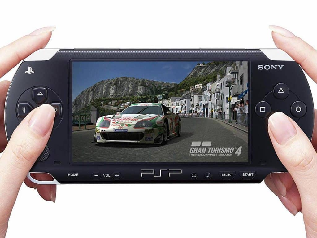
Since the 1980s, Sony was no stranger to innovation. Sony released new gaming consoles, like the PlayStation, and continued to grow its non-electronics divisions. Sony is known today as an innovative company and since first expanding overseas, Sony has remained a highly sought-after company across the globe.
Roadblocks Along the Way
Since Sony has kept the same logo for 50 years, Sony has been subject to pushback to update the logo, particularly in 1981 for Sony’s 35th anniversary. During this anniversary year, Sony went through the trouble of reviewing design submissions from across the globe but ultimately none of these were chosen. Sony felt that their current logo was superior to any submission, and while they received countless submissions, Sony stuck with what was working for the brand.
The other roadblocks that Sony navigated were related to the company’s products. Sony was a leader in the technology space releasing products like the Walkman, PlayStation, and more, but with any product release, there is always going to be competition. The electronics industry is a saturated one, so Sony was not immune to this. Sony is still a leader in this space today so any roadblock the brand encountered; was a roadblock the brand was able to overcome.
The Meaning of Sony’s Logo and Sony’s Logo History
As you go through Sony’s logo evolution below, you’ll notice that Sony’s logo has consistently reflected the evolution of the Sony brand, particularly as the brand transitioned from analog to digital. The designer widely accredited with the initial Sony logo design is Yasuo Kuroki. Yasuo not only worked on developing the early Sony logo but was also involved in the logo’s evolution. In this next section, we’ll walk you through the evolution of this logo.

1946-1955: The first version of the Sony logo
This first logo iteration was introduced once the Sony brand was officially launched. This first logo version was the official logo of the brand for nearly 10 years. The design is a simple, abstract figure in a bold, black color. The emblem resembles a trapezoid and overall appears to be a simple, geometric design.

1955-1957: The second version of the Sony logo
This logo version only lasted for a few years. This rebranding included a rethinking of the logo, and this design was more stylistic and contemporary than the first iteration. Instead of an emblem, this design included a wordmark that depicted the brand’s name. This wordmark was placed inside a black frame and this front choice resembles a handwritten script. This second logo version was registered as Sony’s trademark in 1955.

1957-1961: The third version of the Sony logo
After three years Sony went through a second redesign. This design was a bolder design that introduced a new typography, a rounded, serif font consisting of capital letters. To emphasize this wordmark, the designers opted to exaggerate the ends of the letters to create a unique design.
During this period, Sony was also rolling out its logo on an international scale. This logo design was easily scalable and was scaled up to be displayed in neon colors on billboards in major world cities. The first place this was done was in Hong Kong. Before Sony did this, no other Japanese company had displayed a neon sign there.

1961 – 1962: The fourth version of the Sony logo
This fourth logo design only lasted for a year and only included minimal updates. The designers played around with the letter shapes, elongating the letters, and incorporating space into the design.

1962 – 1969: The fifth version of the Sony logo
In 1962, the fifth iteration of the logo was released. This logo was a sharper design, and the wordmark was straightened out. These design updates helped to make the wordmark have a timeless, elegant feel to it. The color palette remained monochromatic and even with these updates, the logo still felt like it was a logo that belonged to Sony.

1969 – 1973: The sixth version of the Sony logo
Another redesign happened in 1969. With this logo design, the designer decided to give the logo the same feeling it had a few redesigns ago, with elongated letters that had rounded corners. This logo design was a balanced mixture of the previous logos. This new take though helped convey the confidence and professionalism of the brand.

1973 – Today: The seventh (and current) version of the Sony logo
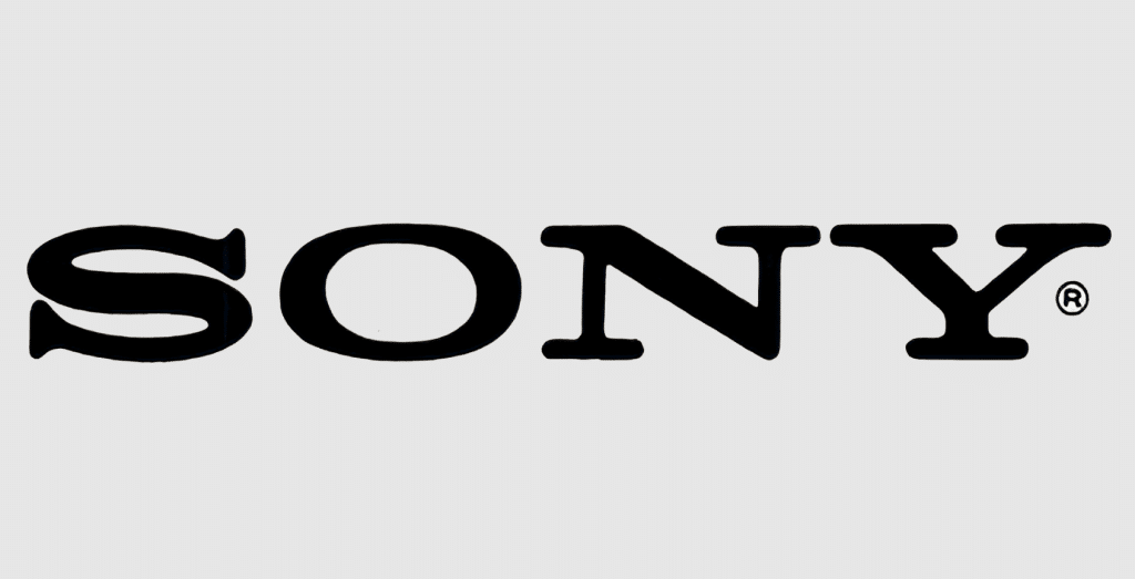
The Sony logo design you know today was first introduced in 1973. It’s not common for companies to keep the same logo for 50 years, so Sony doing this was an impressive feat. The current logo design was another simple update, but this update was long-lasting. The wordmark is the brand name in a straight, horizontal line with neat and clean design elements. This logo design came out of a committee that was part of Norio Ohga’s Design Division at Sony after Sony sought to make a more modern logo.
Sony’s logo font:

At first glance, you may mistake Sony’s logo for the font, Clarendon, but Sony’s logo is its own unique font. This original font is used beyond the logo, for Sony’s slogan as well, “Make Believe”
Sony’s logo color:
Sony’s logo doesn’t use any flashy colors, instead sticking to a monochromatic color palette of black and white. These colors make the logo appear bold and powerful. These color choices also help the logo convey perfection, elegance, sharpness, and integrity.
Sony’s logo symbols:
Sony’s logo symbol is the brand’s wordmark. The brand name is unique so displaying the name on its own creates a one-of-a-kind symbol. Before the brand decided to stick with the “Sony” name as its logo focal point, the first design did test out an emblem. This emblem resembled a trapezoid, but it ultimately wasn’t a logo that tied back to the brand, so the design didn’t last long.
With the logo’s wordmark, the symbol that is formed symbolizes simplicity, strength, and innovation.
Sony Today
Today, Sony has solidified its place as a global leader in the technology industry. This status is due in large part to former leader Akio Morita, and Sony’s leaders since. What has kept Sony on the continued path to growth is that Sony has consistently been an early adapter and leader in innovation.

While Kenichiro Yoshida is the current CEO of Sony, before he rose to this ranking, Howard Stringer served as CEO in 2005. Howard’s title of CEO was a historical one because he was the first non-Japan native CEO of the company.
Howard is credited with many strategic decisions for the brand, including the reimagining of Sony’s media operations, his refocusing of subsidiary enterprises, and an updated Sony slogan, “Make Believe.”

Following Howard’s leadership, before Kenichiro, was Kazuo Hirai who served as CEO in 2012. Kazuo rolled out a new slogan, “One Sony,” in hopes of refocusing the company and in hopes of bringing subsidiaries around the world together, under one umbrella.
Today, Sony employs more than 109,7000 people and the brand generated more than $80 billion in 2022.
Sony has 66 offices and is still headquartered in Minato City, Tokyo, Japan. Due to Sony’s global success, the company ranks 116 among Fortune 500’s global companies.
Lessons Learned from Sony
The biggest lesson we can take away from Sony’s logo evolution is that when you find a logo that works, trust that logo design and stick with it. It can be tempting to want to update a design or add a new feature, but that’s not how you build brand loyalty.
Sony’s logo was simple, only consisting of the brand’s wordmark, and this simple design has been the face of the brand for 50 years. Since this logo has remained nearly unchanged since its inception, and completely unchanged for 50 years, it’s easy for customers all over the globe to recognize the brand.
When it comes to your logo design, try mimicking Sony’s strategy with a simple, timeless design. If you aren’t sure where to begin, companies like Hatchwise can help. Instead of trying to design a logo that will stand the test of time, Hatchwise’s talented creatives can handle that first for you.
Check out these awesome Logo Contests run on Hatchwise:


