
twoimportantthings.com
by mthood143Contest received 23 entries and the contest holder has awarded a winner.
- BACK TO CONTEST ENTRIES
- CREATIVE BRIEF
- ALL ENTRIES
Company or website name
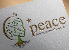
twoimportantthings.com
Slogan or Tagline
two words toward world peace
Describe your company and organization and target audience
My company is me. I am taking responsibility for world peace. The world is safer the fewer strangers there are in it. My goal is to meet and talk to at least one stranger a day for the rest of my life and ask them for two important things - things they want communicated out to the world that they think will aid in world peace.
From these conversations I will be composing a blog to communicate those things out to the world and will encourage others to do the same so that we all get the very real sense of belonging with one another so that violence and isolation become a thing of the past.
The blog will be uplifting, warm, and humorous at times.
The design should have the following
I believe we are all from the same root system. So plant-like roots may work. "Of the same tribe" also works so something with human interaction and connection makes sense too. Given that world peace is my goal, something referring to the earth makes sense too. However, I want to avoid something that looks too flowery or plant-like.
I am also a bit of a wit, so humor is welcome. I'm not sure how that translates into a design though.
Another idea I had was some kind of revealing design. What I mean by that is: if we look underneath the surface at ourselves, we find that we are all the same - people trying to make the best of this crazy thing called life. So, scratching beneath the superficial topography reveals the same or related structures showing that we are all not that different at all.
This logo will be used for
- Online (Website, facebook etc.)
- Print (business cards, letterheads, brochures etc.)
- Merchandise (mugs, t-shirts etc.)
This design should not have this in the entries
I want to avoid red unless it is an earthy brown/red. I'm open to earthy as well as bright colors as long as it makes sense with the tone of the message - we are all of the same tribe.
What style of logo would you like?
Colors to use in the design
As described elsewhere, you can go earthy (organic, natural message) or brighter (excited, energetic message). Both make sense to me.
Earthy would be more greens and browns. Brighter would be more greens and blues.
Briefly describe your contest
World Peace now - just greet a stranger every day and find out two important things