
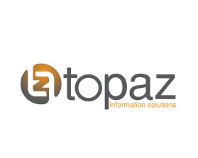
Topaz
by topazISContest received 461 entries and the contest holder has awarded a winner.
- BACK TO CONTEST ENTRIES
- CREATIVE BRIEF
- ALL ENTRIES
Company or website name
Topaz
Describe your company and organization and target audience
We provide software and technology solutions for behavioral health organizations to help them keep track of the treatment they give to a people with a full range of mental health issues. So we bring technology and the care of people together!
The design should have the following
We prefer sans serif fonts.
THE DESIGN DOES NOT HAVE TO CONTAIN THE FOLLOWING, BUT HERE ARE SOME IDEAS WE LIKE SO FAR. Please be willing to surprise us with whatever your idea is but we want it to be really clean and modern.
1) A "gem" concept because Topaz is a multi-faceted gemstone. Behavioral health is also multi-faceted. Don't use the classic diamond shape - see the "NOT" section.
2) Font-based logos. There is one where we HIDE the "IS" inside the O of Topaz. We are looking for this to be elevated and unique - please don't simply plop "IS" inside the "O". Try not to make the IS really obvious - the idea is to blend it. You could also try making the upper and lower curve of the "S" join into the upper and lower parts of the O and then fill in the designs it makes in the background with some colors.
3) We would love to see a logo that is designed using a stylized T as the design icon. Or even a "TZ".
I have attached the mock ups that we liked to give you an idea of where we're going. But again, we want something ELEVATED with a WOW factor over this.
We are also open to new ideas altogether - especially anything that can represent the bringing together of behavioral health & physical health care - mind + body!
This logo will be used for
- Online (Website, facebook etc.)
- Print (business cards, letterheads, brochures etc.)
- Merchandise (mugs, t-shirts etc.)
- Television/screen
This design should not have this in the entries
A classic diamond shape like the one at www.topazsystems.com. They are another Topaz company in the same industry and we want to stay away from copying them.
Please do not submit a logo with just the words Topaz and the "IS" inside the "O". We can design that in 1 minute. We are looking for something ELEVATED and different. There are many cool things you can do - wrap the curves of the S into the O, add different color or a design element in the spaces that the IS create within the O. Think outside the box!
Please do not use really fat or clunky fonts that are too space-age looking. We are looking for CLEAN and MODERN.
What style of logo would you like?
Colors to use in the design
We haven't chosen a brand platform of colors. But we currently use an aqua blue and we are sick of that. Please stay away from blue unless used sparingly. We are loving orange/yellow/red/green - bright, clear colors and don't be afraid to integrate the use of black and grey!
Briefly describe your contest
New, modern logo design wanted to replace tired, old, outdated one!