
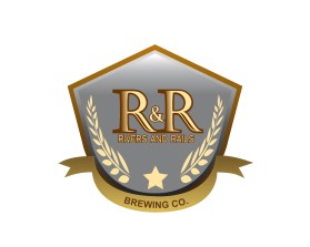
Rivers and Rails Brewing Co.
by JArtmannContest received 25 entries and the contest holder has awarded a winner.
- BACK TO CONTEST ENTRIES
- CREATIVE BRIEF
- ALL ENTRIES
Company or website name
Rivers and Rails Brewing Co.
Describe your company and organization and target audience
We are an upcoming brewery located in Northwestern MN. We are a family friendly, community driven brewery. Our image and atmosphere is centered as small town, proud farmland, cold winters and rustic settings.The building is located on the river with a patio overlook and the occasional train crossing the observable bridge.
The design should have the following
Please see the attached drawing. Essentially am thinking of similar, cleaner concept. A bit rustic, with lighter, fall-like, grey, gold and brown coloring. The ring is a 2-row barley and would like to emphasize the plant as well as the "X" indicating the railroad. The banner is a bit cliche, so I am open to creative ideas here. R&R is a must and should be more prominent than the remainder of the lettering.
This logo will be used for
- Online (Website, facebook etc.)
- Print (business cards, letterheads, brochures etc.)
- Merchandise (mugs, t-shirts etc.)
- Signs (including shops, billboards etc.)
This design should not have this in the entries
Bright and flashy colors.
What style of logo would you like?
Colors to use in the design
A bit rustic, with lighter, fall-like, grey, gold and brown colorin