
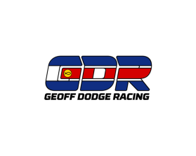
Geoff Dodge Racing
by Gdodge7mContest received 98 entries and the contest holder has awarded a winner.
- BACK TO CONTEST ENTRIES
- CREATIVE BRIEF
- ALL ENTRIES
Company or website name
Geoff Dodge Racing
Describe your company and organization and target audience
This company has been formed to compete and ultimately win sprint car races at the professional level in midwest USA. I am a former "professional" (as in that's how I managed to eat) turned "hobbyist" (I own another business now that affords me the chance to eat) but will be competing at the same level I did while I was racing full time. Since I will be racing against "professional" racers and teams I will be conducting business in the same fashion, and want to present myself in a personalized manner. Ultimately the design is inspired by my helmet paint job, which is a hand-me-down from my dad, who also raced. The roots are from his colorado flag painted helmet as a kid ski racing, through an adulthood of auto racing, to me in karts as a kid to present at 36. Its about going fast, trying to be the best, and remembering where you came from. There is also the christian fish in the center of the gold circle.
The design should have the following
I have uploaded a hand sketch of the design, next to one of my helmets which is the basis for the logo. Also uploaded are a couple pics of what I do for context.
Font should be very close to the hand sketch. Block letter, rounded corners. Wouldn't mind playing with slanting the top of the G the other way so the letters would fit together nicer, but it still needs to look like its "pushing into the wind"
Proportion is intentional, and the low left to high right lean should be maintained. (An alternate that slants the other way so that the logo and the christian fish is always "leaning into" the wind, would be appreciated.)
The black ink outlines should be included as a thin black outline around the letters and color changes. This also allows it to be used on any color better.
Text below GDR should be stretched to the width of the three colored letters.
The center alignment is off in the hand drawing and the bottom curve of the R, the center chunk of the D, and the Center of the G should all align.
This logo will be used for
- Online (Website, facebook etc.)
- Print (business cards, letterheads, brochures etc.)
- Merchandise (mugs, t-shirts etc.)
- Signs (including shops, billboards etc.)
This design should not have this in the entries
I would entertain small changes to the presentation of my concept, but colors are set, and no radical departures in concept.
What style of logo would you like?
Colors to use in the design
Blue, Bright Red, Bright Yellow/Gold, Black, White
Briefly describe your contest
I am a hired race car driver starting my own gig, and need some help putting the finishing touches on my logo concept, and bringing it to life!