
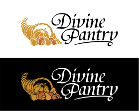
Divine Pantry
by wesley.fordContest received 251 entries and the contest holder has awarded a winner.
- BACK TO CONTEST ENTRIES
- CREATIVE BRIEF
- ALL ENTRIES
Company or website name
Divine Pantry
Describe your company and organization and target audience
We are a food company offering nutritious, high quality, all natural, wholesome yet tasty products. Our main product is a portable breakfast of muesli, yoghurt, nuts, dried fruit and “superfoods”. Our products are an eating experience for consumers, with our food making them feel nourished, positive and uplifted, amidst a chaotic life.
As a company, we want to uplift and connect with individuals on a deeper level, educating them about our products' health benefits as well as inspiring them about mindfulness, equanimity and virtues.
Our primary target market is 60% female, age 25-35, mid to high income ($100K plus per annum) professionals, time-poor, health conscious individuals. The secondary target market are working mothers who are very health conscious and would like to give their children nutritious snacks.
Our company values are Integrity, respect, innovation, community.
The design should have the following
- MUST incorporate the cornucopia as the main symbol. The cornucopia will also be part of the monogram
- Should appear simple, clean, smooth, gentle, homely. A sense of royalty is also desired.
- Font style should convey a premium food brand
- The design should have clean lines.
- Use of god rays or light emanating outwards from the cornucopia would be desirable, as long as it does not cheapen the look.
- The logo should be recognisable from a distance; otherwise we would be happy for this to apply to the monogram (cornucopia) only.
- To add more context, the logo will be used in contemporary-style artworks portraying deities/goddesses, as part of the company marketing
This logo will be used for
- Online (Website, facebook etc.)
- Print (business cards, letterheads, brochures etc.)
- Merchandise (mugs, t-shirts etc.)
- Signs (including shops, billboards etc.)
- Television/screen
This design should not have this in the entries
- No overly cursive or thin fonts. Good examples are Papyrus and Monotype Corsiva
- Do not use dark colours as the predominant colour
- No complex/overly detailed illustrative logos
What style of logo would you like?
Colors to use in the design
- Maximum three colours - preferably including white.
- Remaining colours may be suggested, however there is a preference for any of purple and gold.
- Black is allowed for the font
Briefly describe your contest
Food company seeks a divine logo to convey abundant, healthy food and sense of community with its customers.