

Logo Design Contest
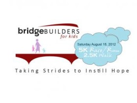
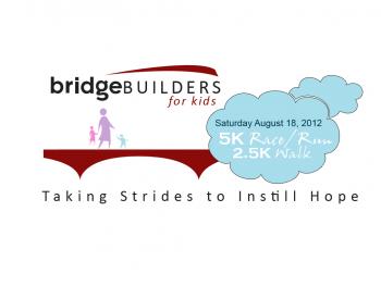
Bridge Builders for Kids
by Picture-itContest received 16 entries and the contest holder has awarded a winner.
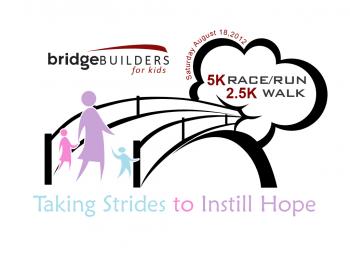
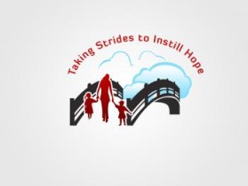
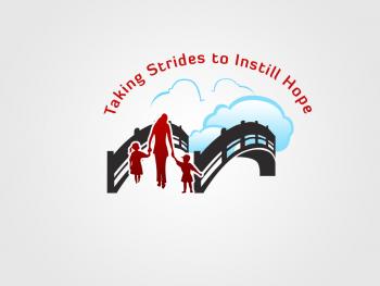
Winning entry by FITRAH
- CONTEST OVERVIEW
- CREATIVE BRIEF
- ALL ENTRIES
Congratulations to winner FITRAH ! They were awarded the contest prize of $125.00


Discussion: