
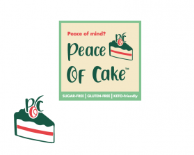
Peace of Cake
by CartesianJockContest received 114 entries and the contest holder has awarded a winner.
- BACK TO CONTEST ENTRIES
- CREATIVE BRIEF
- ALL ENTRIES
Company or website name
Peace of Cake
Slogan or Tagline
Peace of mind? Piece of cake!
Describe your company and organization and target audience
The brand is being built around the philosophy that eating healthy sweets and desserts should not have to come at the price of losing progress or feeling guilty. The logo and brand should have a unique voice that is inspiring, easygoing, fun, and not too formal, but most importantly inviting and welcoming to the first-time looker instilling in him/her that the brand is reliable in maintaining a peace of mind. Our audience ideally includes anyone and everyone from children to seniors who love sweets but would and could enjoy them without any guilt, regret, or apprehension. Specific subgroups include healthy eaters (with/without dietary restrictions or limits), athletes/fitness enthusiasts, children, and sweets connoisseurs.
The design should have the following
This logo will be on the packaging of every piece sold in addition to every platform online and therefore must be able to catch the wanderer's eye and arouse curiosity. The name includes the word "Peace" which tends to remind many of the psychedelic 60's and anything that is usually relating to the Earth and/or green (but NOT ONLY that color), and so would be best to style the words "Peace of Cake" in a fusion of an "Earthly" style with modern elements to create a balanced and appealing logo that is SQUARE IN OVERALL SHAPE. MUST INCLUDE: - words "Peace of Cake" - a border - "SUGAR-FREE", "GLUTEN-FREE", and "KETO-friendly" towards the BOTTOM of the logo equally spaced apart and spaced apart from the center of the logo
This logo will be used for
- Online (Website, facebook etc.)
- Print (business cards, letterheads, brochures etc.)
- Merchandise (mugs, t-shirts etc.)
- Signs (including shops, billboards etc.)
This design should not have this in the entries
- overall lining/shape that is curvy or "circular" in any way - style that is too "1960's" or too retro - details that make the overall product look congested, crowded, or complicated
What style of logo would you like?
Colors to use in the design
In addition to green, the logo should have no more than 3 colors that blend well together (COLOR SELECTIONS WILL BE AT THE DISCRETION OF THE GRAPHIC DESIGNER) - NO PURPLE, BLACK, BROWN, DARK BLUE (light blue is okay), or GRAY
Briefly describe your contest
To create a product logo that is fun, inviting, and pleasing to see on a product label.