
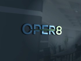
Oper8
by JezdeaconContest received 168 entries and the contest holder has awarded a winner.
- BACK TO CONTEST ENTRIES
- CREATIVE BRIEF
- ALL ENTRIES
Company or website name
Oper8
Describe your company and organization and target audience
Business process outsourcing company. Businesses outsource their administration to us, mainly those in the direct sales industry so that they can focus on sales and let us deal with all the administration components. This logo is for our new database which will be used to process and reconcile all of the sales from each of these businesses and allow them access so they can review the status of each sale. The system is a complete end to end database that tracks the sales from sign up to payment
The design should have the following
I want the 8 in Oper8 to be used as a standalone icon within the system as well. This means that the 8 in the logo should be the highlight. Looking for a flat logo. Simple with the 8 being the main part and ‘Oper’ can just be plain. My only initial thoughts were that the 8 have movement arrows in it or around it to symbolise the movement of the sale within the database. Also potentially something to do with it being the piece that binds the entire process together? I’m open to any ideas though I am not the designer.
This logo will be used for
- Online (Website, facebook etc.)
What style of logo would you like?
Colors to use in the design
Blues, greens
Briefly describe your contest
Design an exciting logo for the launch of our new Saas database