

- BACK TO CONTEST
- CREATIVE BRIEF
- ENTRY # 670735


Comments for entry # 670735
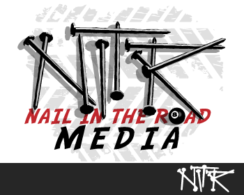
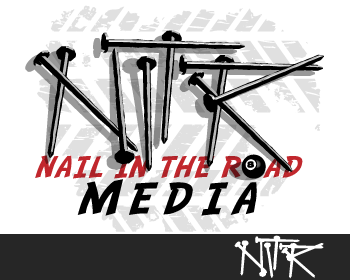
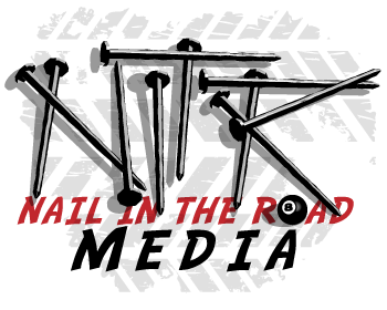
Yes, I only changed the direction of two nails, since that's all I understood from your earlier message. That's a good idea about bending some, varying the lengths a little and adjusting the shadows to make the lettering clearer. On the 8-ball, I don't think it should be there - it is out of scale to the nails and comes off as kind of not belonging there. But I can try having it be a lens - like a translucent 8-ball marble or something - if you want me to try that. Understood on versioning variations with the tread area. I'm willing to work with you on this. Just so you know I'll be going to sleep in about an hour and a half (I'm in Los Angeles but I've been up all night) then I will be off the grid for a total of 9 or 10 hours because of meetings etc. I just say that so you won't be surprised when there's a stretch of time you don't hear from me. But I'm confident we can polish this design off before the end of the contest period. Also when I win one of these contests, my personal policy is that I will do any reasonable number of tweaks if they come up as needed later, for no additional fee. Best, Matthew
Also, what is the light source for this. That is, when I look it it, the sheen on the individual nails seem inconsistent. You have shadowing from above as well as from the side which does not make sense. Can you make the light source affect on the shadows consistent? So, I just need better readibility and shadow consistency as well as adjusting the eight ball to be a lense of some sort. But do you feel strongly about the eight ball, the idea for which came from the writer? Lastly, since the nails have been run over, per the wire tread, you can have some of them be bent. Also, I would like the tread usage to be contained to the nail area only in a version to see if it simplifies it a bit. That will help. Matthew, if you work with me here to get this right you will win as I don't think there is anyone close to you in this regard. So it will not be wasted time. Bob
I just don't see much difference here, other than adjusting one nail being on top rather than underneath. Can you shorten nails or length to make their affect as letter more apparent?
Browse other entries from this Logo Design Contest


Browse other Logo Design Contest
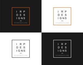
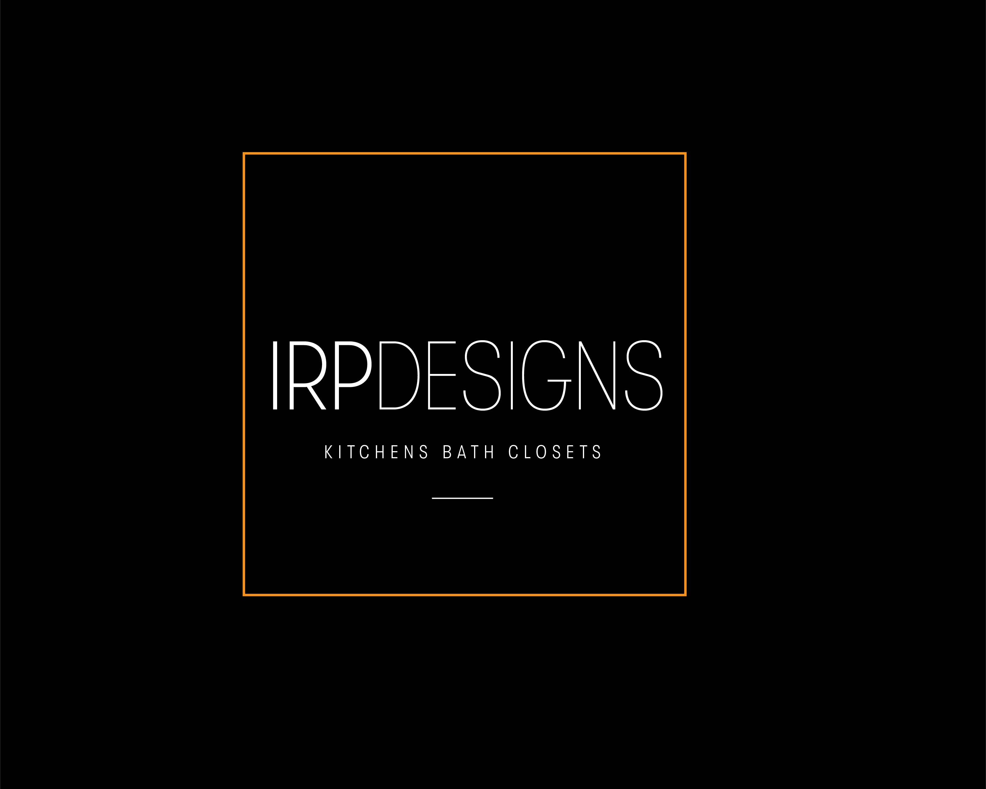


Logo Design Contest: IRP DESIGNS
re doing and modernize the current logo we have.
$150.00 Prize
439 ENTRIES


Logo Design Contest: Parks Digital Media
Fresh New Ideas for Digital Advertising
$210.00 Prize
318 ENTRIES


Logo Design Contest: FreightBucket
HighTech Freight Application Logo Design
$250.00 Prize
45 ENTRIES


Logo Design Contest: Dreamspace (thedreamspace.com)
Interior home design company
$200.00 Prize
204 ENTRIES


Fast. Awesome. Affordable
About the Creative
142
144
605
john12343 Bio
I am an Illustrator and Designer living in Los Angeles. I work for a nonprofit org full time.
Other entries by john12343:
Similar Entries