Logo Design Contest

Australian Private Equity Partners

by grahamlmarsland

Contest received 1472 entries and the contest holder has awarded a winner.

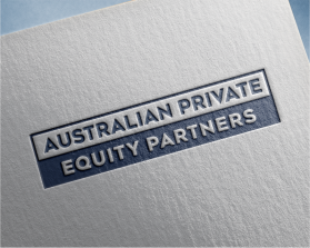
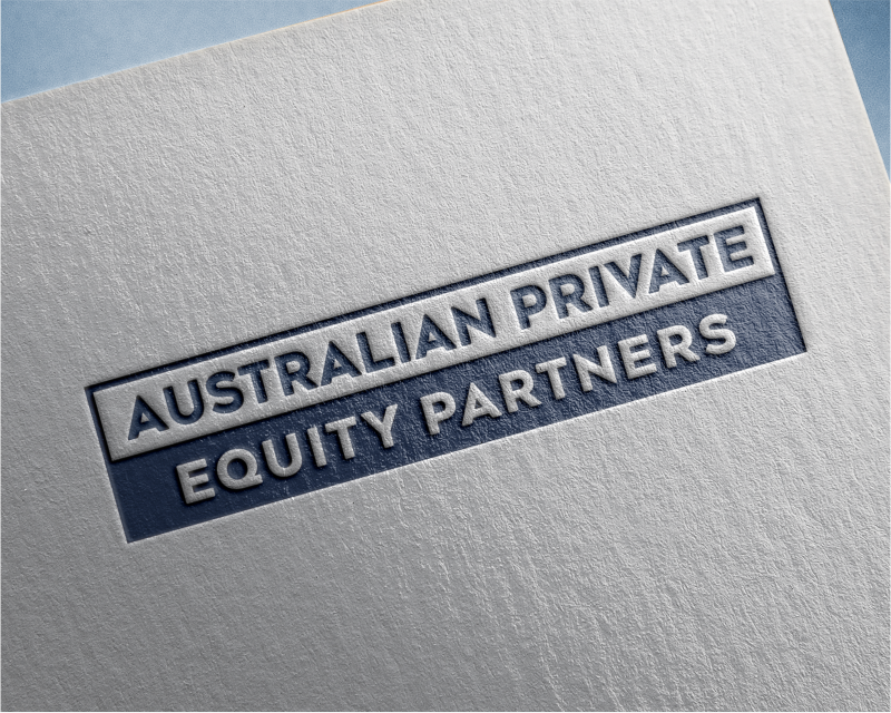
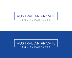
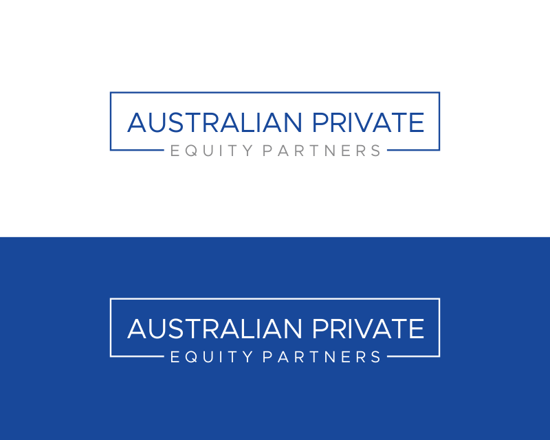
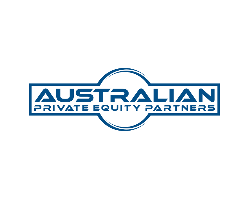
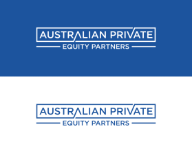
Winning entry by jump.ant

Congratulations to winner jump.ant ! They were awarded the contest prize of $360.00

Discussion:

user-image
grahamlmarsland Contest Holder
Please don't use the acronym APEP
user-image
grahamlmarsland Contest Holder
Please don't have the word "Australian" as super big
user-image
grahamlmarsland Contest Holder
Please don't include the image of Australia or southern cross star
user-image
grahamlmarsland Contest Holder
Please don't group the words "Australian Private"
user-image
grahamlmarsland Contest Holder
Designs should be informed by what might work for the audience of the Australian Investment Council. Similar shapes to the Annual Partner logos would be great. See https://www.aic.co
user-image
grahamlmarsland Contest Holder
Please don't include a logo, such as the letter "A" in big font to the side
user-image
grahamlmarsland Contest Holder
Please use the colour similar to the blue at https://www.australianprivateequitypartners.com
user-image
grahamlmarsland Contest Holder
I like the idea of the three bars (which represent growth). Open to exploring how this might work with a box concept or just on its own. Fonts where the bottom off the "Q" flows under the "U" are preferable.
user-image
grahamlmarsland Contest Holder
I think the three bars concept on the left side of the words works best. Please refer to the other notes below and thank you all for your hard work. Looking forward to picking the final design!
user-image
grahamlmarsland Contest Holder
The bars should stop at the same heights as the word "Australian", next grouping of words should be "Private Equity, followed by Partners at the bottom.