
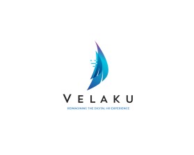
Velaku.com
by MetropolisContest received 129 entries and the contest holder has awarded a winner.
- BACK TO CONTEST ENTRIES
- CREATIVE BRIEF
- ALL ENTRIES
Company or website name
Velaku.com
Slogan or Tagline
Reimagining the Digital HR Experience
Describe your company and organization and target audience
Velaku is a software company that creates HR Managment software that runs on Microsoft Office 365.
The target audience is Senior execs in Human Resources and IT departments.
The design should have the following
We would like a logo that utilizes a Sail.
The founders are sailors, and Velaku is latin for 'sail'.
And we like the connotation that our solution is simple, efficient, elegant, and streamlined, like a sailboat.
Having said that, it shouldn't look EXACTLY like a sailboat... because that would be confusing... it should be more a graphical representation.
It should probably look like a cool, triangular shape. and then if people learn it's a sail, they would say "oh yeah... now I see it"
This logo will be used for
- Online (Website, facebook etc.)
- Print (business cards, letterheads, brochures etc.)
- Merchandise (mugs, t-shirts etc.)
This design should not have this in the entries
We did create a preliminary version that we quite liked, but once we started to show people the logo, we heard that it looked like a shark fin.
And they were right! it does look like a shark fin.
... so, let's please try to avoid that
You can see the Shark fin version here: https://www.velaku.com/
What style of logo would you like?
Colors to use in the design
Colours; predominantly blue, probably 2-tone blue or graduated, but with an accent colour, like a deep red or perhaps violet.
Briefly describe your contest
Logo Creation - Sail Motif for software company