
The momME Method
by lavenderandtimeContest received 124 entries and the contest holder has awarded a winner.
- BACK TO CONTEST ENTRIES
- CREATIVE BRIEF
- ALL ENTRIES
Company or website name
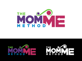
The momME Method
Slogan or Tagline
Putting the "ME" back in mommy
Describe your company and organization and target audience
This logo is for an offshoot of the "mommy to momME" brand (that will also be needing a logo soon). The momME Method is an 8-week online course and accompanying live weekend course on rediscovering the "ME" in mommy.
Target audience: moms with kids at home (baby-teen) who are losing or have lost their individual identity in the pursuit of being a mommy.
The design should have the following
feminine colors (bolds more than pastels)
something to indicate putting the ME back
symbols I like (if they work): arrows, infinity symbol
preferred but not required (keep your creativity):
ability to turn into a black/white vinyl cutout
usable in future logos incorporating "momME"
This logo will be used for
- Online (Website, facebook etc.)
- Print (business cards, letterheads, brochures etc.)
- Merchandise (mugs, t-shirts etc.)
- Signs (including shops, billboards etc.)
What style of logo would you like?
Colors to use in the design
blues, greens, pinks, purples, grey/black/white
optional but less preferred: red, orange, yellow
Briefly describe your contest
logo design, I have no ideas for this one so surprise me!