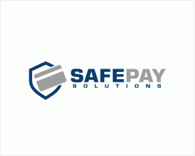
SafePay Solutions
by meredianContest received 735 entries and the contest holder has awarded a winner.
- BACK TO CONTEST ENTRIES
- CREATIVE BRIEF
- ALL ENTRIES
Company or website name
SafePay Solutions
Slogan or Tagline
SafePay Solutions
Describe your company and organization and target audience
We are a merchant bank card processing company
Target audience. Small business who process credit card transactions, and consumers who use credit cards to pay for goods and services. We are the provider of terminals and all backend processing for Visa,M/C, Amex and Discover.
The design should have the following
A uniquely stylized version of our company name, as well as an accompanying unique logo. The words SafePay should be larger and more prominent, while Solutions is less prominent accompaniment to the larger SafePay. No serif fonts, only clean, impactful fonts with no flares or pointy edges. The accompanying logo should reflect a professional, polished company, and not have specific 3-dimensional elements, so that we can represent it alone or in a flattened way on business cards, hats, shirts etc, and not be specific to our online presence. It might be good to have an S incorporated into the logo itself, which would allow for us to use it stand-alone.
Colors: Main color Blue, with Green accent would be ideal, but we may be a bit flexible on this.
This logo will be used for
- Online (Website, facebook etc.)
- Print (business cards, letterheads, brochures etc.)
- Merchandise (mugs, t-shirts etc.)
- Signs (including shops, billboards etc.)
- Television/screen
This design should not have this in the entries
Will provide more feedback as necessary for what not to include. But, nothing too wild or crazy, but creativity is definitely encouraged. Not afraid of a bit of an edginess, but may end up going with something a bit more on the conservative side.
Colors to use in the design
blue main with green is ideal
Briefly describe your contest
Payment processor logo


