
Riverside Food Tours
by laura noyesContest received 39 entries and the contest holder has awarded a winner.
- BACK TO CONTEST ENTRIES
- CREATIVE BRIEF
- ALL ENTRIES
Company or website name
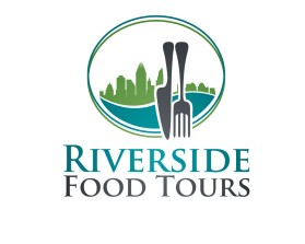
Riverside Food Tours
Slogan or Tagline
of Cincinnati
Describe your company and organization and target audience
This is a walking food tour incorporating multiple stops at different restaurants with facts about the history and culture along the way.
The target audience is locals as well as tourists, ages from 30-65 who are looking for things to do in the Cincinnati area
The design should have the following
a graphic of a river depicting movement or swirl, flowing underneath a knife & fork, creating the feel of a fun, contemporary, gender neutral experience. The design may be contained inside a shape or box or outlined. The river graphic needs to be the color of a river, dark teals or blues so it doesn't look like a swirl or a road going nowhere.
The eating utensils need to be prominent and can be any color that contrast with the water color, or a dark neutral like gray or charcoal, not black. I like a white background rather than a negative image.
The font for Riverside needs to be most prominent, but the words FOOD TOURS needs to be very noticeable also.
This logo will be used for
- Online (Website, facebook etc.)
- Print (business cards, letterheads, brochures etc.)
- Merchandise (mugs, t-shirts etc.)
- Signs (including shops, billboards etc.)
This design should not have this in the entries
Food, people, old fashioned, cursive lettering, dark images,
What style of logo would you like?
Colors to use in the design
white/gray/ or ivory background, deep teal/blue shades for water, shades of either deep coral, brick, red or gray for utensils, black lettering
Briefly describe your contest
I'm launching a food tour and I'm on a very limited budget. Thanks for your creative ability!!