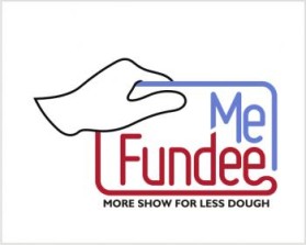
MeFundee
by dvanzantenContest received 50 entries and the contest holder has awarded a winner.
- BACK TO CONTEST ENTRIES
- CREATIVE BRIEF
- ALL ENTRIES
Company or website name
MeFundee
Slogan or Tagline
Optionally under the logo, 'More show for less dough.'
Describe your company and organization and target audience
The perimeter probably should be shaped like a gift card, with the 'Me' part of the logo at the top right and 'Fundee' at the bottom. Then there is a space at the top left. The idea for that space is to show a unisex hand pulling the gift card.
The design should have the following
Yes. It should approximately follow 'Ries and Trout' branding rules, so should be around 2 parts wide to 1 part high.
This design should not have this in the entries
The logo must appeal to participants, event hosts/organizers, and sponsors. Demographic is those who are accustomed to purchasing on the Internet (so, male/female, maybe average age of 35 or so). Also, those who attend a lot of events.
Colors to use in the design
Yes. http://mefundee.ning.com/ The world's most boring blog, but it has the two mockups there. The hand isn't the right shape . The idea is maybe the hand 'happily' grabs the 'mefundee' logo. Maybe the hand is half in the card, half out.
Briefly describe your contest
Logo Design Contest

