Logo Design Contest

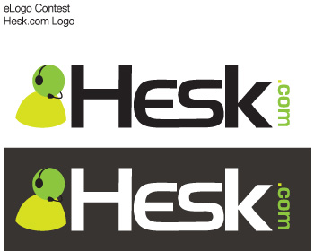
HESK (help desk software)

by PHPJunkyard

Contest received 89 entries and the contest holder has awarded a winner.

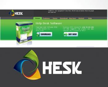
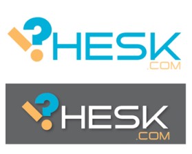
Winning entry by ongyudicandra

Congratulations to winner ongyudicandra ! They were awarded the contest prize of $200.00

Discussion:

user-image
PHPJunkyard Contest Holder
Tip: here's what people have in mind when talking about customer support: http://images.google.com/images?hl=en&q=customer%20support http://images.google.com/images?hl=en&q=help%20desk
user-image
PHPJunkyard Contest Holder
PLEASE NOTE that the background color should be dark gray (#353535)! The logo will be placed where it says "LOGO HERE" at http://www.phpjunkyard.com/hesk_com/
user-image
PHPJunkyard Contest Holder
Here's a design I like (made by some other designer for me), I would like to explore similar ideas or more variations (please don't copy the logo, just to give you an idea): http://www.phpjunkyard.com/hesk_com/logo.png
user-image
PHPJunkyard Contest Holder
Update: I prefer logos which don't have a mirror reflection at the bottom. Thanks!
user-image
griffindesign Creative
Please consider adding some feedback along with your ratings so that the designers might be able to determine in which direction to go, or do you only want to see variations of the example you posted? Thank you
user-image
PHPJunkyard Contest Holder
Hey there, thanks for the heads-up, it's my first time here at eLogoContest and I'm not yet quite sure how it all works (although I did comment on a number of entries that I like more than others). To clarify: no, I'm not looking only for variations of the logo posted, I'm also looking for completely new ideas. To be honest I'm not 100% sure what kind of logo I want that's why I like the way this works as many designers post many different ideas. But I know when I see something I like. If you look at the entries rated 4 and 5 the logos I like best are: - clear and easy to read font - connected to the website content (gives an idea that it's about customer support; either directly (customer support person icon) or in a unique way. - if it's a person icon I mostly prefer those with a somewhat 3D look rather than 2D. - overall I like logos than look clean with clean (sharp) edges (that's why I'd prefer not to have a mirrored shadow for example). Looking at your logo it is nice, but the left icon just doesn't attract my attention. If you have any questions please feel free to ask.
user-image
griffindesign Creative
Thank you so much for your response. This definately goes a long way in giving the designers some direction and I'm sure we all appreciate it. It may be helpful if you give a score of 3 or 4 to add some comments such as "I like the font and colors used but the icon isn't quite there", etc. or something similar, like you just did, that helps alot. Thanks again.
user-image
PHPJunkyard Contest Holder
Hello designers! Just a heads-up: I will be choosing the winner before the deadline (probably in Friday or Saturday) so if any of you are still considering posting any new variations or ideas please feel free to! Thanks!
user-image
ktsoap Creative
Thanks for the opportunity. Oh well, I tried.
user-image
PHPJunkyard Contest Holder
To give you all an idea of what I think fits best, current favorites are (in no particular order): Entry #41603 (luckyhow) Entry #41533 (naropada; maybe also Entry #41576 if the icon was smaller and not that dark) Entry #41904 (ongyudicandra)