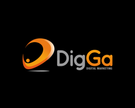
Digga
by diggaContest received 98 entries and the contest holder has awarded a winner.
- BACK TO CONTEST ENTRIES
- CREATIVE BRIEF
- ALL ENTRIES
Company or website name
Digga
Describe your company and organization and target audience
We are a company that specializes in digital marketing, as services from Google and other social media, and more specifically SEO. We target the SMB market to provide a simple startup program for SEO. We are providing services for bigger customers eventually.
The name Digga means to be popular, admired and cool in Norwegian, and the idea is that the name and the logo will give associations to being visable on the internet. The first three letters is the same as in "Digital" which is intentional.
The design should have the following
Minimalistic and esthetical in style is our highest priority, while playfulness and creativity is secondary.
Our idea has been to have the first thee letters in a thin "classy" font in lowercase, while the second G is in uppercase. Google services is important, and a small hint to that could work. These inputs should NOT limit artistic freedom for other ideas.
This logo will be used for
- Online (Website, facebook etc.)
- Print (business cards, letterheads, brochures etc.)
This design should not have this in the entries
Not more than one element in the logo.
Colors to use in the design
Orange/green/blue/red. Preferably one of these colors (in this priority order) in combination with black or white. If you work with the spotlight idea, yellow will of course also work.
Briefly describe your contest
Esthetic logo for digital marketing company

