
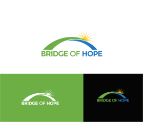
Bridge of Hope
by DavidMcAllisterContest received 401 entries and the contest holder has awarded a winner.
- BACK TO CONTEST ENTRIES
- CREATIVE BRIEF
- ALL ENTRIES
Company or website name
Bridge of Hope
Describe your company and organization and target audience
THANK YOU TO EVERYONE WHO HAS CONTRIBUTED DESIGNS - AND SORRY THAT WE COULDN'T WRITE 280 RESPONSES. WE HAVE NOW SHORTLISTED TWO DESIGNS, WHICH WE WILL CHOOSE BETWEEN ON MONDAY. WE DON'T NEED ANY MORE SUBMISSIONS.
Bridge of Hope is a non-profit project designed to connect marginalised members of the UK workforce with inclusive employers. In short, we help people like the over-50s, women returning to work, people who’ve spent time in prison, people who’ve experienced mental illness, former military personnel, not to mention people from BAME, LGBTQ+ and other minority social groups, get jobs with companies who value the idea of having a more diverse, inclusive and representative workforce.
We do this by running a jobs board, bridgeofhope.careers. This is just like Monster, Reed, Indeed etc., but tailored specifically for people from marginalised groups. Many of our candidates are referred to us by UK charities who have helped to put them back on their feet after a difficult time, and employers have to demonstrate their commitment to inclusive recruitment before they can subscribe to the board and post jobs.
Our corporate clients include: FedEx, Tesco, Asda, Sodexo, Greggs, Virgin Active and Boots.
Our charity partners include: Royal British Legion, The Prince’s Trust, Mind and Working Chance.
Bridge of Hope is owned and run by Prosper4 Group, a UK social enterprise. Prosper4 expects to earn revenue from the board to cover its costs, but profits are distributed to our charity partners.
OUR VALUES: Inclusivity, Opportunity, Diversity, Professionalism
The design should have the following
Bridge of Hope currently has a piece of art that it uses for branding, but it does not function effectively as a logo. We are looking for a distinct, modern logo that will compete visually and professionally in the crowded recruitment marketplace. The logo should be designed firstly to work in a horizontal lockup on the header of our jobs board, but be flexible enough to be stacked vertically for use on reports and in social media. Note: the word HOPE is as important as the word BRIDGE.
The logo needs to appeal to two very different audiences:
• Our corporate clients – the employers – need to see us as organised, professional, trustworthy and modern. To us, this suggests sans-serif typography and decisive colours.
• Our candidates and charity partners also need to see us humane, hopeful, authentic and aspirational. To us, this – and our name – suggest designs with a degree of softness: curves rather than sharp corners, and open or broad (rather than narrow) letter shapes.
It's a tricky balance!
This logo will be used for
- Online (Website, facebook etc.)
- Print (business cards, letterheads, brochures etc.)
This design should not have this in the entries
There are many different organisations called ‘Bridge of Hope’ and we must not trample on their intellectual property or cause any brand confusion.
We must avoid the blue-green teal colour (#64C3C3) used in our old artwork, although 'purer' shades of either blue or green would be perfectly acceptable.
We must also avoid coral red (#FA5050) and the font Montserrat, as these are used by a close competitor in our marketplace.
Overly literal designs reproducing suspension bridges etc. should be avoided, but something more abstract might be interesting.
What style of logo would you like?
Colors to use in the design
No strong preferences, but blue and green are popular choices in our marketplace.
Briefly describe your contest
BridgeOfHope.careers is a successful social enterprise helping marginalised people in the UK get back into work. We need a strong, simple logo for our