
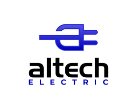
Altech Electric
by DispatchContest received 213 entries and the contest holder has awarded a winner.
- BACK TO CONTEST ENTRIES
- CREATIVE BRIEF
- ALL ENTRIES
Company or website name
Altech Electric
Describe your company and organization and target audience
07/28/19- CONTEST EXTENDED TO ALLOW FOR OUR SPECIFICALLY REQUESTED REVISIONS TO BE SUBMITTED..........
Electrical Contractors
NOT Electronics.
Horrible existing website at www.altechelectric.com -It is currently in the process of being redesigned.
Our Complete name is Altech Electric of Central Florida, Inc. We typically use just Altech Electric. Logo design should be able to be used with OR without the "of Central Florida, Inc." .
Attached is a copy of the current logo in use (which is altered from the original on the website).
I am also attaching the recently touched up "turbine" image. The original from 1998 is lost and no clean copy of the turbine existed. It was quickly recreated due to the current website update in progress. The fonts currently used are Impact & Trebuchet MS. These CAN be changed.
We are looking for something simple, that conveys what we do, if at all possible. The turbine was originally chosen, as it represented on of the first projects completed by the company in 1998. At the same time, it is not really related to the Electrical Contracting/Construction field.
The design should have the following
Full Company Name
Partial Company Name option
Branding icon/logo image
***update*** I have removed the request of no lightning bolts. Our initial thought process is that they are overused in the industry, and many times used very poorly. We did, however come accross something that incorporated the bolt into another image using negative space that we found a very interesting and modern look and feel in comparison to what we typically see.
If it will be used, note that we are looking for clean, modern and simple. It cannot be an item in itself.
***update 4/6***
Color Information has been updated to be more in line with the ongoing website design.
Would like to see some gradient work on the imagery to make it a little more dimensional, not totally flat.
Added a .pdf that shows you the type of logos that really catch our eye and interest, as it may give you more to go on. We are not looking for copies of any of these- simply provided as style guidance and ideas.
No "Star Trek" fonts example of what I am referencing is included in the pdf attachment.
This logo will be used for
- Online (Website, facebook etc.)
- Print (business cards, letterheads, brochures etc.)
- Merchandise (mugs, t-shirts etc.)
- Signs (including shops, billboards etc.)
This design should not have this in the entries
NO Serif fonts.
No "Star Trek" type fonts- see bottom of .pdf attachment for example.
What style of logo would you like?
Colors to use in the design
A Royal Blue along the lines of #0000b6 you can go one or two shades darker to tone it down a touch. Please include black.
accent color (if needed) of #ffc329 OR #00b300 would be acceptable. Less is more with the additional color
Black
Briefly describe your contest
07/28/19- CONTEST EXTENDED TO ALLOW FOR REQUESTED REVISIONS TO BE SUBMITTED..........20+ year old company. existing logo needs updating or total redes