
41° North
by rperl212Contest received 71 entries and the contest holder has awarded a winner.
- BACK TO CONTEST ENTRIES
- CREATIVE BRIEF
- ALL ENTRIES
Company or website name
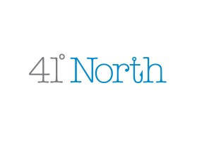
41° North
Describe your company and organization and target audience
Seafood Restaurant located in NJ suburbs(NYC) that is meant to transport the customer to the ocean from landlocked town. Rustic feel, but mid-upscale dining experience in terms of quality of food and service. Locally sourced ingredients (Mid-North Atlantic US) where customers can tell that we care about the product we are selling and know a lot about it too.
The design should have the following
Something that has to do with fishing/the ocean/seafood. Also, 41 North is the latitude line that Montauk falls on. which is where the inspiration for this restaurant comes from (growing up fishing in Montauk during the summer). Demographic is white collar adults/families (upper class) as well as singles/dates.
This logo will be used for
- Online (Website, facebook etc.)
- Print (business cards, letterheads, brochures etc.)
- Merchandise (mugs, t-shirts etc.)
- Signs (including shops, billboards etc.)
- Television/screen
This design should not have this in the entries
red, orange, yellow, bright colors
What style of logo would you like?
Colors to use in the design
earth tones/ sea , blue,black, white, gray, sea green/blue
Briefly describe your contest
Seafood Restaurant Logo!!!