

- BACK TO CONTEST
- CREATIVE BRIEF
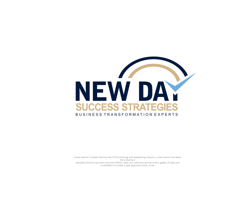
- ENTRY # 1639750


Comments for entry # 1639750
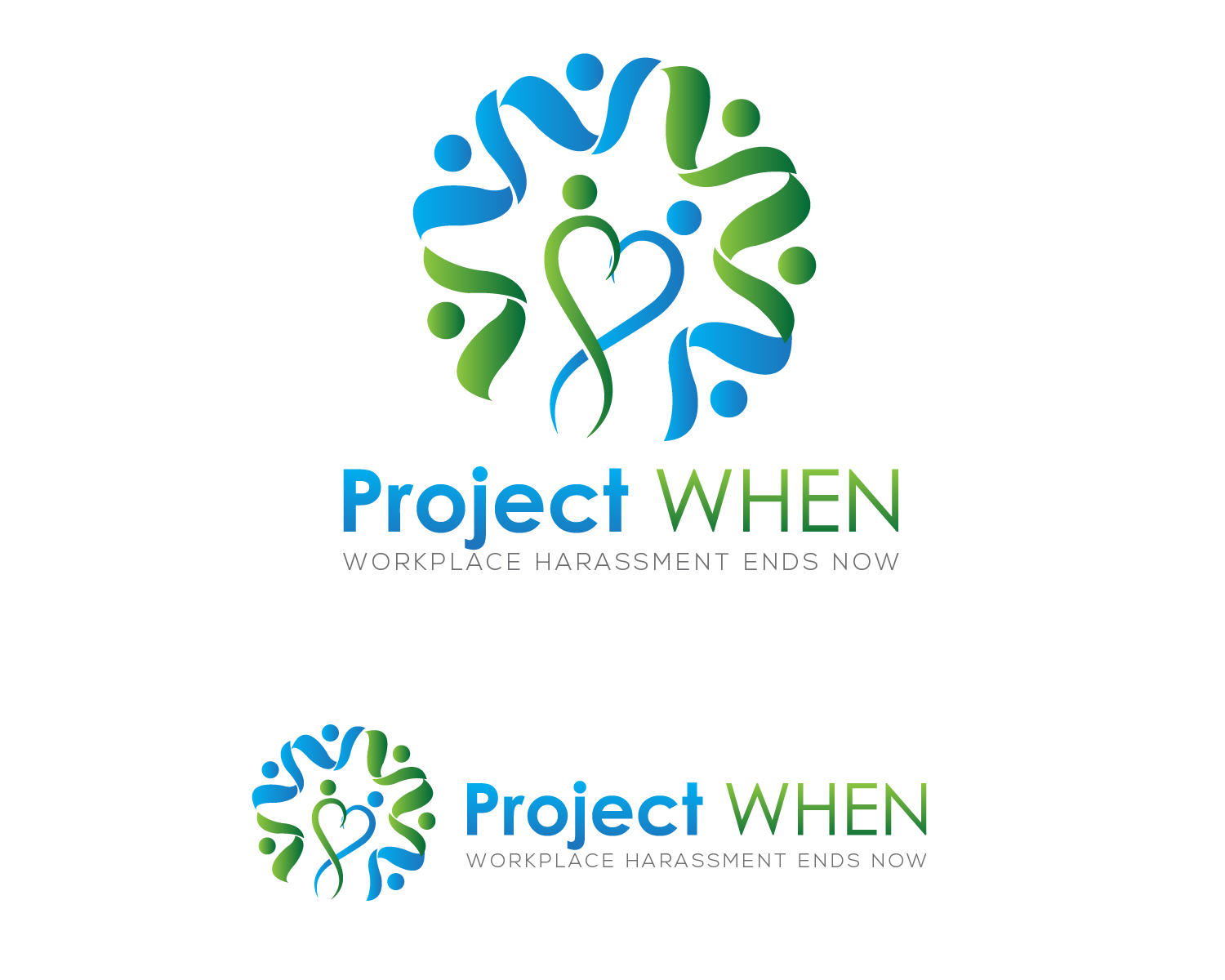
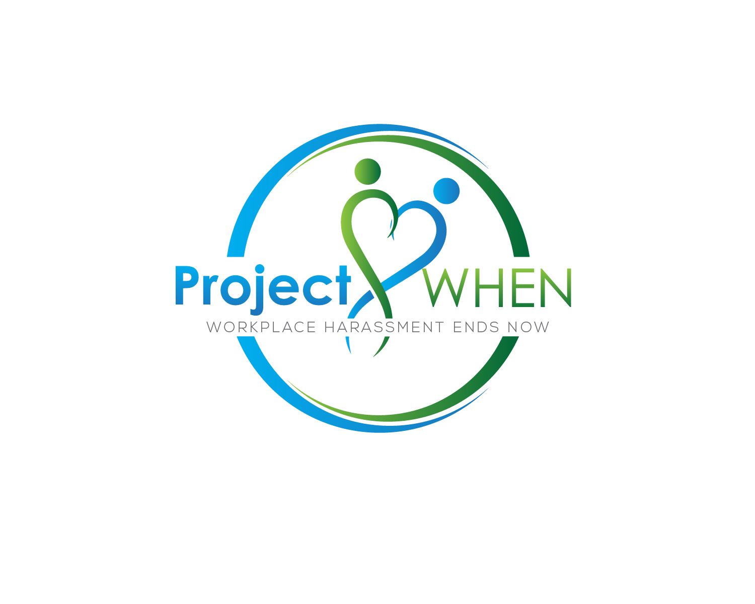
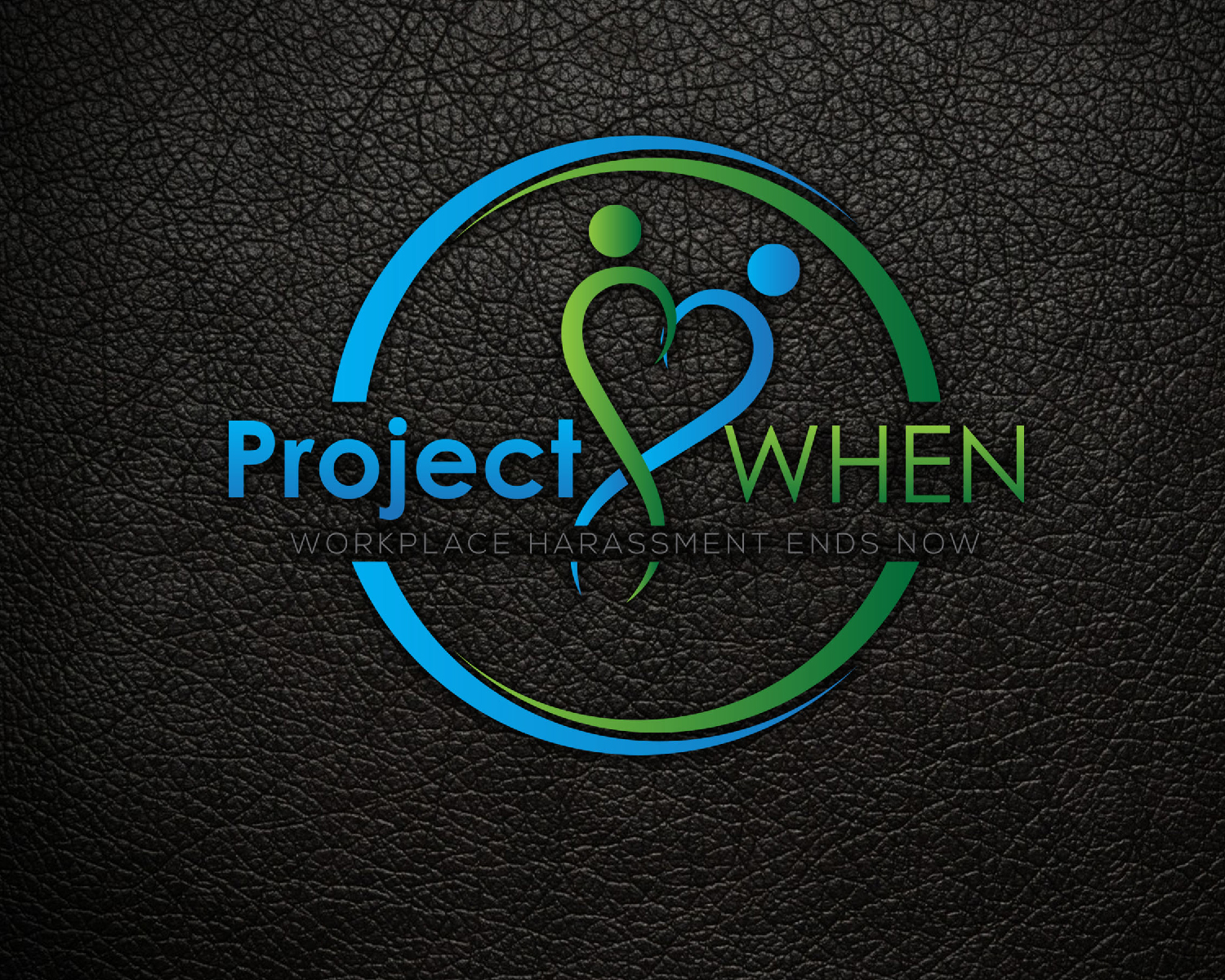
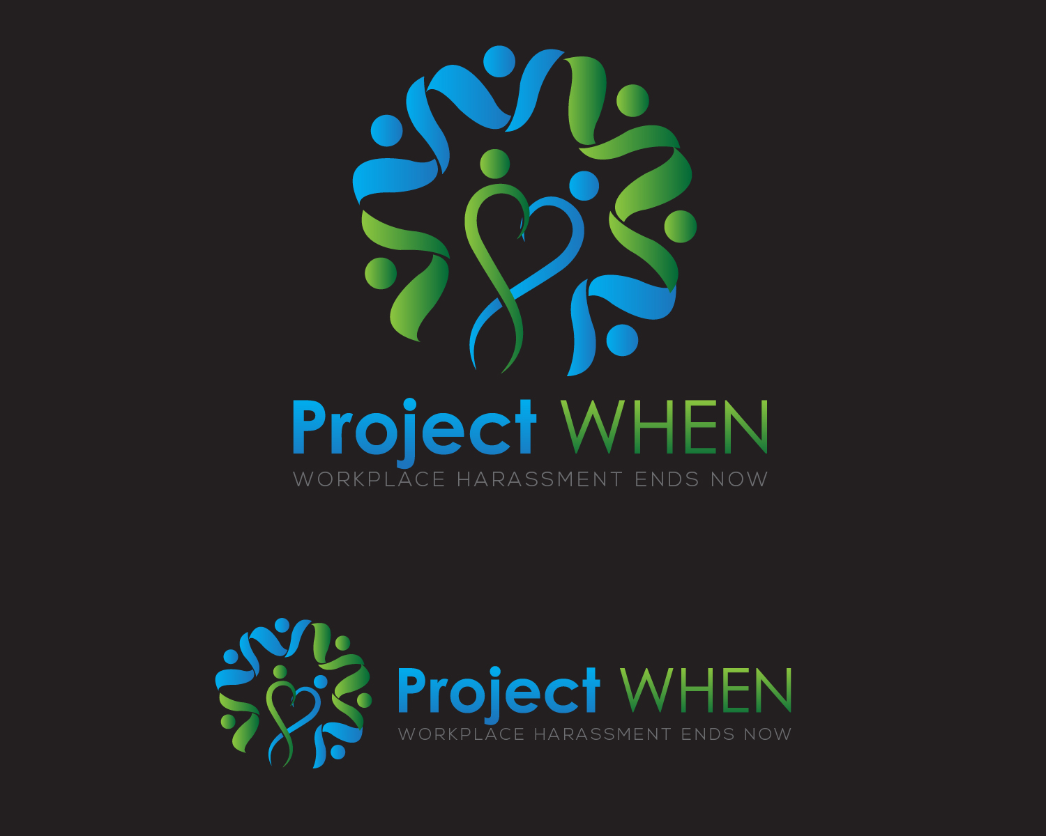
Thickness of Project and WHEN should be reversed. Justified font beneath is good. Heart again is too feminine. People around edge looks more like wings instead of arms...just an observation, maybe a bit too abstract in that sense. We do like the graphic to the left of the text so it is nice you have them as two examples (above and separately to left). For icon to left option, would prefer icon/font area to be same height. We feel the circle (other entry) with text in between is better than the arms/wings around. They are both visually appealing...just off in terms of a CONCEPT so far. Please ask for clarification if needed...maybe a combination of these two now that we've provided some feedback. Definitely a promising start. Thanks!
Browse other entries from this Logo Design Contest
Browse other Logo Design Contest
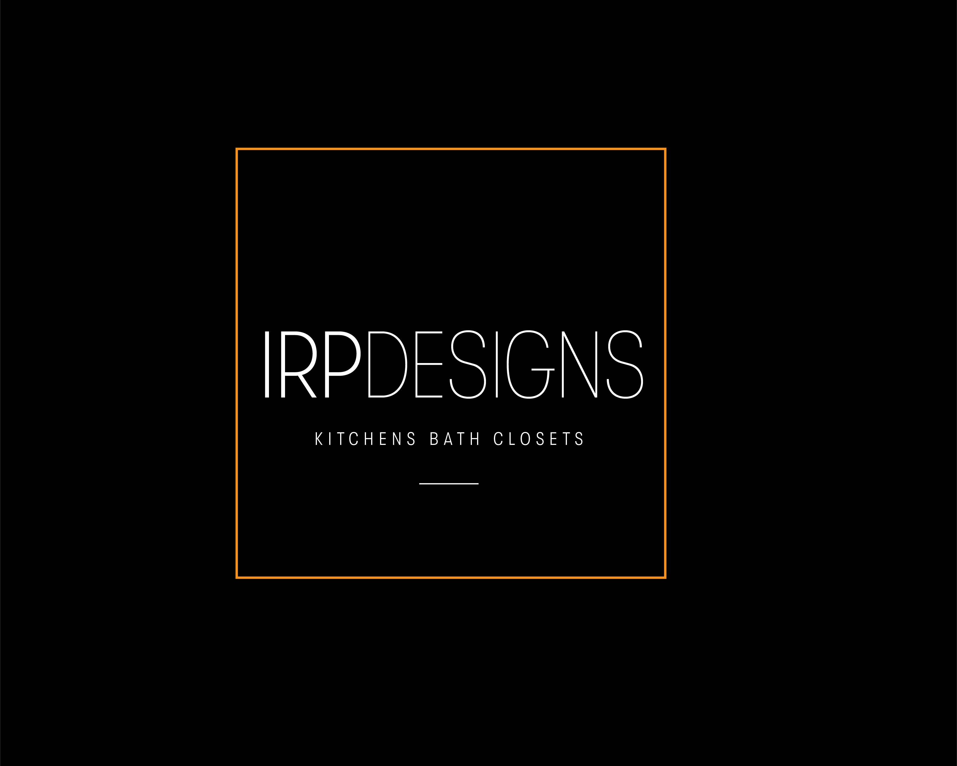


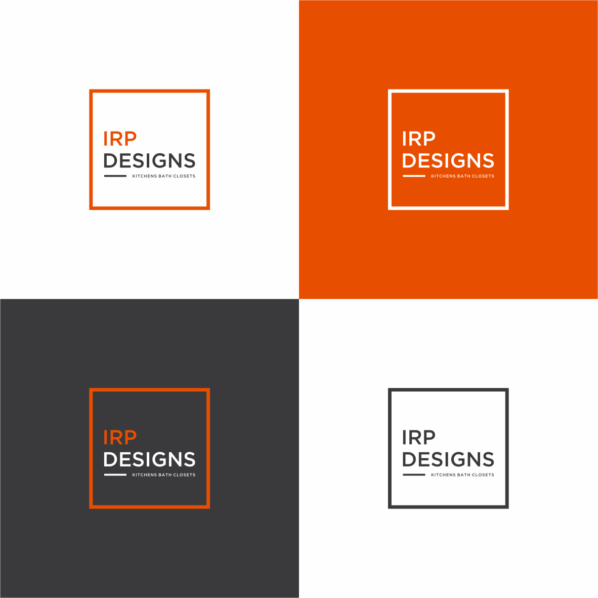
Logo Design Contest: IRP DESIGNS
re doing and modernize the current logo we have.
$150.00 Prize
439 ENTRIES

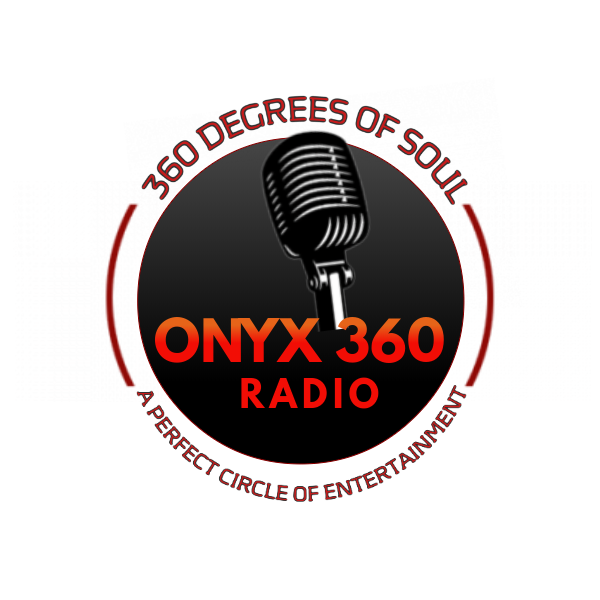
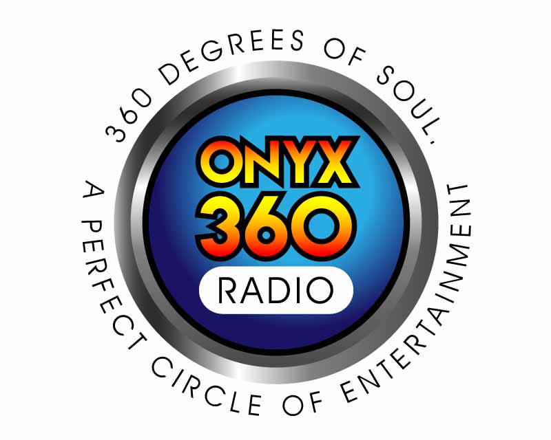
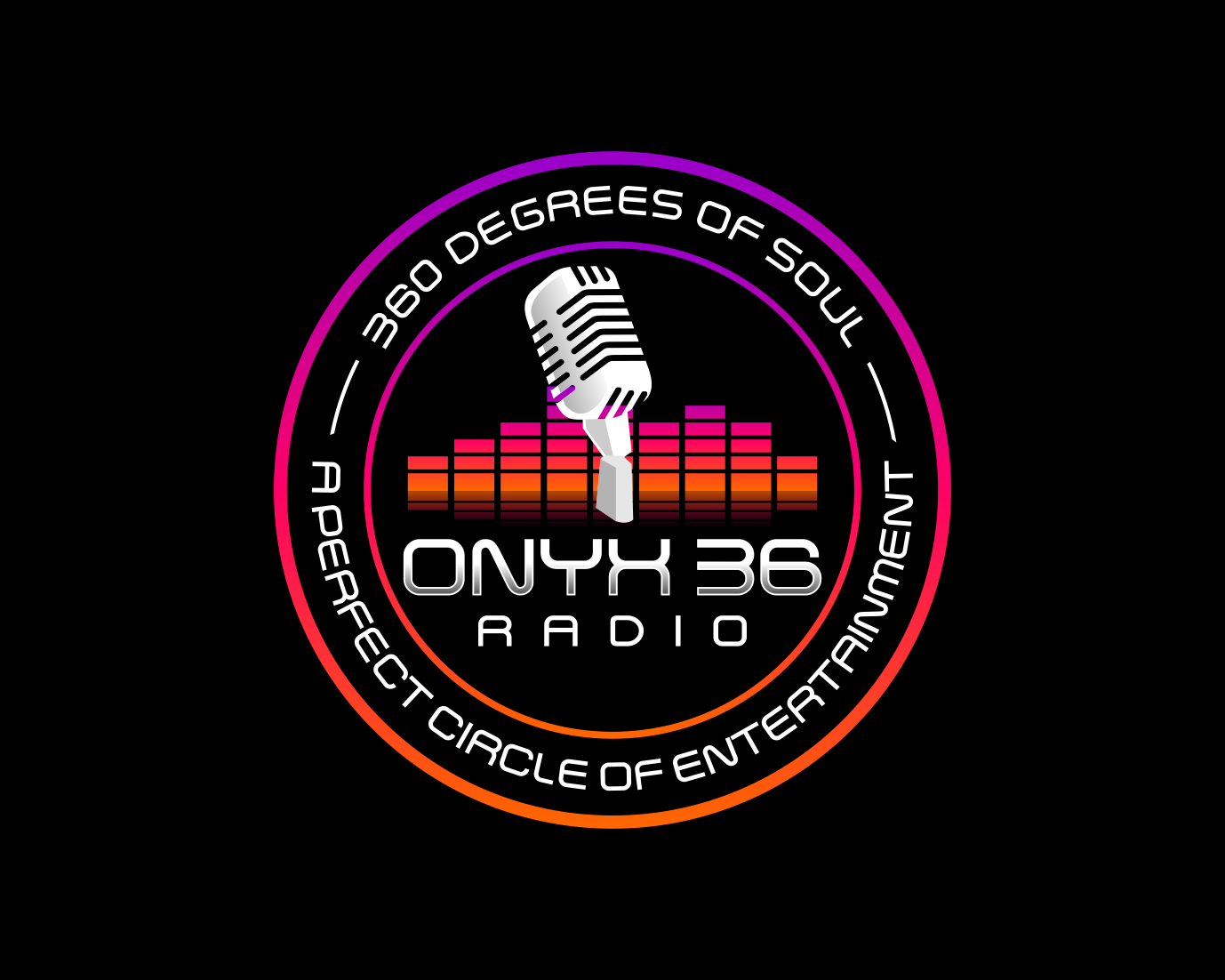
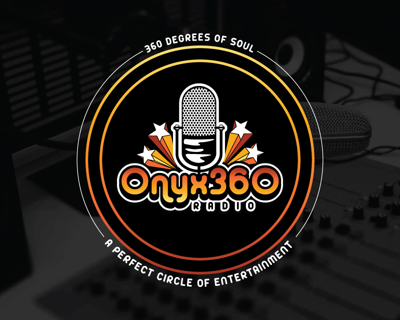
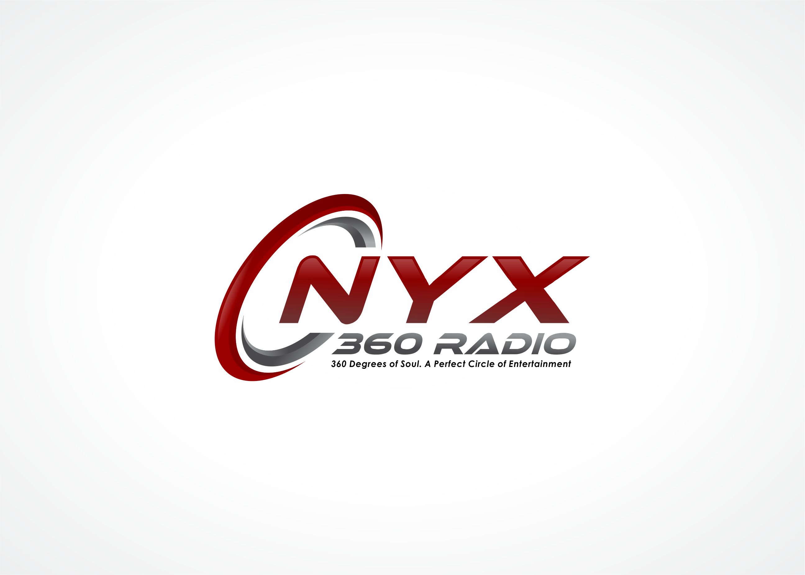
Logo Design Contest: ONYX 360 Radio
Need a logo for new business launch.
$150.00 Prize
67 ENTRIES
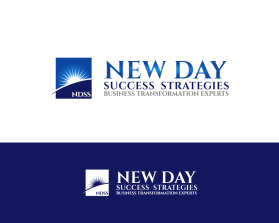


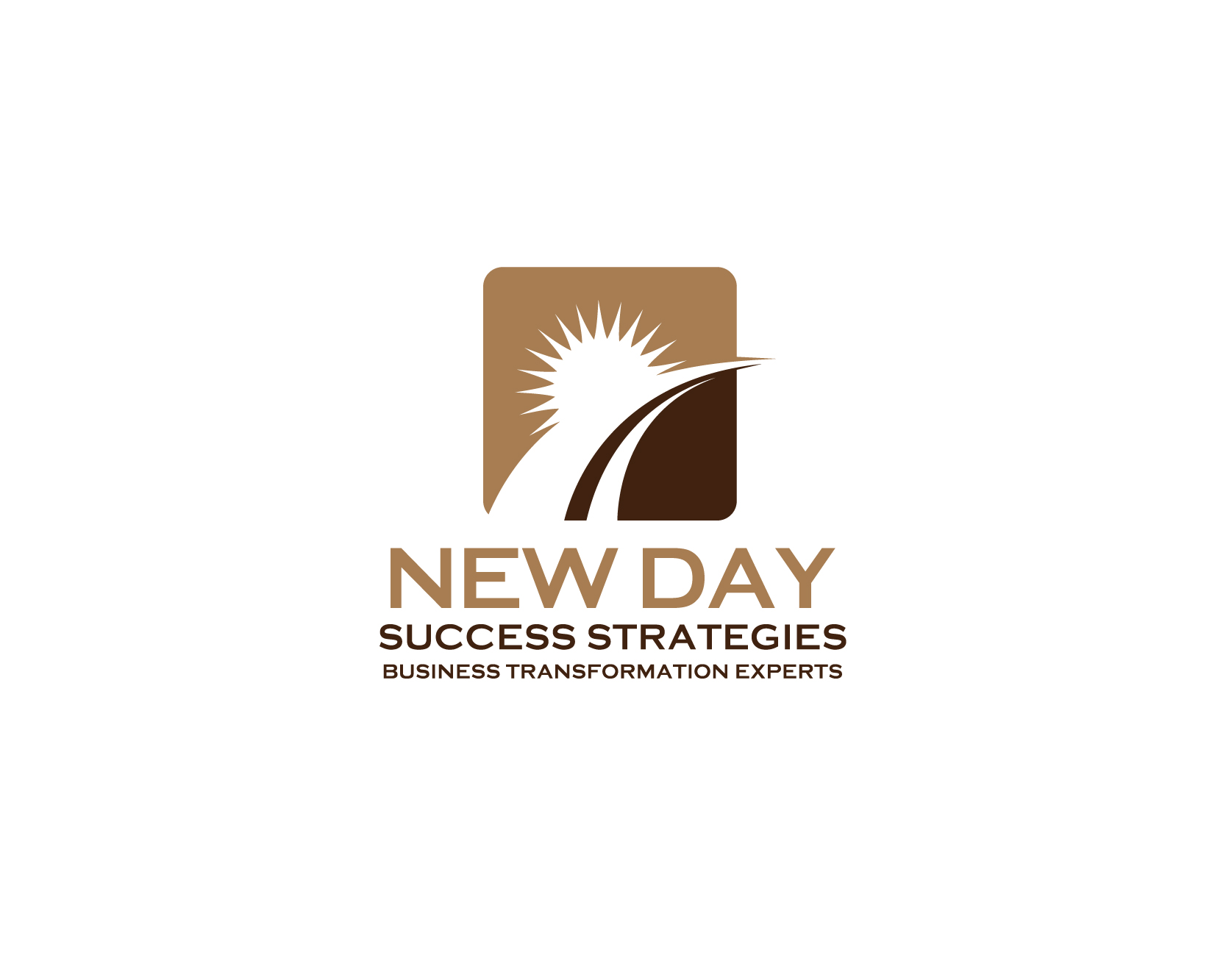
Logo Design Contest: New Day Success Strategies
Logo needed for a coaching company that specializes in sales and management training helping financial institutions develop front-line staff.
$135.00 Prize
75 ENTRIES

Fast. Awesome. Affordable
About the Creative
59
59
187
Other entries by JBsign:
Similar Entries