

- BACK TO CONTEST
- CREATIVE BRIEF
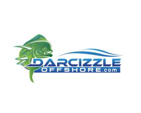
- ENTRY # 1180722
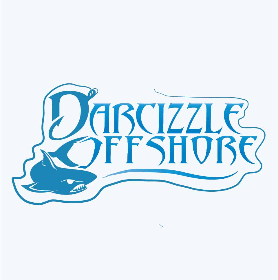
Comments for entry # 1180722
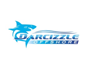
Cool design. The logo needs to be easy to read! This lettering is difficult to read at first glance. Needs to be less cartoonish and easy to read! Thicker lettering. Can you have the hook barb stick out away from D instead of turned in? Remove the fishing line wrapped around design. I like how the shark creates the O...but shark needs work. Shark needs to be generic looking- not mean or happy looking. The line under offshore can be fixed look more like waves. Maybe I can see a version with a black outline or light shadow around lettering?
Browse other entries from this Logo Design Contest
Browse other Logo Design Contest
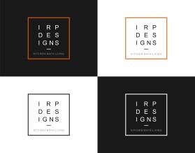
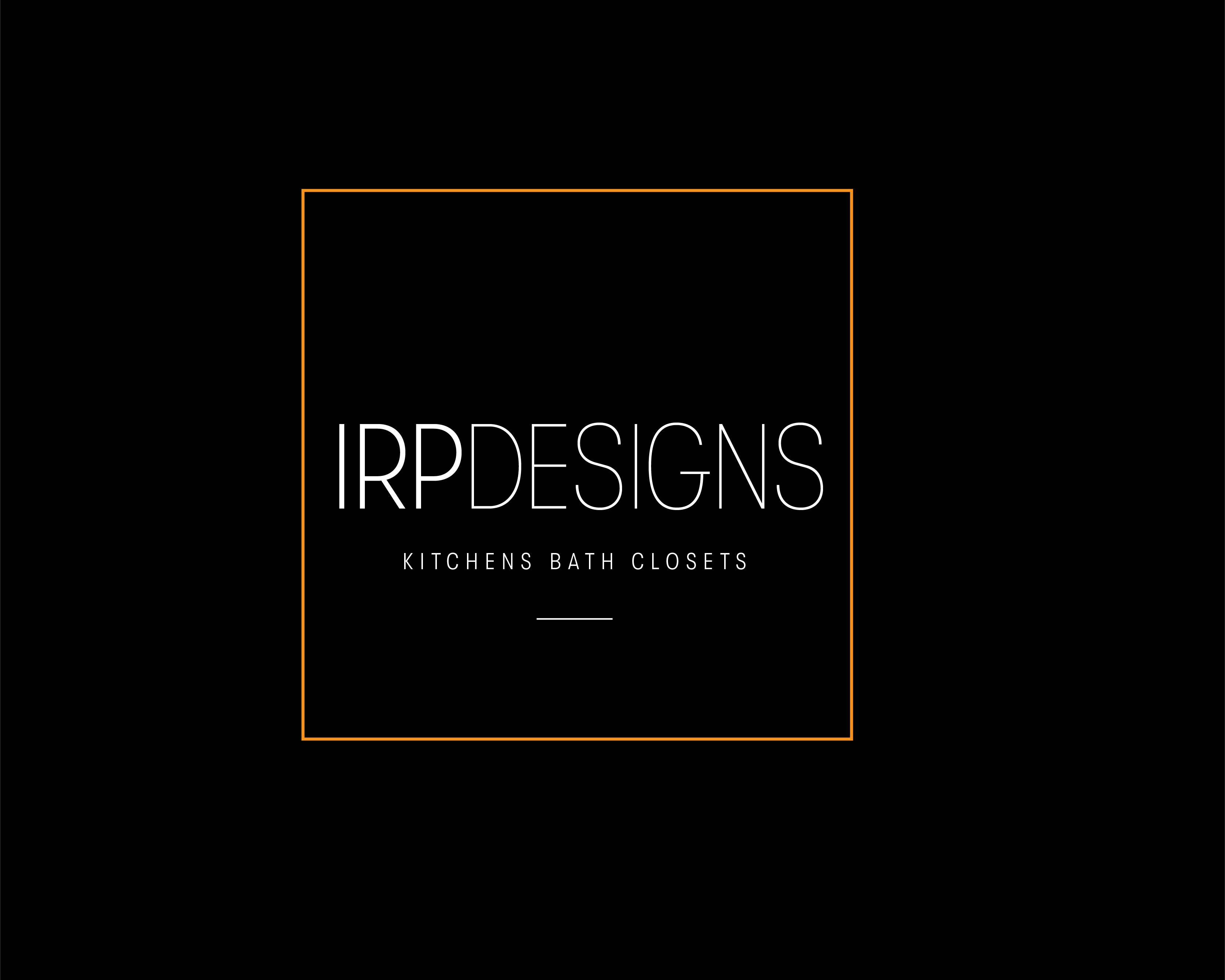


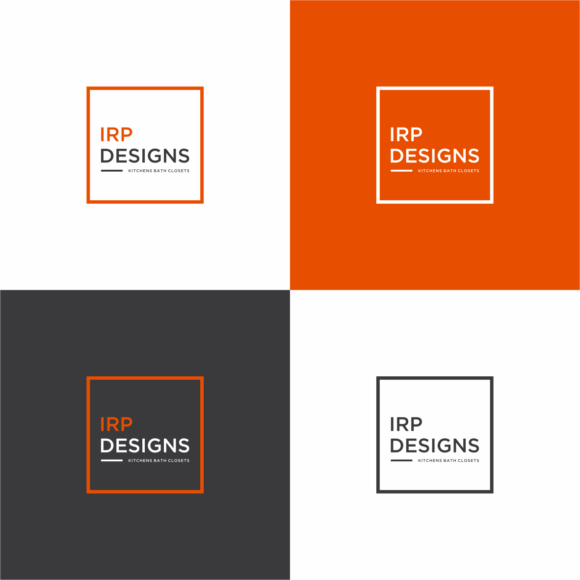
Logo Design Contest: IRP DESIGNS
re doing and modernize the current logo we have.
$150.00 Prize
439 ENTRIES

Logo Design Contest: ONYX 360 Radio
Need a logo for new business launch.
$150.00 Prize
67 ENTRIES
Logo Design Contest: Por Vida
looking too to see all of the artist with imagination that there design will catch everyones eye
$110.00 Prize
91 ENTRIES
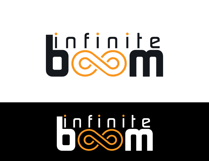
Logo Design Contest: Infinite Boom
Modern logo for a web design and digital marketing agency
$125.00 Prize
240 ENTRIES

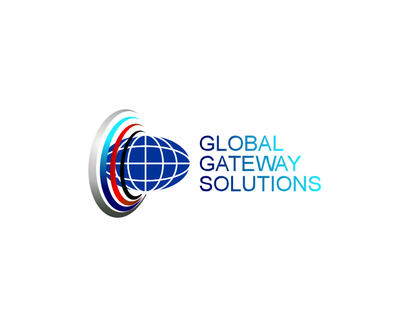

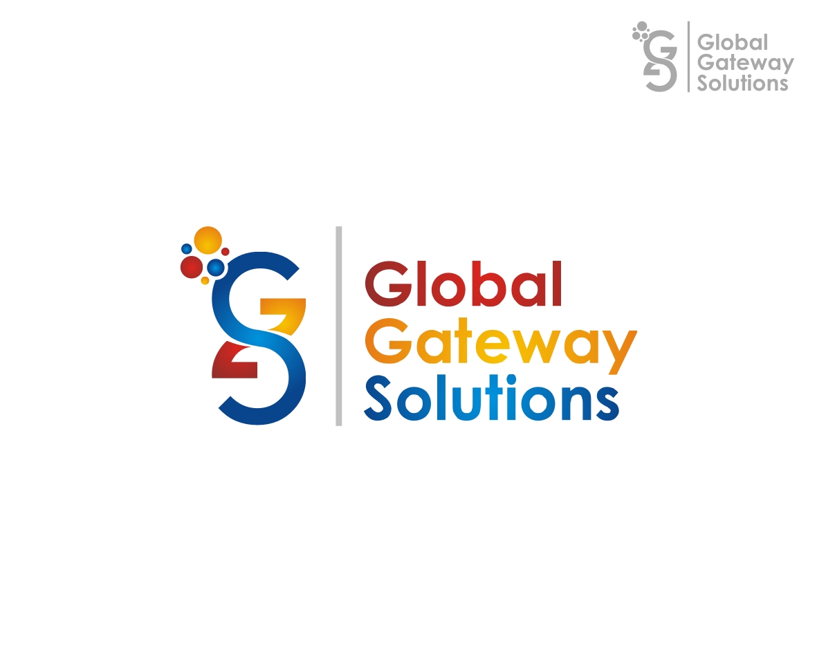
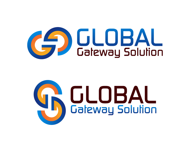
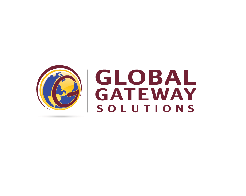
Logo Design Contest: Global Gateway Solutions
Modernize an existing logo for international call center Global Gateway Solutions
$105.00 Prize
214 ENTRIES

Fast. Awesome. Affordable
About the Creative
1
11
Other entries by Armen:
Similar Entries