

- BACK TO CONTEST
- CREATIVE BRIEF
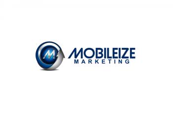
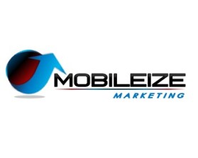
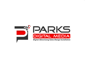
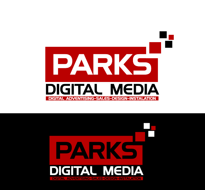
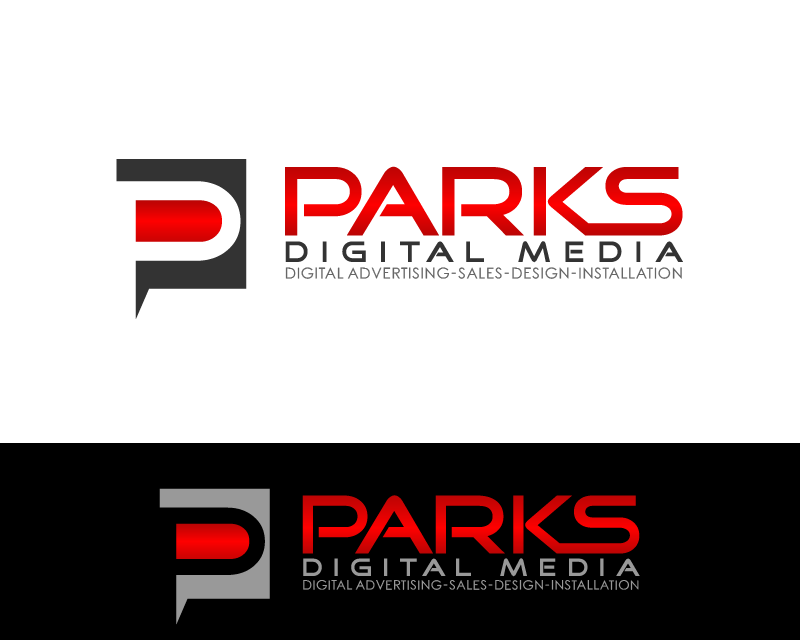
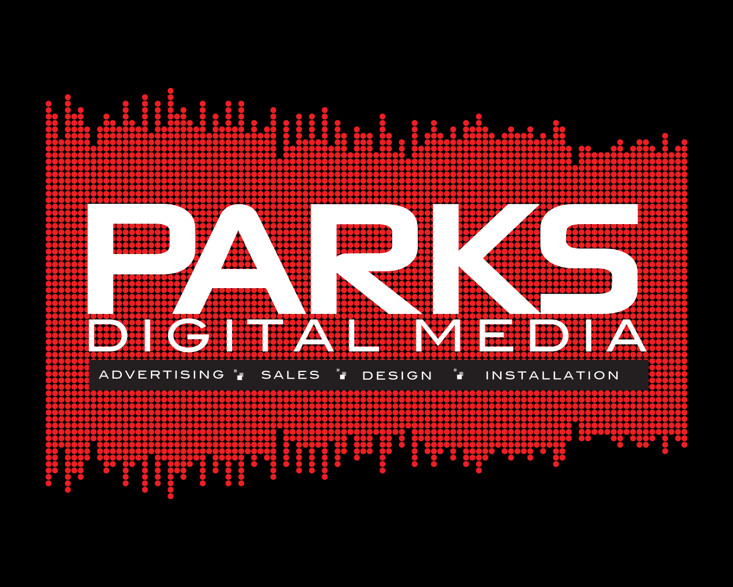
- ENTRY # 641215
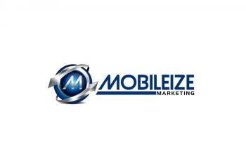
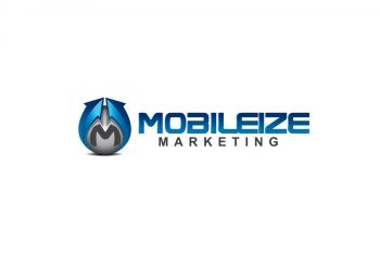
Comments for entry # 641215
First, let me say I'm very impressed with your graphic! It's original and it communicates the core value of the business - which very few entrants have managed to do. I love the font you chose for Mobilize, and how the M is italicized, and the way you did the line underneath. Excellent design choices, in my opinion. A comment about the lettering size however - I prefer to have the word marketing larger (since my company is not established), so that people know clearly what the business is engaged in because the word "Mobileize" does not tell the whole story on its own to everyone. Now on to the logo: I love the colour choice, the movement aspect, but I'm not so keen (even though done well) on the M being there. I understand the rationale, and it's a nice "M" per se, however, the overall effect is that it diminished the logo into being too busy looking. The backwards arrow, while adding balance weightwise, implies backwards movement and that too, adds an element of confusion. Overall, the logo does not deliver the nice, clean-look effect that your lettering has, as a result. Now I believe if the logo were bigger, the "busy"-ness factor would diminish, but then the overall effect might be a little overpowering, almost like a tank rolling in. Something I could even relate to on given days, but probably wouldn't to a prospective or new client, I'm guessing! I'm sure some people would disagree, but I'm inserting judgment of what would create appeal to the small business owner engaged in service industries. I've taken quite a bit of time to respond to this one, because I feel it deserves a detailed commentary. You have obvious ability and worked hard with this and I appreciate the effort taken. In sum, while I think this is a great graphic and I love that you created something unique and relevant, the logo is what
Browse other entries from this Logo Design Contest
Browse other Logo Design Contest
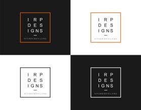
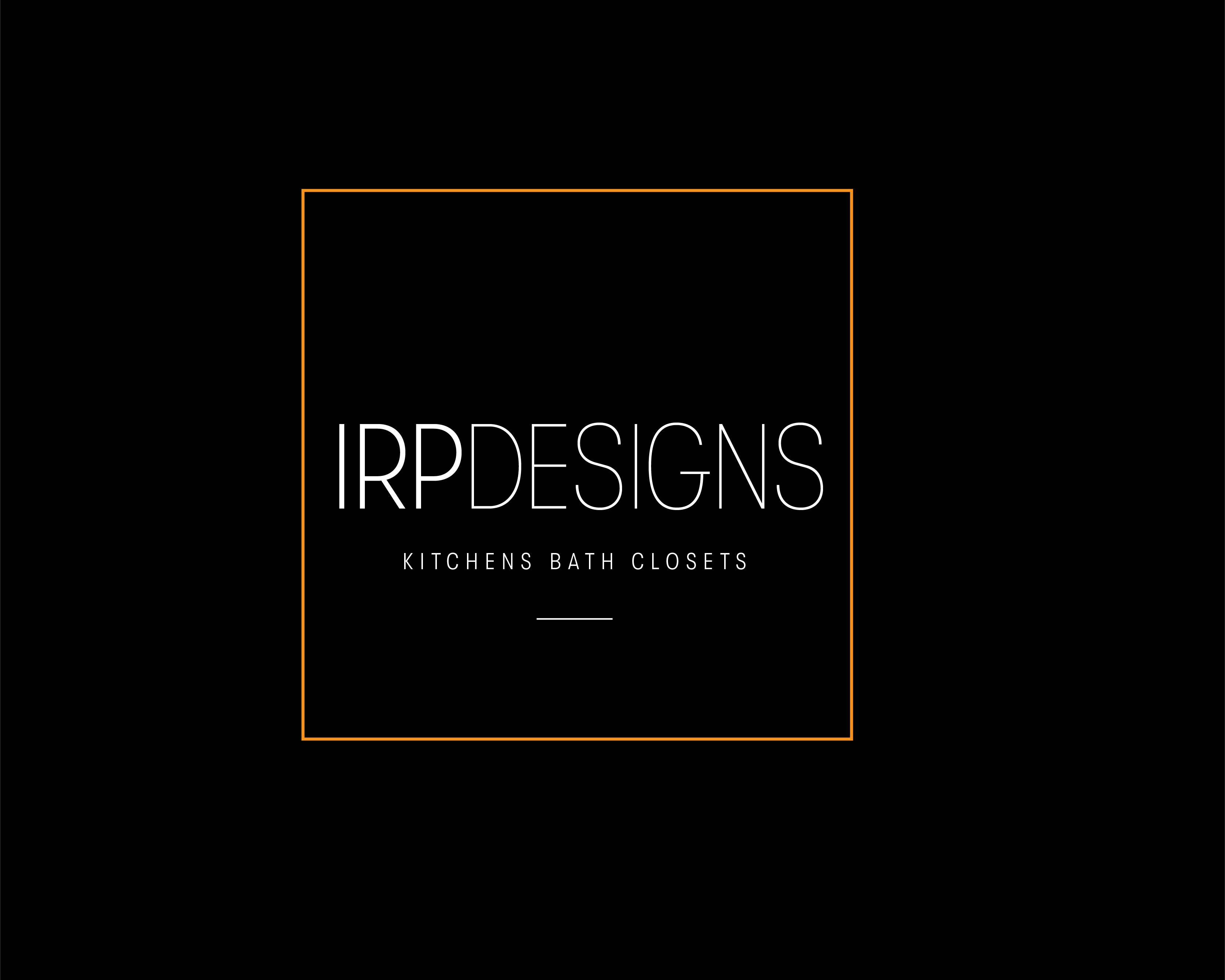
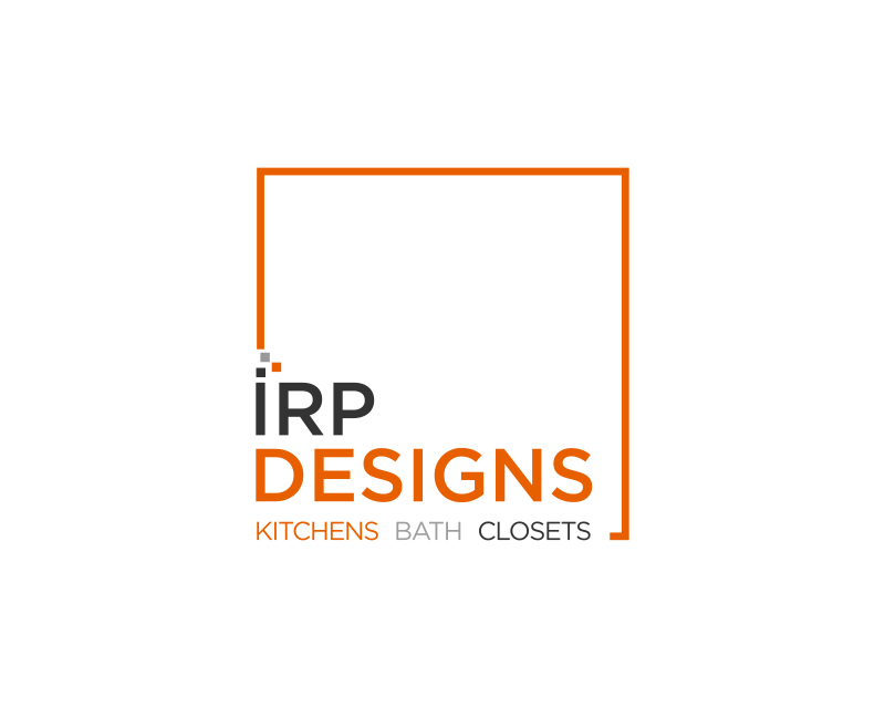
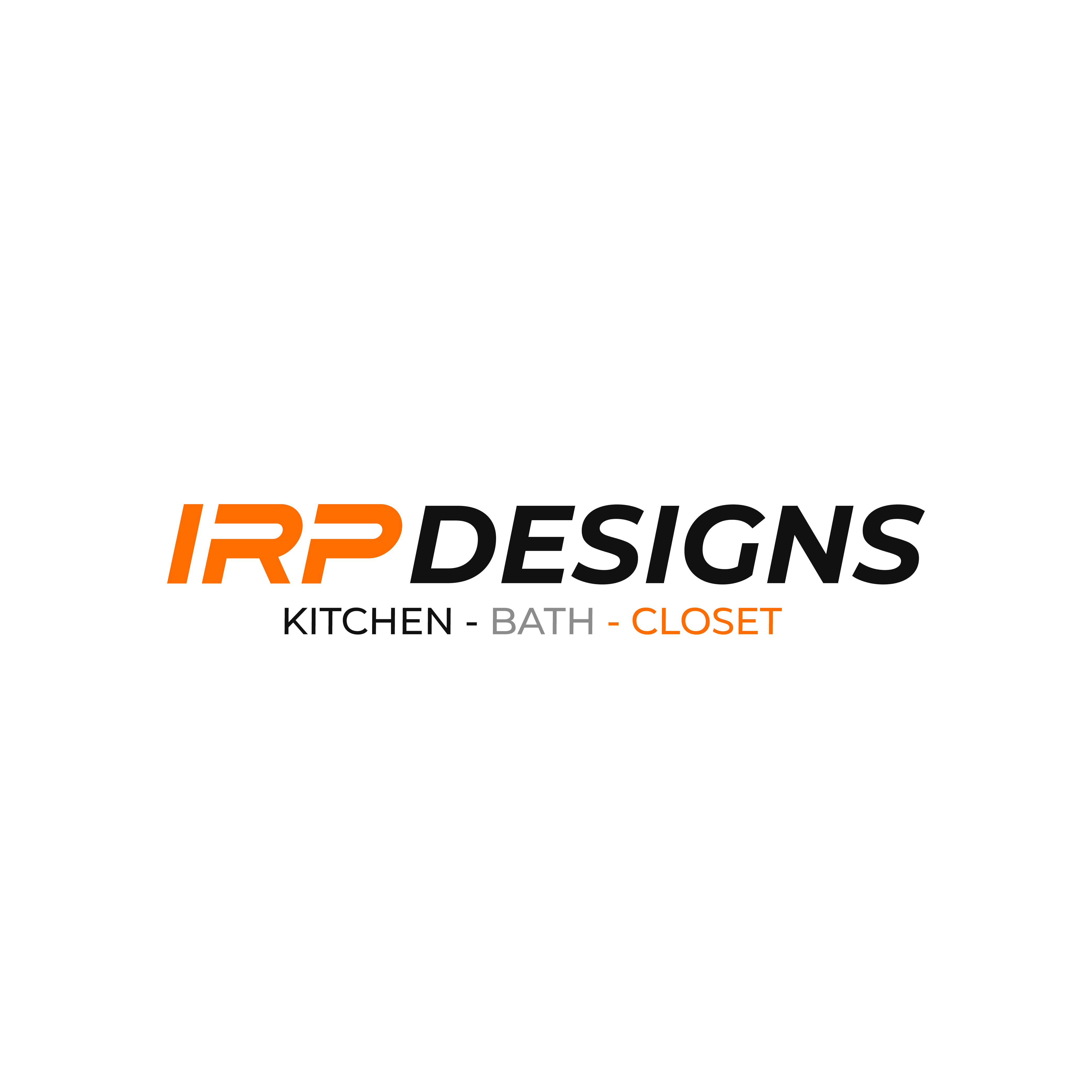
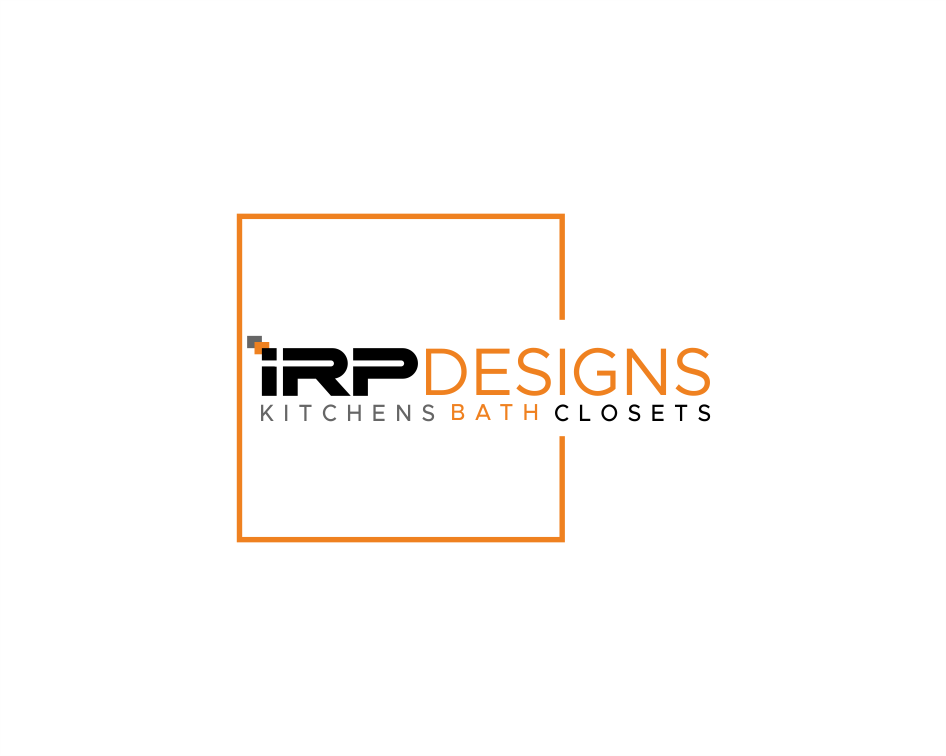
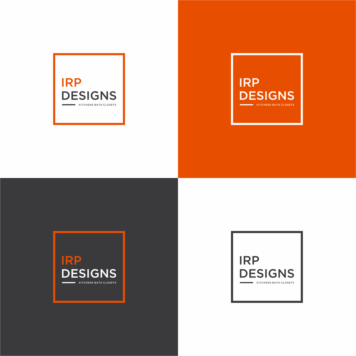
Logo Design Contest: IRP DESIGNS
re doing and modernize the current logo we have.
$150.00 Prize
439 ENTRIES
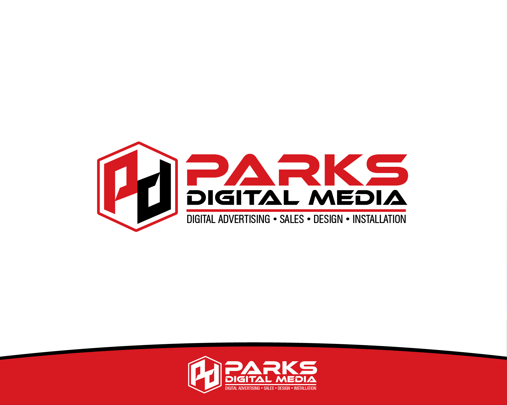
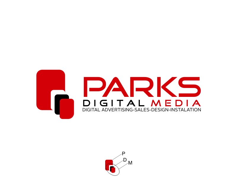
Logo Design Contest: Parks Digital Media
Fresh New Ideas for Digital Advertising
$210.00 Prize
318 ENTRIES
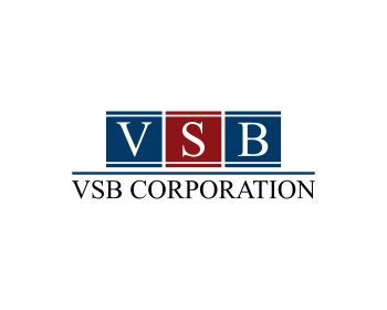
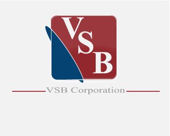
Logo Design Contest: Veteran Sales and Branding Corporation
Logo for VSB Corporation
$105.00 Prize
59 ENTRIES

Fast. Awesome. Affordable
About the Creative
4
5
40
einstine Bio
Imagination is everything...
Other entries by einstine:
Similar Entries