

- BACK TO CONTEST
- CREATIVE BRIEF
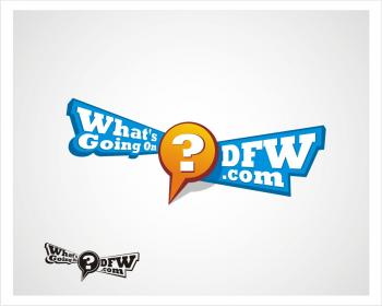
- ENTRY # 300049
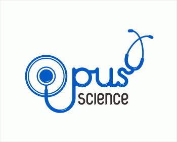
Comments for entry # 300049

I can make it outest line from stetoskop more havier, so more eye catching
We like this one better than the next entry (#300050) from a color standpoint. It feels a little "soft"--maybe the cursive font and the loopy end of the stethoscope that forms the "o" is what cathes the eye?
Browse other entries from this Logo Design Contest


Browse other Logo Design Contest
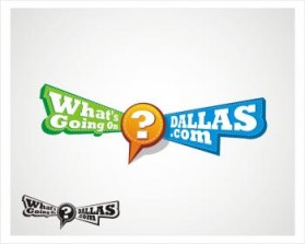
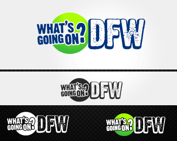

Logo Design Contest: WhatsGoingOnDFW.com
Logo Design for City Guide Website
$300.00 Prize
430 ENTRIES


Logo Design Contest: Optimal Power Technologies
Logo design for Green Technology firm
$150.00 Prize
93 ENTRIES

Fast. Awesome. Affordable
About the Creative
2
Similar Entries