
Staceys Planners
by cosiplannerContest received 167 entries and the contest holder has awarded a winner.
- BACK TO CONTEST ENTRIES
- CREATIVE BRIEF
- ALL ENTRIES
Company or website name
Staceys Planners
Links to the website
Website is not developed yet
Describe your company and organization and target audience
We manufacture wall planners, calendars and organizing tools that are used with dry erase markers.
 Our target audience for this contest's product is women, ages 30 to 50 years old, who love to cook and love using their electric pressure cooker.
The design should have the following
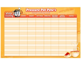
The product to design is a chart that will hang in a kitchen. The owner will fill in the chart with information they need to remember times and button settings for cooking with an electric pressure cooker.
I uploaded 4 files to help you:
A PDF example for you to see a product I made to help guide you
A JPEG called “Our Character.” It is a drawing we made and we want you to use it to make it into a computer graphic.
A JPEG called “5 Stock Images” which are other cartoon characters out there in the internet that I do NOT want you to copy.
A JPEG called “5 Photos of EP Cookers” to show you what these electric pressure cookers look like.

The size of the final product MUST be 11” high X 17” inches wide. Bleeds are allowed.
The middle table chart MUST be 9” high X 15.5” inches wide and centered from left to right. That will leave a .75” margin on the left and on the right.
Leave a .75” inch margin on the bottom and that will allow a 1.25” area on the top for the title and cartoon character.
These side and bottom margin areas can be used for graphics or designs if you think it looks good and will not be too busy.
 The table chart must have 17 rows including the header row and 8 columns. 
The widths of each column must be pretty close to what is shown but do not worry about being exact.
I made the uploaded PDF example very quickly. Do not go by my color scheme nor my choice of fonts. I want YOU to be creative with the background pattern, color scheme, choice of fonts and size of fonts and especially the cartoon character. 
I want you to make the table chart look more creative with the headers and line quality so it does not look like a word processor made it. Maybe add drop shadows?
The cartoon character is very important. We made our own drawing of a character because we do not want it to look like the others out their in stock image sites. We want you to use our drawing and make it come to life in a computer graphic image. You can made minor adjustments if you have good ideas. I would like the character to be silver and black for the body - not other colors.
I think the placement of the cartoon character should be in the upper left corner. He can overlap the table chart as long as we can still read the word “Food Type” in the left header box.
If there are other food or cooking graphics that you think would look good in the upper right corner or along the side margin areas - I am open to seeing that. Maybe a bowl of soup?
I will be very involved and will be coaching you and giving you a lot of feedback.
Briefly describe your contest
Contest Description: Design a cartoon character on a colorful cooking reference chart by using our uploaded cartoon character we drew.